- A data hierarchy map shows the metrics everyone in your organization is tracking and the relationships between them.
- It prompts you to iterate on your metrics and remove or update any goals that don’t contribute to higher-level objectives.
- The map helps you stop chasing vanity metrics, enables cross-team collaboration, and empowers team members to take ownership of their goals.
- A neutral team—like the data team—should create the first version of the map.
- The goal isn’t to create a map with the perfect metrics but to create a starting point for learning.
- As your organization collects data, update and evolve the metrics to better feed into business objectives.
There are infinite data points a team or organization can track. It’s a struggle to know what metrics to prioritize. The result? Organizations often end up with a flat playing field, with revenue holding the same value as a low-level metric like email open rates.
When there isn’t explicit agreement over the relationships between different metrics, people end up in data silos. Each team spends time working to improve vanity metrics that don’t connect and impact business goals.
The solution is a data hierarchy map: a framework showing the relationships between different metrics in an organization. It illustrates how lower-level metrics contribute to higher-level outcomes and defines who is responsible for which metrics.
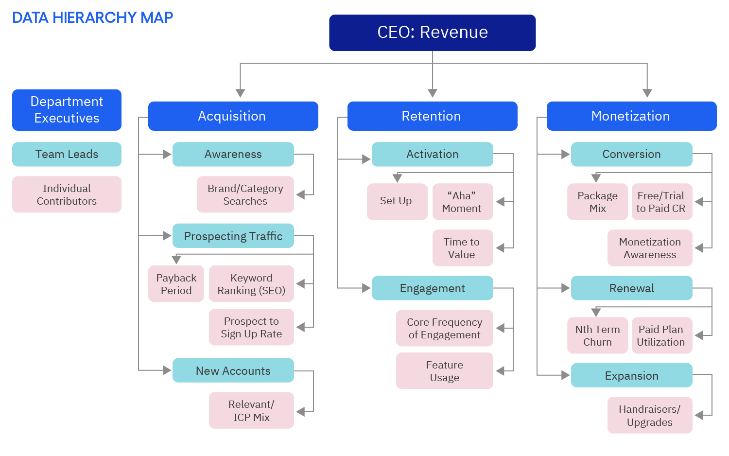
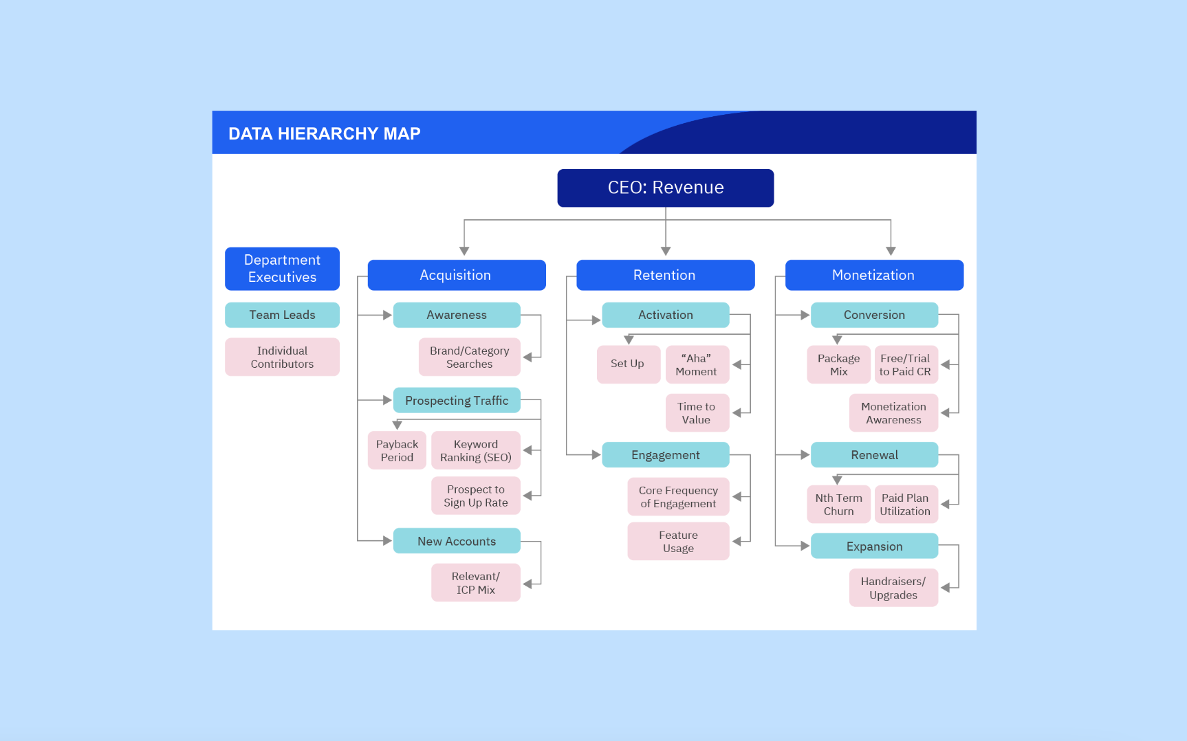
An example data hierarchy map with my most commonly used metrics
The map shows the hierarchy of metrics in an organization. For instance, feature usage, owned by an individual contributor, feeds into the engagement metric, owned by a team lead. The metrics that team leads (e.g., product managers or marketers) own contribute to the metrics that department executives (e.g., heads of growth, product, or marketing) are responsible for.
A data hierarchy map prompts teams to see how data points feed into the rest of the organization. That way, you can choose metrics to track based on data and evidence and put your efforts into positively impacting organizational goals.
Stop chasing vanity metrics
A data hierarchy map forces you to prioritize metrics that impact your organization’s goals. If you’ve selected the right metrics, pulling a lever at the bottom will have an impact all the way up the data tree.
If you don’t map these connections, you improve metrics that don’t do anything. Let’s say a marketing team has the target of increasing traffic. They work hard and manage to double, triple, or quadruple the amount of traffic to your site.
Meanwhile, the business is failing. There isn’t a plan for activating or monetizing the marketing team’s traffic, so it doesn’t impact conversions. When you apply the wrong data metrics, you’re not data-driven—you’re just data forceful. And that doesn’t help the business.
A data hierarchy map shows where you’ve selected vanity metrics, which prompts you to iterate and update the metrics you track. If you improve the metric you own, and it doesn’t impact the metric a level above it in the hierarchy, you know you need to rethink that metric.
Get everyone speaking the same language
Siloed teams track metrics that don’t link to the rest of the organization. Everyone needs alignment on the critical data points so they can work toward the same goals.
A data hierarchy map fosters teamwork between departments because everyone is unified around business goals. Instead of, for example, marketing or product tracking different metrics that aren’t linked, you get a company-level view of how you solve for acquisition, retention, and monetization.
It also makes data the common language between departments. There’s often implicit agreement (or disagreement) about which metrics contribute to which outcomes. For example, the marketing team might assume increasing traffic will help increase revenue, but that might not be the case.
Plotting the hierarchy map forces you to discuss metrics and make those agreements explicit: we all agree that improving X metric will have Y impact. With those agreements made explicitly, everyone trusts the chosen metrics, and discussions between teams can run more smoothly.
Enable ownership and autonomy
When you set goals around data-first outcomes rather than tactics, team members can take responsibility for their outcomes.
With tactics as a goal, people feel micromanaged. They’re forced to stick to completing specific tasks, even though they might believe they’re pointless.
When you have a data outcome—a metric that maps upstream—as a goal, people can take ownership. Team members have the freedom to use their skills and creativity to come up with the optimal tactics to reach the goal.
The result is a more democratic organization. People get more satisfaction from their work because they feel accountable for something.
It also leads to outcome-based project planning. Say, for instance, someone in marketing had a tactic as a target: create four blog posts per month. They feel constrained and frustrated because they have to keep coming up with those posts, regardless of the impact that the posts will have.
Let’s say you give them a data outcome as a goal: drive 30% more organic traffic per month. They might decide the best tactic is to create the four posts, or they might devise more creative and effective ways to achieve that goal. For instance, they might increase distribution to existing posts, refresh old posts, or find external influencers to collaborate with instead of only posting company-generated content.
The map also means that you assign the right level metric and give people metrics they can impact. For example, it doesn’t make sense to give a marketer revenue as a metric. Instead, you give them a lower-level metric that maps onto revenue.
Another outcome is that people see how their work impacts the company. The connection to a higher outcome is motivating because team members can see how their work is meaningful.
How to implement a data hierarchy map
A data hierarchy map is dynamic. The value comes when you learn from it and evolve your tracked metrics.
Get version one of your data map up and out there as soon as possible. It’s not supposed to be perfect; it’s supposed to be a starting point for learning.
The map should come from a single source of truth—a single team—so there’s one definition for each metric. Ideally, your data team creates the map, but any data-savvy neutral party can create it. The team who creates the map can base version one metrics on past learning or metrics teams are currently tracking.
Because the map is about getting everyone on the same page, it needs to include definitions for the metrics and any inclusions or exclusions. For example, for a new user acquisition metric, you might track only business-level acquisition as your primary metric.
Share the map with the entire organization, including where to find the data for the metric. Every data point don’t need to be on the same dashboard, but everyone needs to know how to find or calculate their metrics.
At this point, it’s expected that people disagree with the metrics on the map. Everyone should voice their disagreement but commit to accepting the metrics as a starting point. Teams should then gather data and examples to justify changing a metric. Any updates should be based on objective customer data, not opinions or instincts.
Revenue always stays the same. Acquisition, retention, and monetization also remain constant, though you might decide to update their definitions.
How often you revisit and iterate on the rest of the metrics depends on the velocity of your organization. A startup might review its metrics every month. For a large and established organization, it makes sense to iterate every few years.
Common pitfalls to avoid
- Not setting ownership of team metrics. If no one is responsible for a team metric, people end up selecting vanity metrics for individual contributors or using floating definitions of their metrics. This ultimately leads to distrust and data-culture failure. Assign an owner for every metric on your map.
- Misaligning metrics. Let’s say you have a product-led monetization model. It doesn’t make sense for sales to be the only team who owns metrics that map onto revenue. Adjust the structure of the hierarchy map to fit your business model.
- Each department comes up with its own version of the map. If different teams use separate versions of the map, they’ll work in departmental silos. The data hierarchy map must be a shared source of truth across departments. Create and use the same map across your entire business and product.
Get started tracking the metrics that matter with Amplitude
Use Amplitude Analytics to track the metrics in your data hierarchy map and empower your teams with self-service product analytics insights. Get started today with our free starter plan.
If you enjoyed this post, follow me on LinkedIn for more on product-led growth.