Once upon a time, only companies with the resources to code all of their analytics by hand could look at their data properly. That usually meant diverting valuable developer attention and making lots of mistakes along the way, but it also meant that a lot of thought went into how the metrics were presented and understood. There were no preconceived notions—everything was done for a specific purpose.
Today, analytics is accessible, affordable, and powerful. With three clicks, you can pull up a chart to compare 2-week retention rates for new users depending on whether they joined a “community” in your app or not, delve into the correlation score to nail down if there’s a statistically significant link there, and then save this cohort for further study.
The biggest challenge in understanding your analytics today isn’t the data itself or how it’s presented. It’s adjusting for bias. No one is immune to the various fallacies, paradoxes, and cognitive errors that come pre-installed in the software of the human brain, not even founders.
There are countless ways that our brains get it wrong—here’s more than 100—but we’re going to focus on four particularly insidious logical fallacies that can keep you from understanding your data.
1. Semmelweis Reflex
19th century Europe was a dangerous place. In 1845, 7% of pregnancies at the General Hospital of Vienna were ending in the mother’s death. By 1846, it was 12%. Ignaz Semmelweis, a physician at the hospital, knew they had to be doing something wrong.
After a series of experiments with different processes, he figured out what it was. Interns would go from taking care of patients to doing autopsies, and vice versa, without washing their hands. Though the germ theory of disease didn’t yet exist, Semmelweis had a feeling the two were related. He immediately instructed his residents to start washing up.
Source: The Lancet
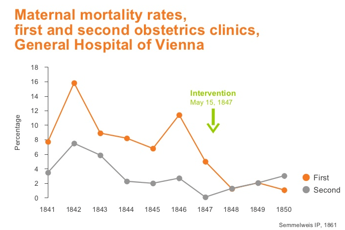
Maternal mortality rates immediately dropped below 2%. But Semmelweis, famously, was not embraced for this life-saving discovery. He was committed to an asylum—doctors simply did not accept the premise that tiny, invisible particles could be responsible for so many deaths.
The Semmelweis reflex refers to this reaction–to the human tendency to reject ideas that don’t fit established paradigms.
If you’re trying to prove that your app has traction, for instance, you’re going to love hearing from your team that you have a 45% ratio of daily active users (DAU) to monthly active users (MAU). That’s the same legendary ratio that Mark Zuckerberg had with Facebook in the very early days. It was held up as an example of Facebook’s amazing growth potential then, and it’s regarded as early proof of the service’s greatness now.
Your startup must be on the track to success.
Your Semmelweis reflex kicks in right around the time you realize how much that DAU number actually keeps hidden from you. For instance, it’s great that you have 25,000 users that are active on your app everyday. But that’s an easy thing to measure a lot of the time. There are many things that DAU number won’t be able to tell you:
- It won’t tell you that it’s a _new _25,000 users every day—that none of them are being retained.
- It won’t tell you that only 1,000 of those users are even using the core feature of your app—that its whole purpose is unclear.
- It won’t tell you what features of your product are actually bringing your users back, or what they’re using it for.
The Semmelweis reflex means that you’re not necessarily going to want to confront these kinds of truths. And when DAU is held in such high esteem, and talked about so frequently, you’re even more likely to stay on the surface of your metrics.
But even if it seems like a usage metric, DAU doesn’t actually say anything about how many people find your product valuable. When you finally do see the reality underlying that active user count, it can be really hard to accept.
What You Should Do: Build a fool-proof process for understanding the metrics that really correspond with your company’s success. Dave McClure’s Pirate Metrics model is a popular one, and for good reason: it lets you track each step of the customer funnel, from acquisition to referral, with metrics that you can actually act on.
That’s the key. As the U.S. Marines say, you need to operate with a “bias towards action.” Your analytics are not just opportunities for reflection, either on success or failure. They’re about opening up spaces where you can act and influence things in a measurable way. The fact that your DAU fell by 1,000 users in a week doesn’t tell you anything actionable; knowing that usage of one of your core features has fallen by 10% because of a UI change, however, does.
2. Hot-Hands Fallacy
In 1985, three researchers set out to investigate a theory of immense sway among basketball enthusiasts: that players could get “hot hands.” After hitting several shots in a row, it was thought, players were “hot” and more likely to hit even more. But Gilovich, Tversky and Vallone found that it was not so.
When they analyzed individual players and their shooting profiles, they found that it made no difference whether they’d just made six shots in a row or missed six: their chance of hitting the seventh was exactly the same, statistically.
This study didn’t exactly blow the lid off this logical fallacy, as you can tell if you ever switch on ESPN. “Hot streaks” are still a regular topic of conversation, and not just in sports. From politics to business, no one wants to think that success is random. We want to think that we have something in our brain, or our gut, that gives us special abilities. We want to see the ball literally catch on fire after we make enough shots in NBA Jam.
Image: Bleacher Report

When you don’t use data to understand your app, or you use data in a cursory, surface-manner, you’re going to attribute your successes to your intuition rather than random forces. And this means that we’re liable to rely on our guts when we have to make difficult decisions later.
Often this involves intuiting how and why people are using your app:
- What do people really enjoy about it?
- Why do some people come back every day and why do some uninstall it almost immediately?
- What do you need to do to encourage better user retention?
These questions concern the fundamental raison d’être for your app. Because they’re so essential—because maybe you feel like you’re supposed to know—it’s easy to answer them with your gut instincts.
But the fact that a basketball player has sunk their last three baskets does not mean that they’re any more likely to hit the fourth, and the fact that you developed an app does not make you an authority on how people are going to use it.
What You Should Do: Behavioral cohorting is how you go past intuition and figure out how people are actually using your product. You take metrics that track actions performed inside your app, assess them against patterns of behavior (like sharing, posting, how many times someone re-opens your app over the next week) and then see where you have a connection.
The difficult part is picking the right patterns and then assessing the strength of the connections. For the former, you need to understand what kinds of behaviors users exhibit when they are truly tapped into the core value of your app. For the former, you need to do a lot of experimenting: you need to make sure that you’re dealing (as much as you can) with causation rather than correlation.
3. Simpson’s Paradox
There’s an error in statistics so deadly and difficult to spot that it’s achieved the status of a paradox. First described in the 1950s, Simpson’s paradox basically states that trends that appear in groups of datasets can disappear—even reverse—when those sets are combined and analyzed together.
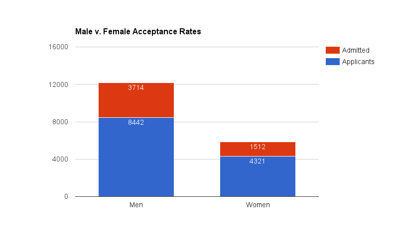
One of the best examples comes from a study of gender bias at the University of California, Berkeley. After noticing that only 35% of women who applied for graduate school were admitted compared to 44% of men who applied, researchers dug into the numbers, expecting to prove what seemed obvious—systematic bias. What they discovered was that even the most straightforward statistics can lie.
This was the starting point for the investigation. It would certainly seem, based on a glance, that there’s significant bias in favor of men.
But when the researchers ran the numbers on each academic department and their individual acceptance rates, they found something shocking: not a single department displayed significant bias in favor of men when it came to admissions. In fact, most had a “small but statistically significant bias” in favor of women.
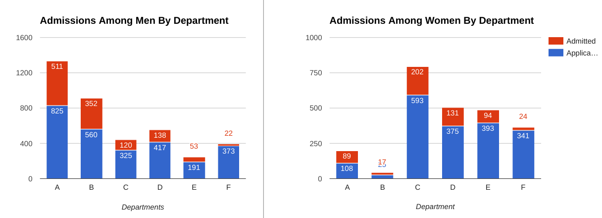
(Source: Wikipedia)
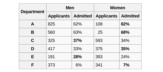
What was really going on was that men were generally applying to less competitive departments than women, getting accepted to them at higher rates, and skewing the overall numbers. Look at Department A, the least competitive department by far. Out of 825 men who applied, 511 were accepted: 62%. Out of 108 women, 89 were accepted: 82%.
Just based on those two points, you wouldn’t expect such a discrepancy in admissions numbers pointing in the opposite direction. The reason we end up with Simpson’s Paradox is because there’s such an inverse effect in Department C, by far the most competitive one. Rates there were 34% for women and 37% for men—but nearly 600 women applied compared to 325 men.
Researchers had discovered a trend they did not expect. Men were driving up their overall acceptance rates by applying in large numbers to less competitive departments, while women were driving theirs down by applying to more competitive ones.
Simpson’s Paradox, for you, means that thinking about your business in terms of broad metrics like revenue or growth doesn’t always tell you the truth about how your business is actually doing.
Let’s say you’re recording 10% increases in revenue every month. Depending on your company, this might be amazing. You might think you are doing everything right.
But if you’re increasing revenue because you’re growing and adding more customers, you need to factor in the costs of acquiring those customers and the additional cost necessary to maintain their service. You also have to factor in churn—if you’re expanding quickly and booking more and more revenue, you might not even notice it, but churn is deadly. Those 10% increases don’t mean anything if your churn rate is increasing.
Maybe a full 80% of your revenue is coming from upselling existing clients. Your customer base, in this case, wouldn’t actually be growing that much. The problem there is clear: focus on upselling to a customer base that’s stagnant, and churn is going to gradually destroy your business from the inside.
Taking your metrics at face value is dangerous, and not just because you might wind up optimizing for the wrong variables for a couple of weeks. It’s not just about wasting some time. It’s about doing the exact inverse of what you should be doing.
What You Should Do: Break down all of your metrics into composite pieces so you can verify these constituent elements. Separate total bookings, for instance, into upsells and new acquisitions. This will you a give you a better idea of where your growth is coming from—and more importantly, where it’s not coming from. If your primary revenue source is a market segment with high customer acquisition costs and low lifetime value, then it’s a good sign that you need to change something.
You might not be able to pick a new kind of customer. But you can identify whether there’s unnecessary excess in the amount you’re paying to acquire customers or missed opportunities to boost the value of each customer over their lifetime. Those two metrics are the nuts and bolts of creating a strong business, and you won’t be able to truly increase revenue unless you understand and optimize for both.
4. Argumentum ad populum
Also known as the “appeal to the people,” the argumentum ad populum is a rhetorical technique that deems something true as long as there are enough other people out there that think and say it is.
Nowhere is this more true than in the world of startup analytics, where ideas can propagate and achieve legitimacy simply because they’re talked about so much. “Startups love to point to big growth numbers, and the press loves to publish them,” TechCrunch professed to their role in this back in 2011, “These growth metrics can often be signs of traction (which is why we report them), but just as often they are not.”

Not much has changed about the way we talk metrics. Those big growth numbers are still what gets held up when a startup is favored, what gets hung around their neck when they fail, and the result is a largely pervasive feeling that those numbers are probably what really matters.
This fact complicates one of the big pieces of advice that startup founders get when they first start tracking their analytics: that they should share the numbers with their entire team. Let everyone know how the business is actually doing, the idea goes, and you’ll have happier and more engaged employees.
But because analytics are easily misunderstood, simply giving everyone on your team the password to your Amplitude account is unlikely to be a productive exercise.
To do good analysis, your metrics need to be understood in context, and there’s a level of domain-specific knowledge that you need if you’re going to do that. You need to understand the difference between correlation and causation, for instance, and not just in theory—in practice, as it applies to mobile analytics.
Your team also needs to be united. If the various decision-makers at your company are interpreting your analytics differently, then the chances are good that you’re going to be working at cross-purposes; you won’t be putting your combined focus behind one strategy.
That’s why you need to both open up your company’s analytics and help your team come to a collective understanding of what they mean. Transparency doesn’t mean letting everyone see a bunch of data they can’t understand or put in context. Transparency means giving everyone insight into what’s really going on and formulating a plan, together, for how you’re going to make things better.
What You Should Do: Set up an internal process for running retention experiments. Make sure that your team follows it to the letter, because the whole point of using your analytics to improve is that you can reproduce and verify the results of your experiments. Don’t use your gut—use the results of previous experiments and hard data. Ideally, this process will end in the discovery of a behavioral metric—like Facebook’s famous 7 friends in 10 days—that reliably indicates success. When you find it, stop measuring. Pursue that metric with full force.
Making the most out of your analytics doesn’t just mean collecting the right kind of data. It also means analyzing data in a way that avoids both personal bias and logical fallacies. We’ve barely scratched the surface with this list, but it’s a good place to start when you’re just starting out analyzing your data and making business decisions based on those insights.