Find the right chart for your analysis
Amplitude Academy
Getting Started with Amplitude Analytics
Learn the most fundamental features of Amplitude Analytics, including cohorts.
Get startedAny Amplitude analysis begins with selecting the right chart for the job. This article summarizes Amplitude's chart types and the analyses they're best suited for.
Know your users
Event Segmentation
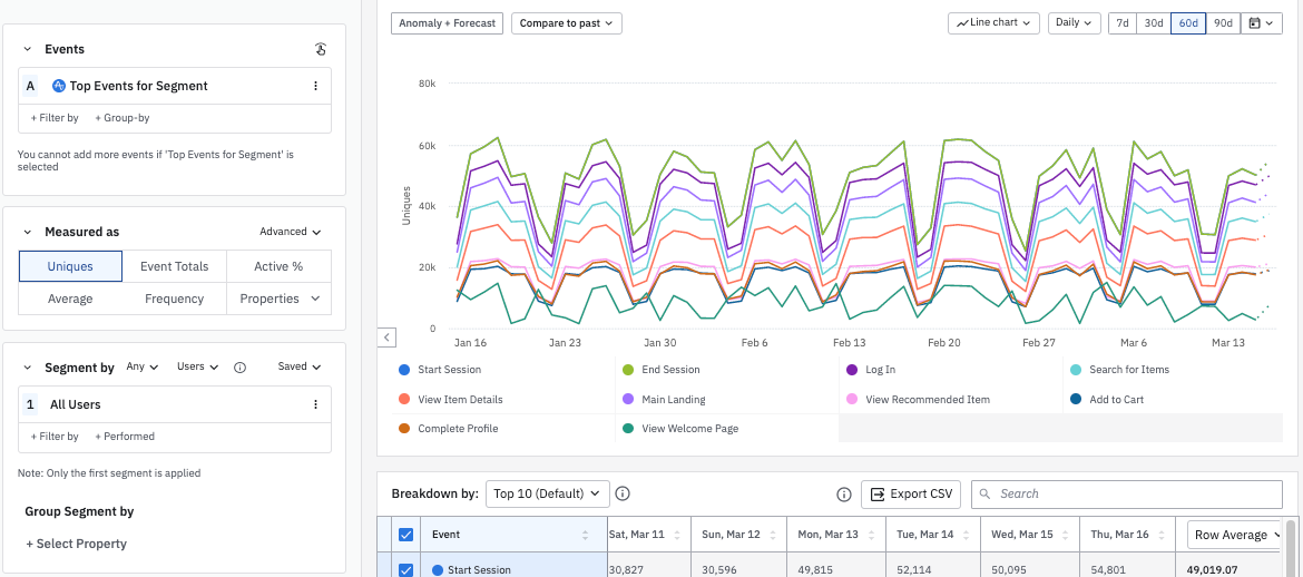
Use this chart to compare or segment your events by user properties or event properties, over a selected time frame. Depending on your Amplitude plan, you can also view your data in real time, with a frequency of hourly, daily, weekly, monthly, or quarterly.
Data Tables
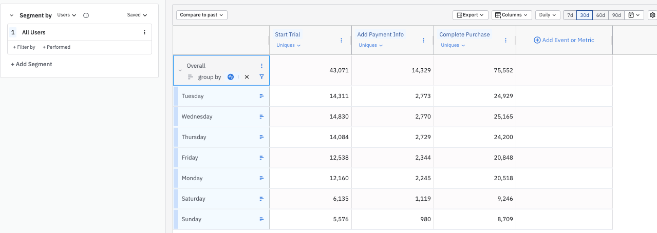
Data Tables enable multi-metric, multi-dimensional analyses in a single view, so you can analyze any combination of user behavior, user attributes, and metrics.
User Composition
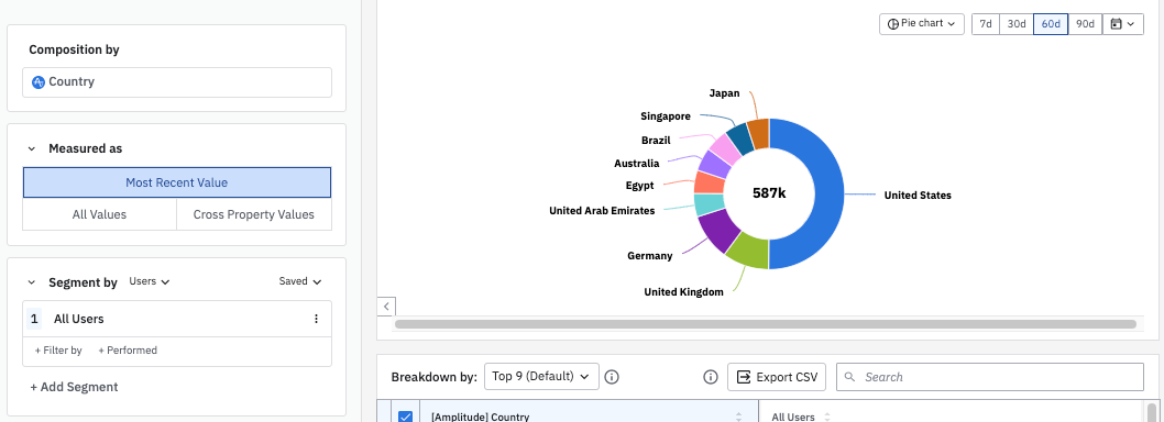
This chart shows the breakdown of active users based on a single user property.
User Sessions
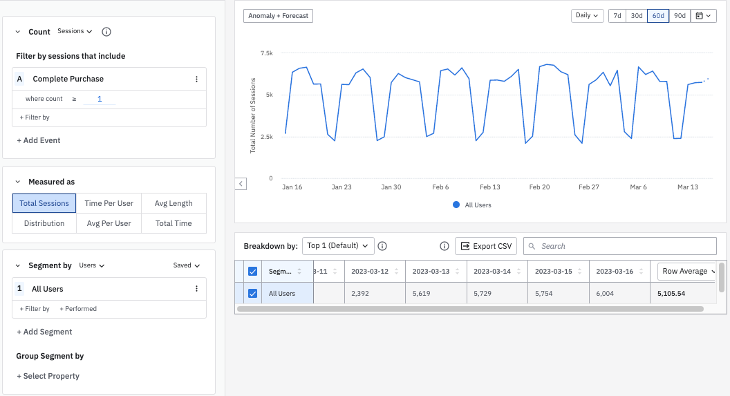
The User Sessions chart helps you analyze your users through various session-based metrics.
Personas
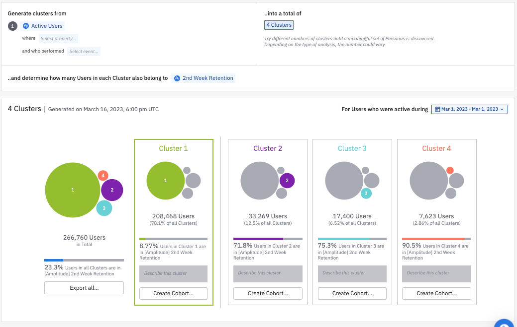
The Personas chart automatically groups similar users into different clusters. Amplitude determines which users belong in each cluster based on how often they trigger various events. Personas charts are frequency-based, not based on pre-specified rules.
Experiment Results
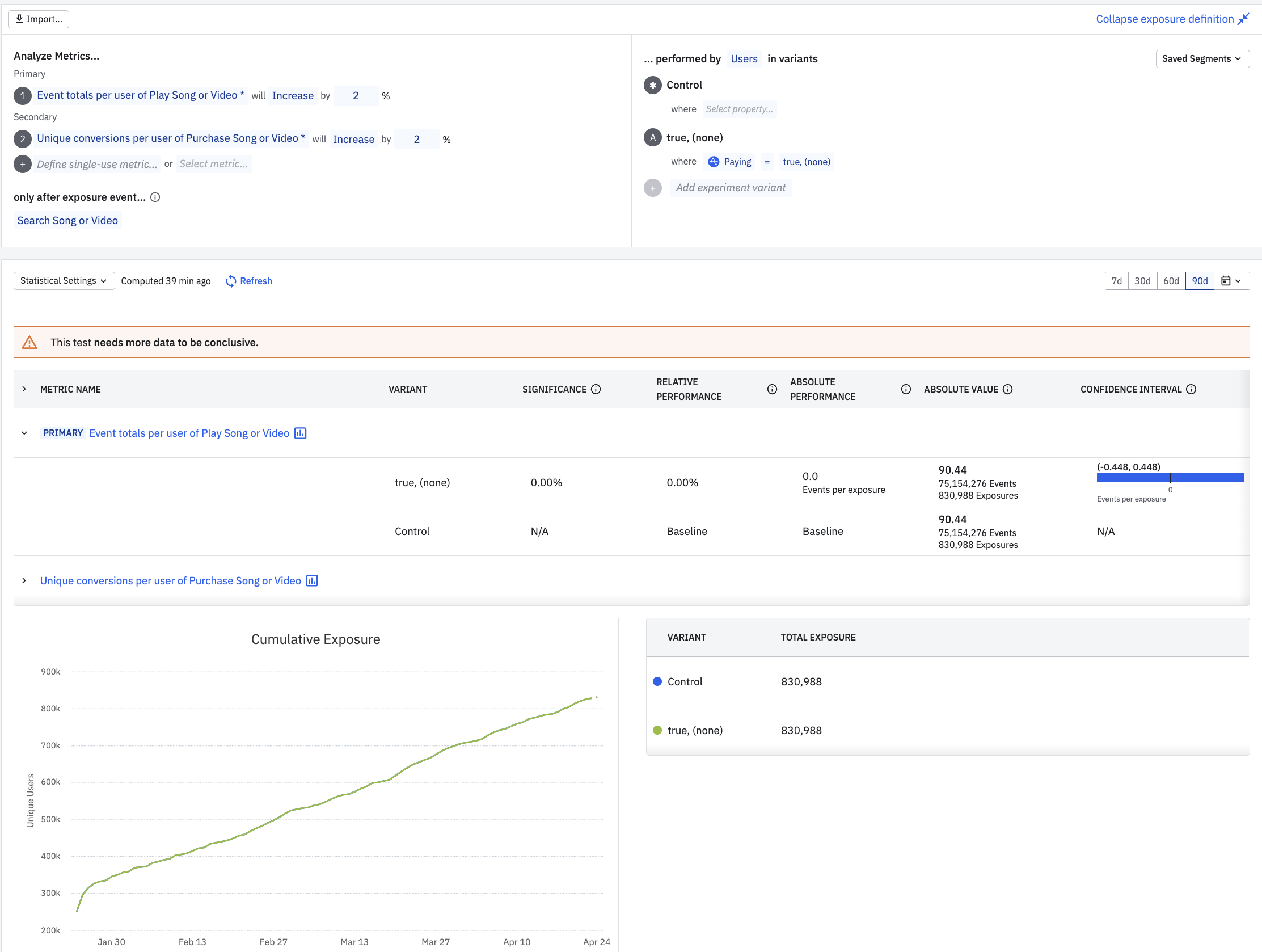
The Experiment Results chart lets you create an A/B test and helps you identify statistically significant outcomes.
Convert your users
Funnel Analysis
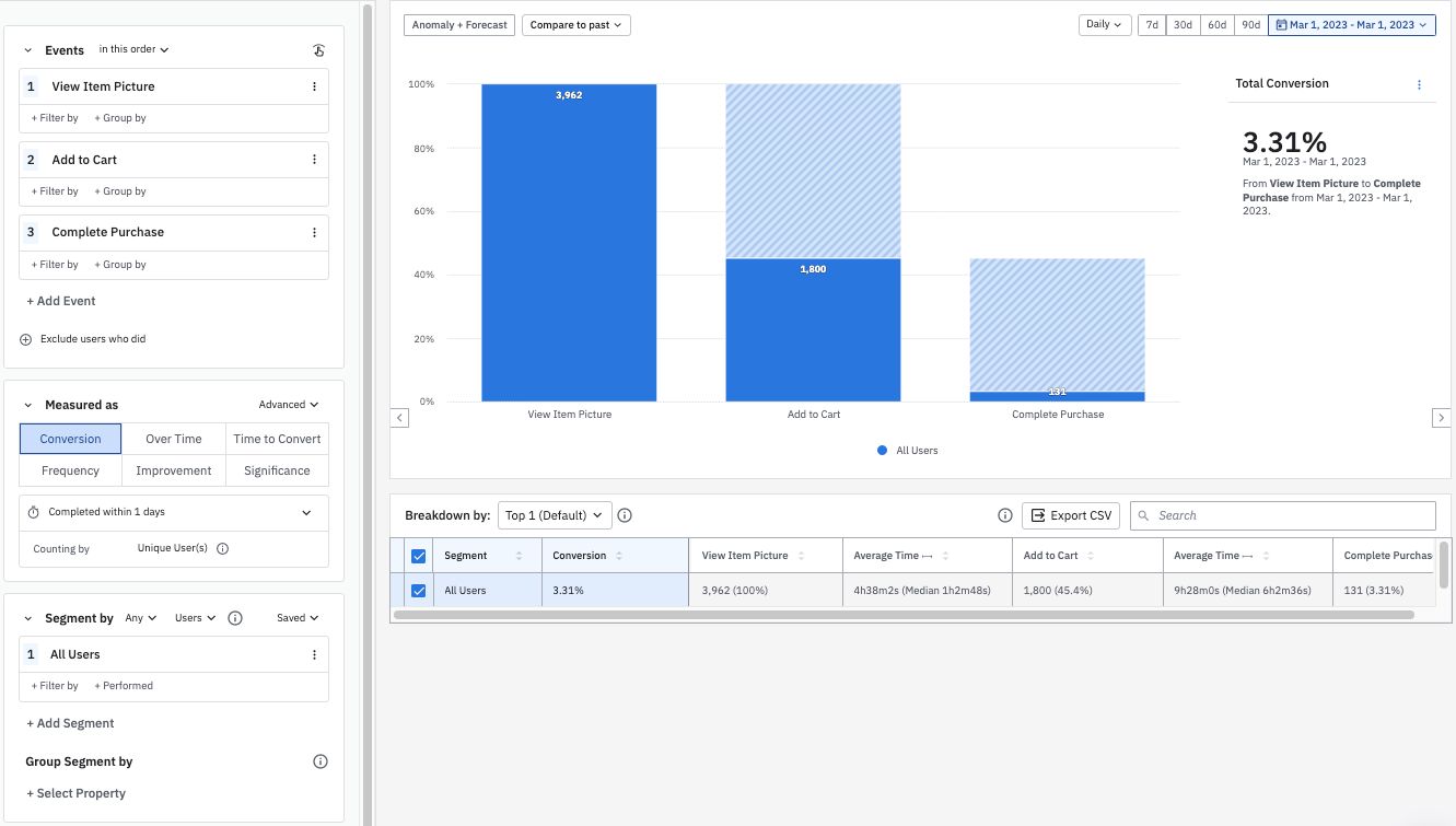
A funnel analysis explores how users navigate a defined path in your product. It also shows where drop-off happens.
Journeys
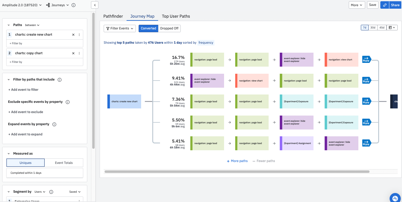
The Journeys chart lets you inspect your users' product journeys in two ways: by the total number of unique users who took a particular path, or by the total number of times they opted for that path.
Engagement Matrix
The Engagement Matrix lets you identify features that aren't performing well, so you can refactor or deprecate them, and the features that perform best, so you can extend that engagement to other areas of your product.
Impact Analysis
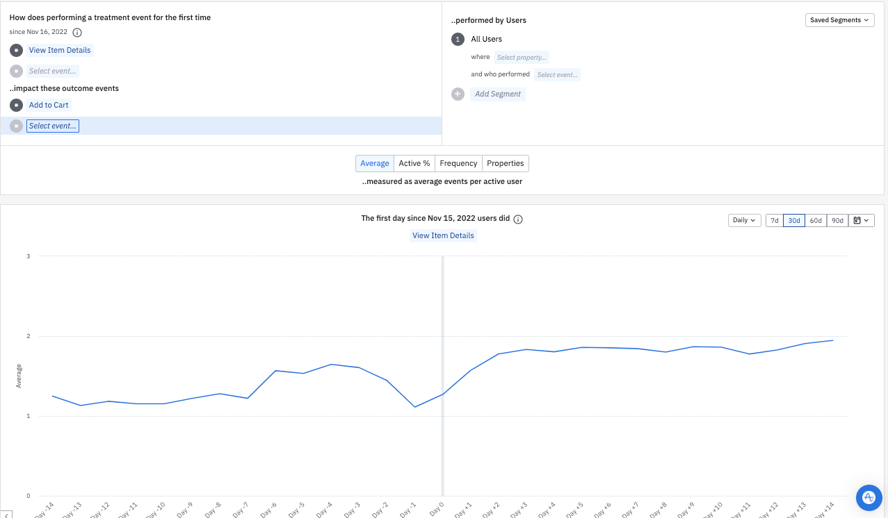
The Impact Analysis chart helps you discover how first-time engagement with one feature affects the rate of another behavior.
Retain your users
Retention
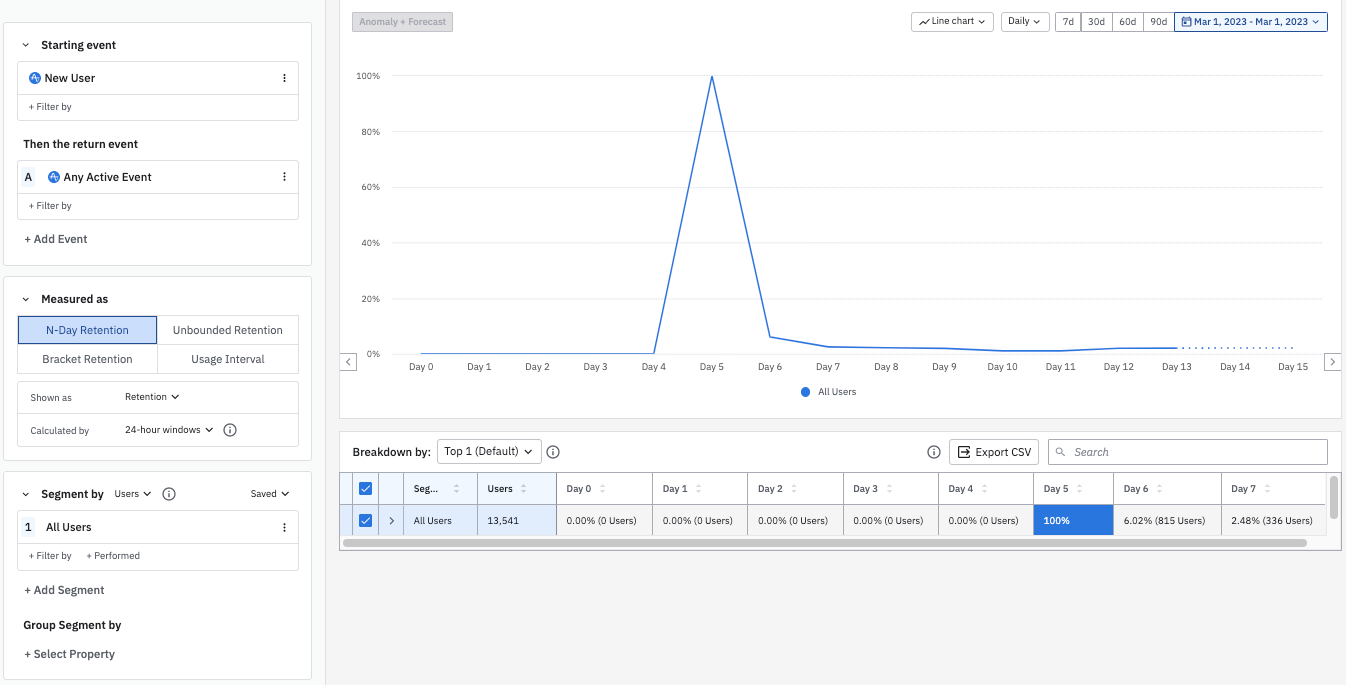
A Retention chart shows you how often users return to your product after firing an initial event. This information is essential to understanding whether users come back to your product.
Stickiness
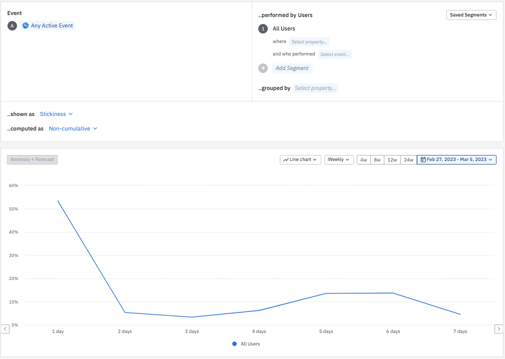
Stickiness measures the number of days a user performs an event in a weekly or monthly interval. It identifies the events that drive users back to your product.
Compass
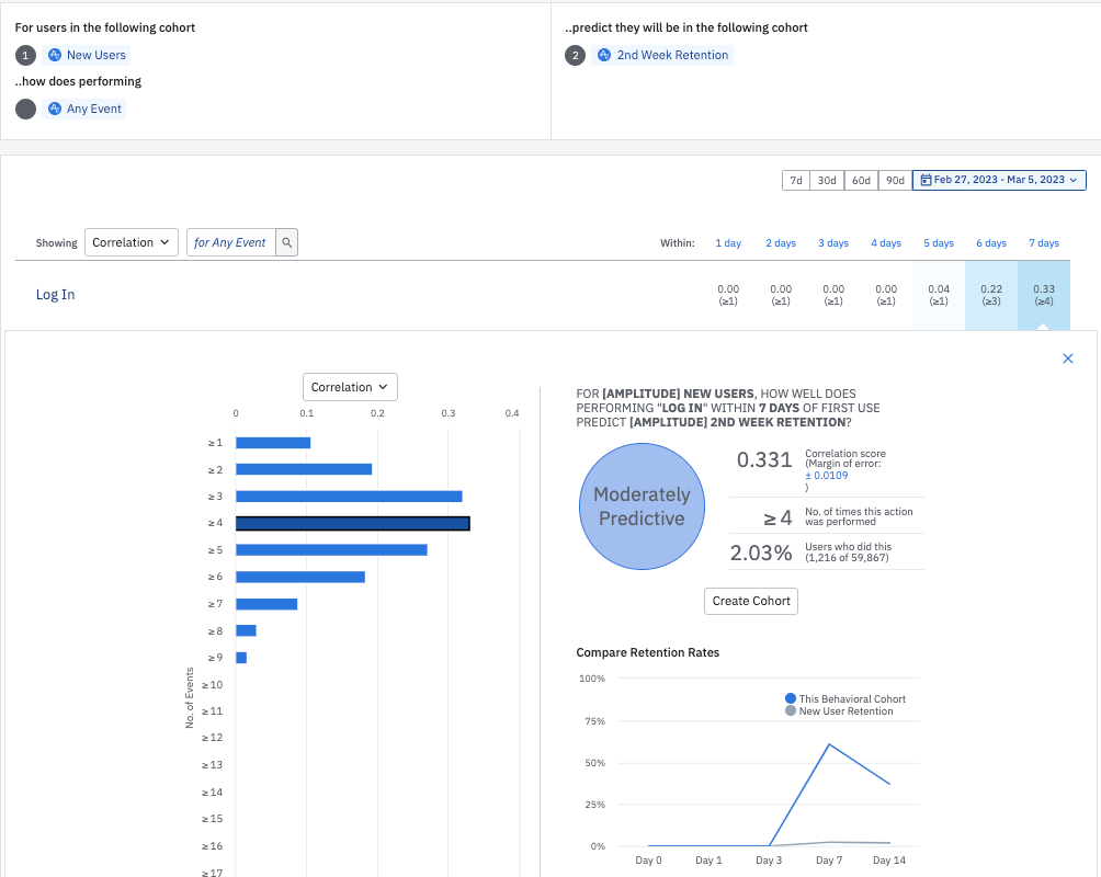
Compass helps you find thresholds of user behavior that may predict long-term retention and lead to growth for your application.
Lifecycle
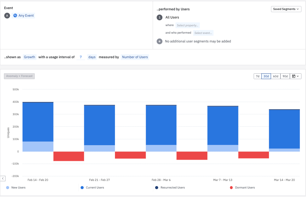
A Lifecycle analysis breaks out your active users into new, current, and resurrected categories, and offers a count of your churned users.
Monetize
Revenue LTV
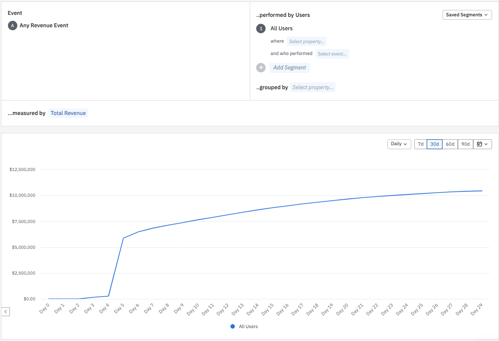
A Revenue LTV chart displays the lifetime value of your users, based on the date they became new users.
Chart access by Amplitude plan
Access to Amplitude charts varies by plan. Contact your Customer Success Manager for more information.
This table compares chart access by Amplitude plan:
| Chart | Free | Plus | Growth | Enterprise |
| Event Segmentation | X | X | X | X |
| Data Tables | X | X | X | X |
| User Composition | X | X | X | X |
| User Sessions | X | X | X | X |
| Personas | X | X | ||
| Experiment Results | X | X | ||
| Funnel Analysis | X | X | X | X |
| Journeys | X | X | X | X |
| Engagement Matrix | X | X | ||
| Impact Analysis | X | X | ||
| Retention | X | X | X | X |
| Stickiness | X | X | X | X |
| Compass | X | X | ||
| Lifecycle | X | X | ||
| Revenue LTV | X | X |
Was this helpful?