

The conventional approach to UX says you should always make it as easy as possible for people to use your app. Don’t make people think. Don’t distract them.
Your app is auditioning for your users’ time. You’re competing with a human attention span that’s been reduced to approximately . You’re trying to introduce new information to people whose short-term memory can only hold seven thoughts—plus or minus two—at . If you want to retain users, you need to get into their head and get in quickly.
The problem with this point of view is that it only helps you get more users—it doesn’t help you retain them.
Taking all the thinking out of your onboarding will probably help you get more users to download your app or register for an account, but by itself, it won’t help you keep those users around to drive growth in the long-term.
You want to help users understand the core value of your app on a deep level because that’s how you retain them. If people try your app and really “get it,” then they’ll come back again for more , and they’ll tell their friends. To do that, speed isn’t enough. Sometimes, a little creatively deployed friction is what you need to build retention.
The IKEA Effect and Customer Retention
In 2011, researchers Dan Ariely, Michael Norton and Daniel Mochon set out to study how people valued objects. In the process, they uncovered the real reason why we love holding onto our old IKEA furniture so much and why we drag it from apartment to apartment—why IKEA, simply, is so good at customer retention.
One group of participants in their study made origami cranes and Lego sculptures and assembled pieces of IKEA furniture, then was asked how much they would pay to take the items home with them. A control group, which did no building or assembling, was presented with the same items and asked the same question.
What the researchers found was that the people who put together a bookshelf or folded a crane were willing to pay significantly higher prices for those objects than other people. This tendency to place a higher value on those things we participate (in some way) in creating has become known as the “IKEA effect.”
Asking users to put some effort in early on can be an incredibly powerful way to show them value upfront. To build retention, nothing is more important than proving to your users that your app matters from their very first open.
Apple Music and Playlist Loss Aversion
Look at how Apple Music forces users to invest effort into their own onboarding en route to a convincing value proposition. Just a few screens in, you’re asked to navigate a series of bubbly representations of musical genres and artists, tapping on those “you’re into”:
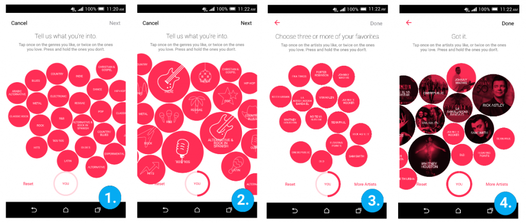
It’s vaguely game-like, but you’re still asking users to invest some time into making good decisions here. Some would balk at asking users for such an investment so early on, but Apple isn’t doing it for fun.
They’re doing it because the power of the Aha! moment that follows—your first glimpse at Apple’s playlist generating algorithm—relies on the effort you put in at this stage. Based on the artists and genres you select, Apple immediately generates a series of sample playlists and puts them right upfront in the catalog.
These playlists don’t even have to be perfectly tailored to you to succeed on a psychological level. You put in the effort to make these playlists. You’re inherently invested, and the principle of loss aversion means you now don’t want to give up what you have.
This is how valuable even a briefly creative onboarding process can be to encouraging retention from the beginning.
Because of the IKEA effect, you start ascribing value to Apple Music as soon as the playlists you worked together to create appear. That value becomes a sunk cost if you switch to a competing service, which means you’re more likely to stick around with Apple Music and less likely to go check out Spotify, Google Play Music, Pandora—or Tidal.
Without Any Friction, Users Just Slide Right Off
Tidal is unique among music streaming services in that they’re actually . Instead, they’re going upmarket and offering completely lossless audio, something no other streaming service does.
Tidal’s onboarding is quick. Before long you can go to the catalog, browse for your favorite artist or album, find a song you want to hear—but _then Tidal _hits you with a subscription prompt:
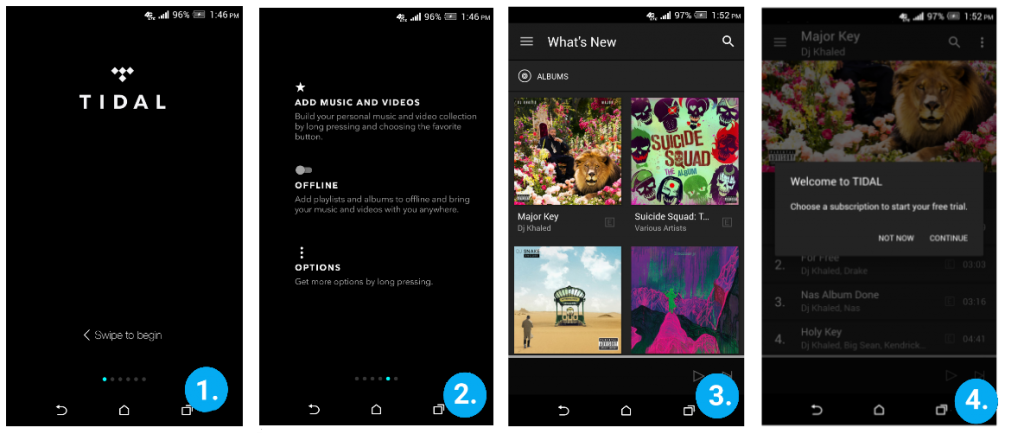
The problem here is that I don’t yet have a convincing reason to commit to Tidal over another streaming service. When the core value proposition of your app is that it offers music in high fidelity, you have to let people experience that first-hand. Without hearing DJ Khaled in 320kbps for myself, it’s very hard to believe that Tidal is going to be worth paying 2x the amount that other streaming services charge.
Apple doesn’t let users see their music catalog very quickly—Tidal does it much faster—but when you get there you immediately understand what Apple Music is all about. You see playlists customized to your taste. Your natural tendency to appreciate what you participated in creating kicks in and you’re organically incentivized to stick around.
When designing for retention, speed matters—you don’t want to waste people’s time doing useless tasks—but it matters even more that people understand why your app is going to be valuable for them.
Tidal gets you into the main app quickly, but without any real evidence of the value they’re going to bring you. Then, at the precise moment you could be luxuriating in their high fidelity value proposition and having your Tidal Aha! moment, your flow is broken. At that point, there’s no reason for you to stick around. You’re not missing out on anything. So your attention drifts elsewhere, and you churn.
Slowing Down To Retain
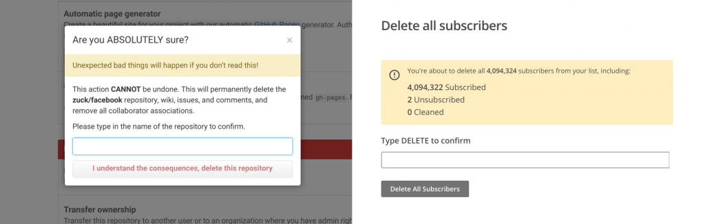
We accept and even demand a certain amount of situational friction from our apps. We don’t mind that we’re interrupted while deleting a repository on Github, for example, or while removing subscribers from a MailChimp list. By forcing us to slow down and think at this exact moment, we’re kept from making potentially disastrous decisions by accident.
Selective friction isn’t just for failsafe measures, though. You can take the same kind of thinking, flip it, and apply it to your onboarding to produce delight, Aha! moments, and ultimately, retention. When the customer messaging company Drift decided they would let users customize their dashboard, set an avatar, create a welcome message and choose an icon set—all during onboarding—their flow doubled in length from 6 to 12 steps. It asked users to do more and to think more. It took longer than their old flow. And it .

Good design isn’t always about preventing users from thinking. By all means, make the procedural stuff fly by. No one wants to think about check-out or sign-up or other generic app experiences. But when it comes to your app’s core value proposition, don’t be afraid to slow down and let it sink in. Do it right, and those little moments of friction will become places where users can get caught on the stickiness of your app.
Comments
: Thank’s for the good insights, I’m adding those to my notes of the investment phase of HOOK model.
: The experiments were done with participants and origami – not IKEA furniture 🙂 It’s just called the Ikea effect.