Interpret your stickiness analysis
Amplitude Academy
Find your Power Users with Stickiness Analysis
Learn how to analyze which users return on a regular cadence by using the Stickiness Chart.
Get startedStickiness helps you dig into the details of your product's user engagement, specifically users that have formed product usage habits.
This article explains the Metrics Module of the Stickiness chart and helps you interpret your stickiness analysis.
Before you begin
If you haven't already, read building a Stickiness chart in Amplitude.Interpret your Stickiness chart
In Amplitude, you can measure stickiness in one of two ways: cumulatively or non-cumulatively. You can change this setting at the top of the Metrics Module at any time during your analysis.
Non-cumulative stickiness
The non-cumulative Stickiness chart shows the percentage of users who triggered the event at least one time on the exact number of days listed on the X axis. For example, users in the 2 days bucket triggered the event on exactly two days over the course of a week (or month) in the time frame of your analysis. Users in the 3 days bucket triggered the event on exactly three days in a week.
A user can appear in more than one bucket of a non-cumulative stickiness analysis for each week (or month) in the time frame. For example, they might trigger the event on one day in week one, then three times in week two. This user appears in both the one-day and three-day buckets.
Cumulative stickiness
The cumulative Stickiness chart shows the percentage of users who triggered the event one or more times on at least the number of days listed on the X axis. For example, users in the 2 days bucket triggered the event on two or more days over the course of a week (or month) in the time frame of your analysis. Users in the 3 days bucket triggered the event on three or more days in a week.
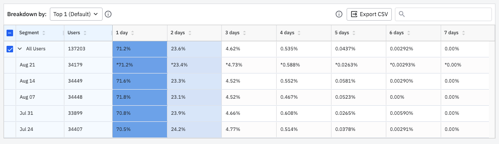
You can also click a specific data point to inspect the users included in that point. Refer to the Microscope article for more information.Breakdown data table
The table shows a detailed breakdown of the data by each user cohort and more granular daily buckets. Days with incomplete data have an asterisk.
Track changes in stickiness over time
You can discover how the stickiness of your most engaged users fluctuates over time by selecting Change Over Time from the ..shown as dropdown menu.
Create a cohort from your Stickiness chart
Users on Scholarship, Growth, and Enterprise plans can create a cohort.Was this helpful?