Interpret your retention analysis
Amplitude Academy
Drive Product Adoption with Retention Analysis
Learn how the Retention chart can help drive product adoption.
Get startedAmplitude's Retention Analysis chart helps you drive product adoption by showing you how often users return to your product after triggering an initial event. This article describes how the Retention Analysis chart works and how to interpret the data it contains.
Analyze your retention analysis data in the chart area. There, you can:
- Specify the method Amplitude uses to measure retention (Return On or After, Return On, or Return On (Custom)).
- View data for either Retention or Change Over Time.
- Define how Amplitude measures days when it calculates retention (24-hour windows or strict calendar dates).
- Specify the timezone and set the time frame for your analysis using the date picker.
Before you begin
If you haven't already read the overview of Amplitude's Retention Analysis chart, start there before continuing.If you find the references to time in this article confusing, this Help Center article explains how time works in a retention analysis.Interpret your Retention Analysis chart: Retention view
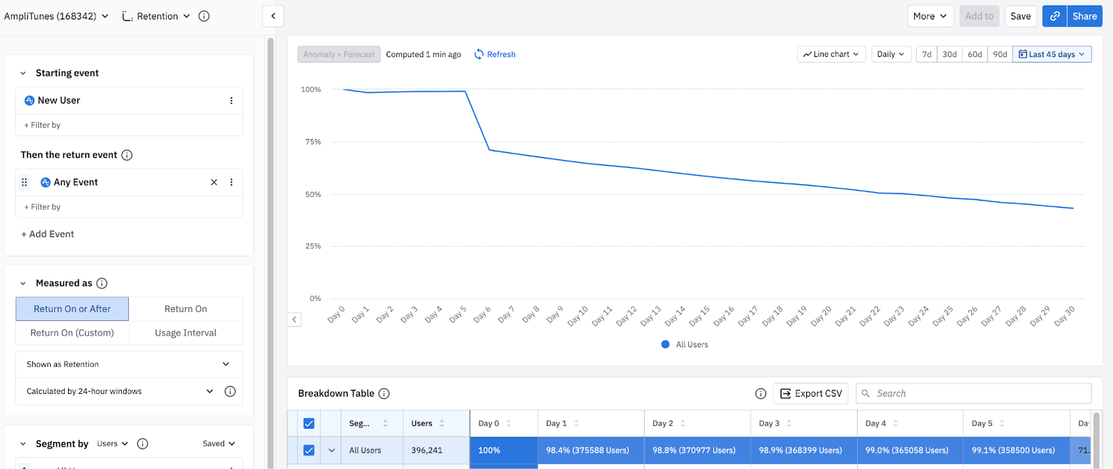
Interpreting your Retention Analysis chart is simpler than it may at first appear, because you can read through the parameters like a sentence. For example, the following chart shows you (1) new users who came back and triggered (2) any event (3) on or after the first day of your retention analysis over (4) the last 45 days:
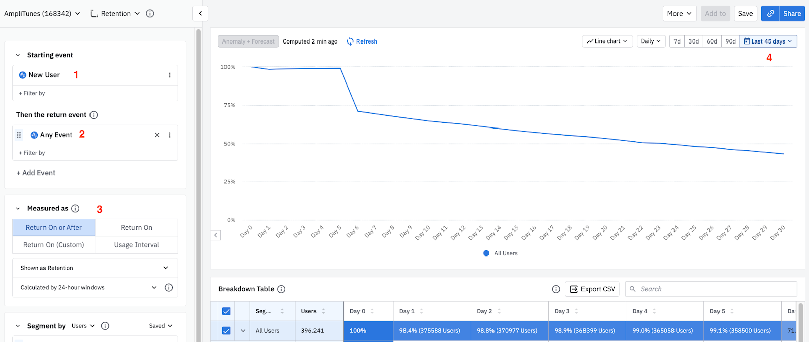
Change all these parameters to reflect the needs of your analysis.
The rest of this section explains how to measure retention, what the parameter options mean, and how to use them to generate the data you want.
Different ways to measure retention
The Retention Analysis chart offers several options for measuring retention, based on when your users triggered their return event:- To discover how many of your users triggered your return event on a specific day or after triggering your starting event, use Return On or After retention.
- To learn what percentage of users came back to fire your return event only on a specific day after they performed your starting event, use Return On retention.
- To create custom brackets for your Return On retention instead of using predefined units of time (like weeks or days) as retention brackets, use Return On (Custom) retention.
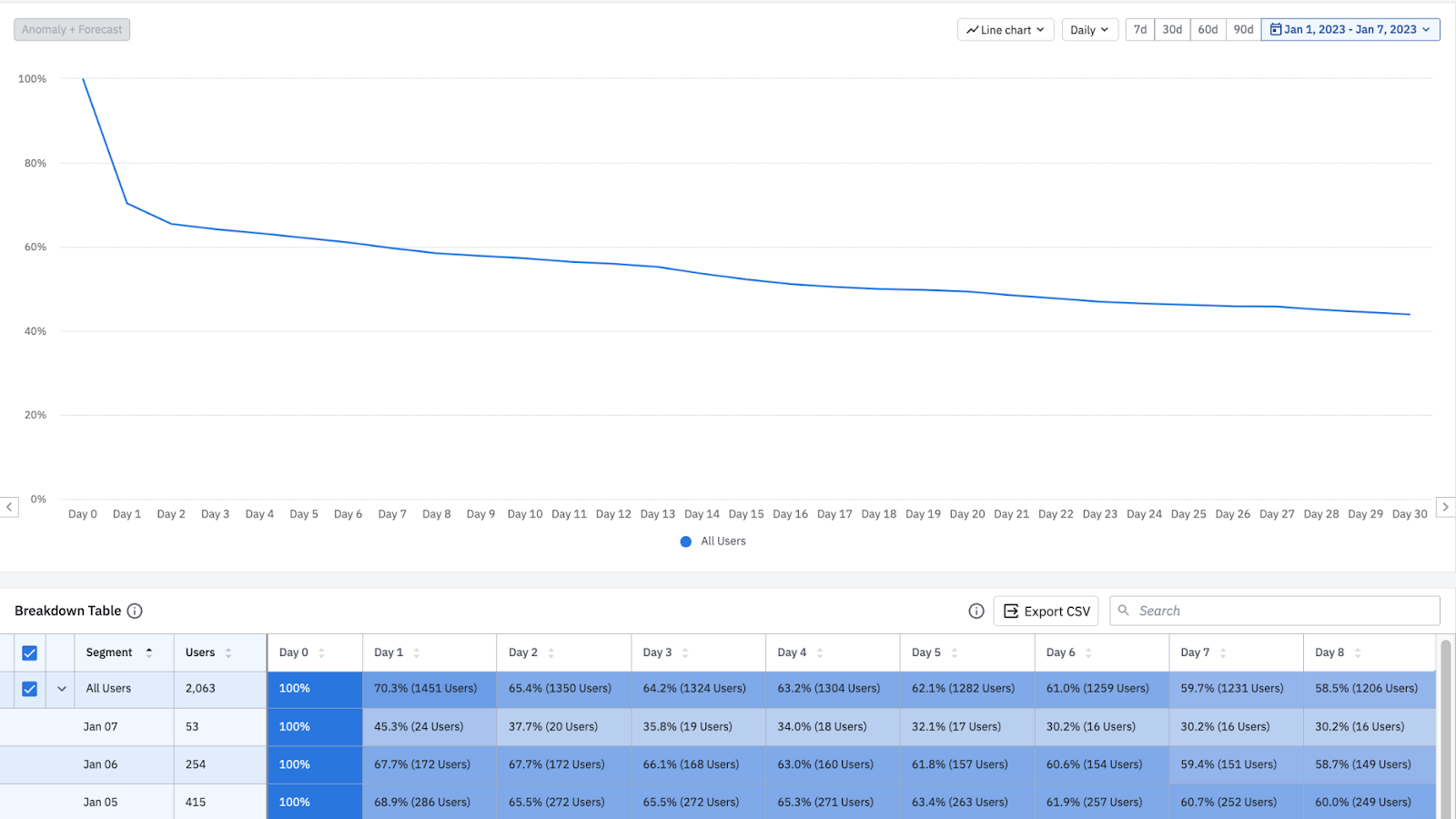
Return On or After (formerly known as Unbounded)
Return On or After retention tells you how many of your users triggered your return event on a specific day or after they triggered your starting event. When using Return On or After, the retention value for Day 7 tells you the percentage of users who returned seven days or more after their first use.
To see this data as a bar chart, click the Line chart dropdown. You can still use Microscope to get more details on users who weren't retained.
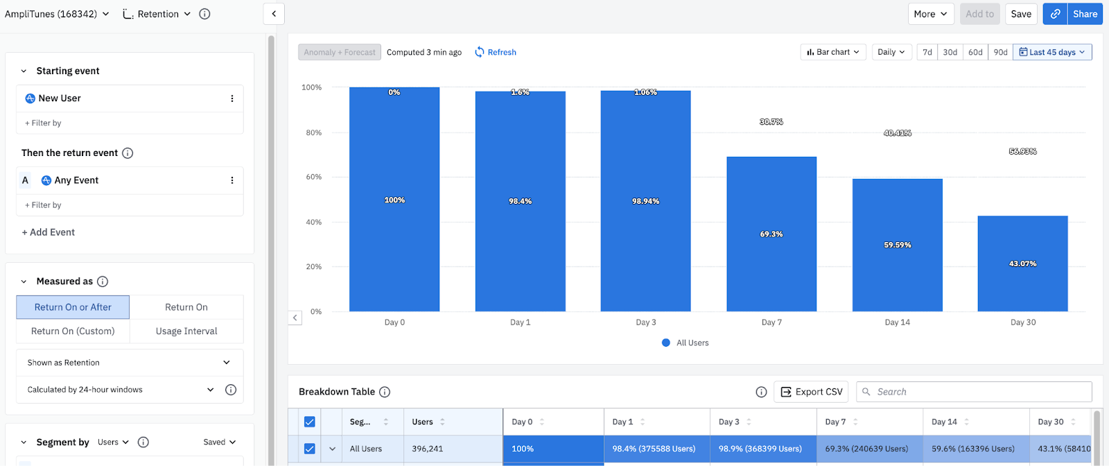
In bar chart format, the X axis includes the most common units of time (days, weeks, months) by default.
Amplitude also displays a detailed table breaking down the data, broken out by each user cohort and into individual day buckets.
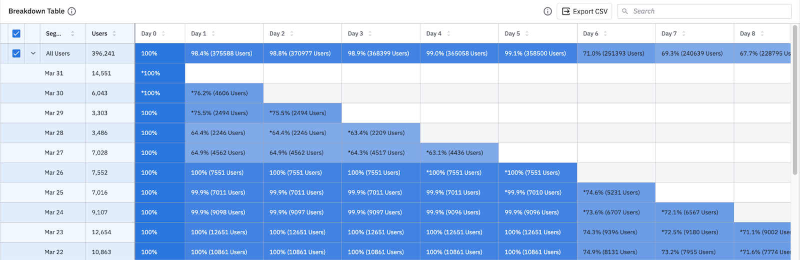
The method Amplitude uses to calculate Return On or After retention depends on whether you're looking at retention for all users or for a specific cohort entry date for your segment. Both the chart and the first row of the breakdown table below it show overall retention by default.
Return On (formerly known as N-Day)
Return On retention tells you the percentage of users that came back to trigger your return event on a specific day after triggering your starting event. The retention value for day 7, for example, tells you the percentage of users who returned on day 7 after their first use.
Regardless of whether you're looking at retention for all users or for specific cohort entry dates, Amplitude uses only one method to calculate Return On retention (unlike Return On or After). Both the chart and the first row of the breakdown table below it show overall retention by default.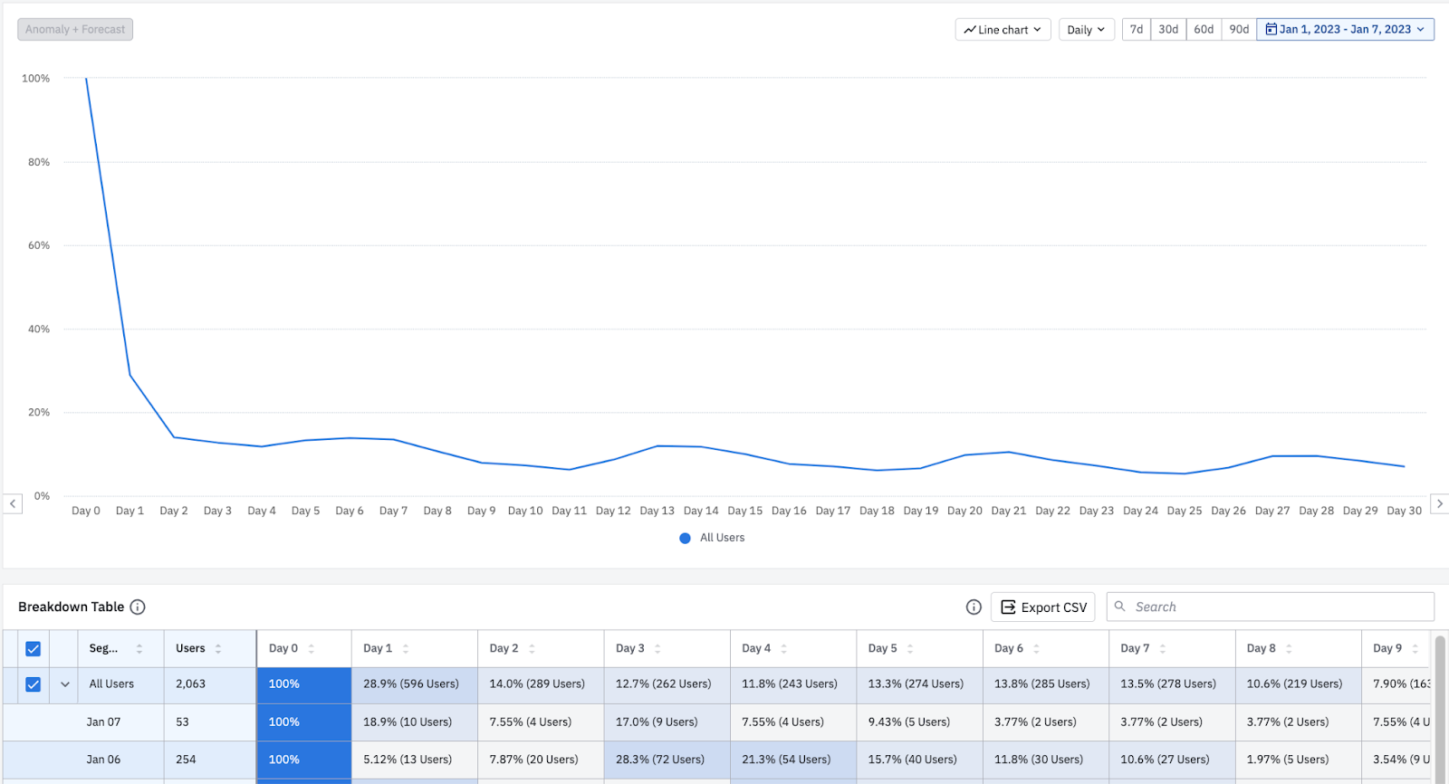
Return On (Custom) (formerly known as Custom)
By default, Amplitude assumes you want to use predefined units of time, such as days, weeks, or months, as retention brackets for your retention analyses. Change this by using Return On (Custom) and instead create custom brackets for your Return On retention.
Because the custom brackets feature uses the same logic as Return On retention, you can use it to generate the equivalent of a Return On retention chart while defining the relevant units of time yourself.
In the image above, there are four custom brackets defined:
- First bracket: one day (Day Zero).
- Second bracket: three days (Day 1-3).
- Third bracket: three days (Day 4-6).
- Fourth bracket: five days (Day 7-11).
The line graph shows the weighted averages of all the bracket retention numbers from the user cohorts within the selected timeframe.
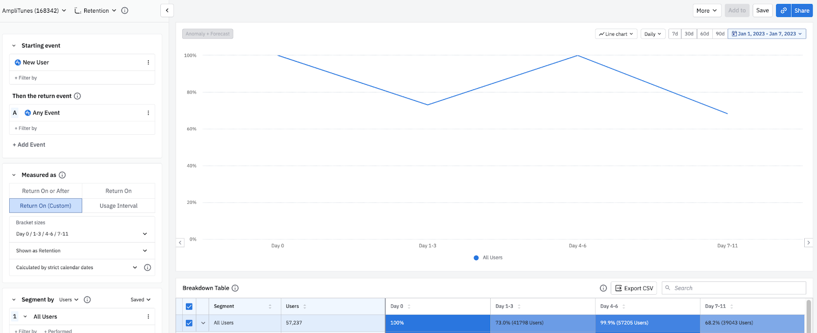
In the table below, on Jan 4th there were 3,172 new users.
The Day 1-3 retention is 75.1%, meaning that 2,382 of the 3,172 users triggered the return event anywhere between one and three days after their starting event.
The Day 4-6 retention is 99.7%, meaning that 3,164 of the 3,172 users triggered the return event four to six days after their starting event.
Each chart can have a maximum of 100 custom brackets. Results for days with incomplete data show an asterisk.
Retention vs change over time
Sometimes you may need more than a straightforward view of your retention rates on specific days. You may want to know how a new release has affected your product's Day 1 retention rates, or if a new training program has had an impact on your Day 14 retention rates. In these cases, view your retention data over time by selecting Change Over Time from the Shown as dropdown.
In this chart, the data shows all users who were new on January 1st. 100% of them triggered the return event on Day 1, and 72.1% triggered it on Day 7.
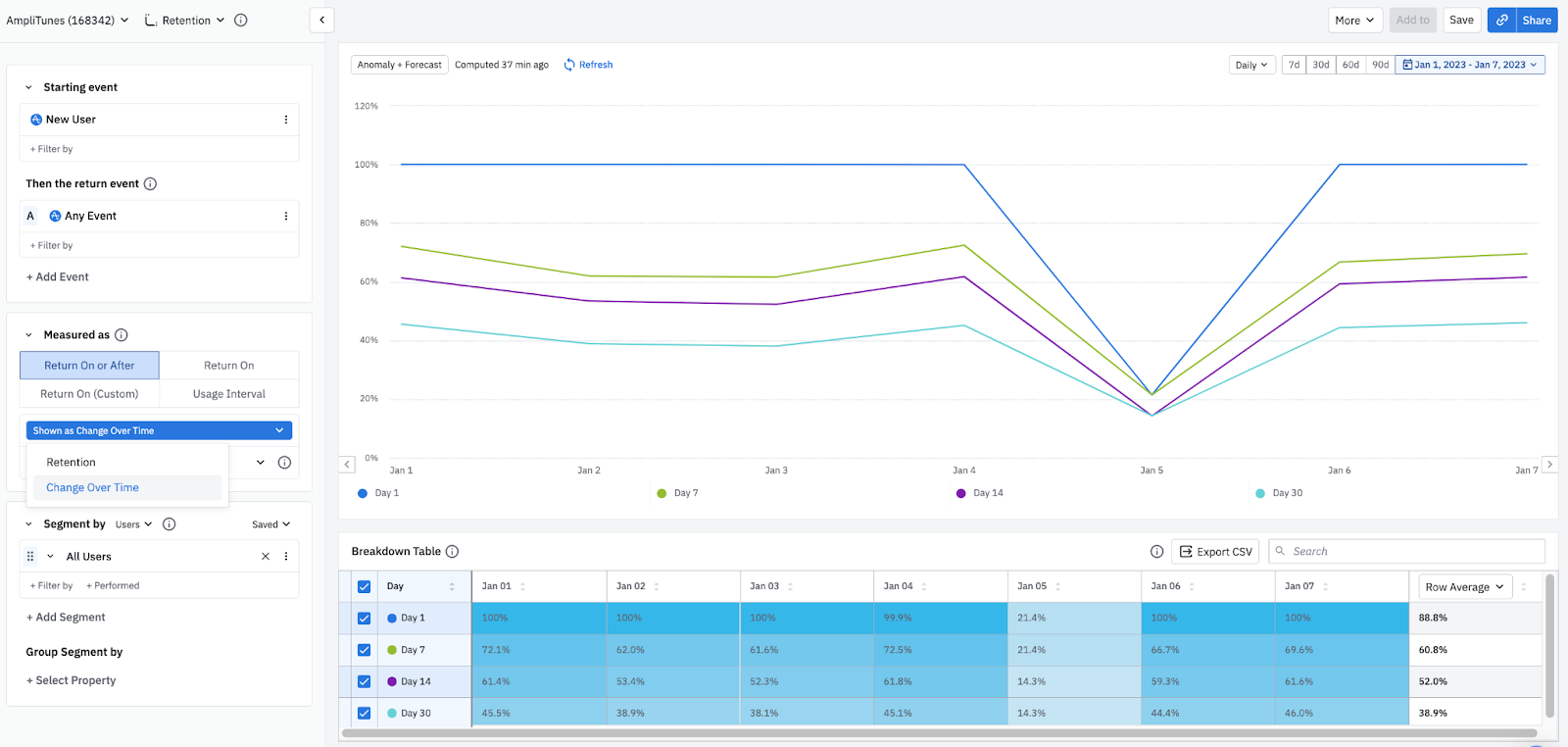
Amplitude calculates this percentage by dividing 1) the number of users from each new user cohort who triggered the return event on each retention day, by 2) the number of users who were new on the selected day.
The Return On Change Over Time data table shows the same data as the Return On Retention data table, but with the X-axis and Y-axis switched.
Further reading
The retention view is only one way of working with a Retention Analysis chart. You can also use the usage interval view to view the percentage of active users who triggered your selected events with a specified daily, weekly, or monthly median frequency.Understanding how time works in a retention analysis is crucial to correctly interpreting your results.You may also need more details on how the Retention Analysis chart calculates retention.Was this helpful?