The cumulative exposures graph: Inflection points and flattened slopes
Inflection point
Sometimes, lines have an inflection point caused by a sudden increase or decrease in the count of exposures per day.
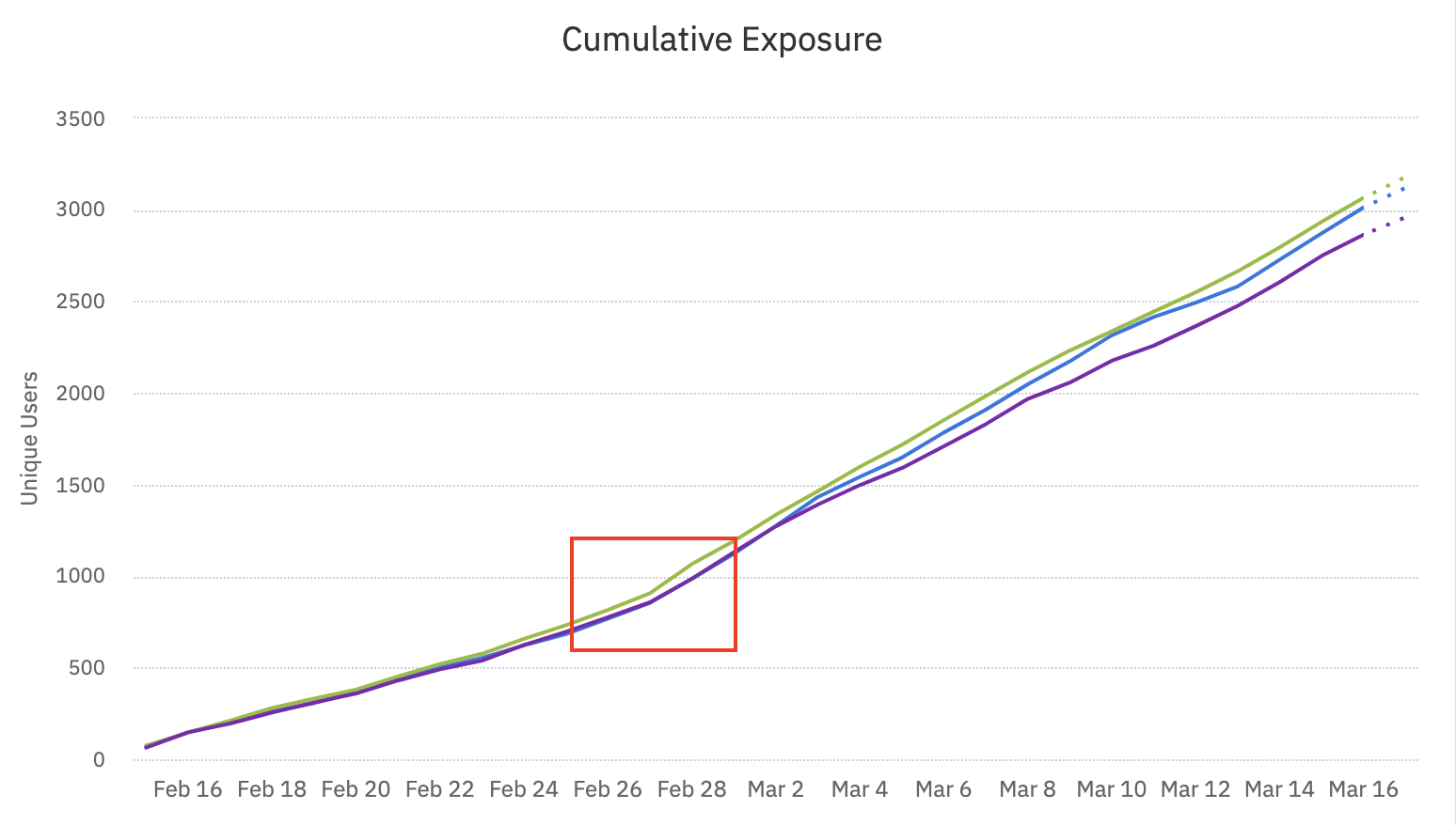
On February 27, the slope of all three lines changed from around 70 users per day per variant to about 100 users per day per variant. The slope can also flatten after an inflection point.
Several reasons explain why this can happen:
- Traffic to your experiment increased.
- Traffic allocations increased for each variant. If you increased traffic to a single variant, then only one line shows this inflection point.
- The targeting criteria changed. For example, you originally targeted users from California, then decided to target users from California and Florida.
- An external event occurred, such as an increase in the advertising budget or the release of a new feature, which drove more users to your experiment.
Settings changes during a live experiment
Don't change settings for traffic or traffic allocations to variants in the middle of an experiment. Doing so can introduce Simpson's paradox into your results. If you changed the traffic allocation, restart the experiment by choosing a new start date. Avoid including any users who were already targeted.Don't change the targeting criteria during an experiment. The sample then doesn't represent what happens if you roll out a variant to 100% of your users. Instead, gradually increase traffic to the entire experiment, or do a gradual feature rollout instead of an experiment.
For example, in the first week of your experiment, you target only Android users, and 100 of them see your experiment. The following week, you change the targeting criteria to include iOS users, and 20 of them see your experiment.
After two weeks, 220 users have seen your experiment, and 9% of them (20/220 = 1/11 = 9%) are iOS users. When you release your experiment to 100% traffic, you discover the true percentage of iOS users is 16.7%. In this case, you underestimate the effect of iOS users. If the experiment shows a positive lift for Android users but a negative lift for iOS users, you may roll out a feature based on what you think is a positive experiment, but the result is negative.
Consider changing the experiment's end date
After you answer why the slope changed, consider whether to adjust the end date of the experiment. With more traffic, you reach statistical significance faster. With less traffic, statistical significance comes more slowly.
Flattened slope
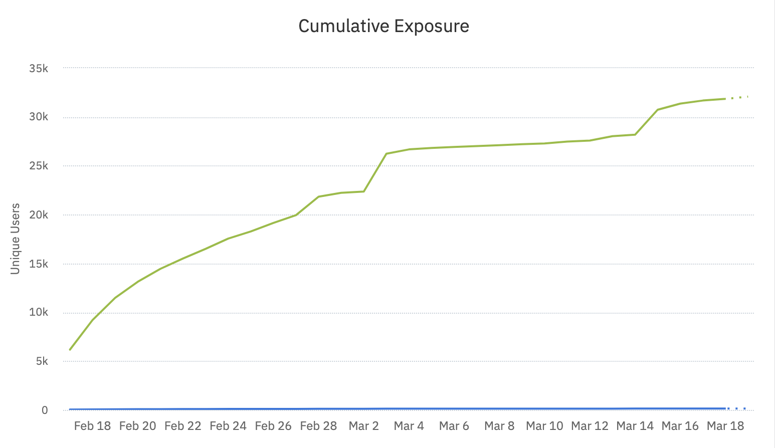
From March 4 to March 11, the graph is fairly flat. Few new users joined the experiment during that period. Potential explanations include:
- You ran out of users to add to the experiment.
- A bug exists in the sending of exposure events.
- Seasonality strongly affects your product's usage.
The following hourly chart shows a strong example of seasonality.
Between March 21 at 7 PM and March 22 at 9 AM (the rightmost section of the graph), few users saw this experiment. Just before that, starting around 5 AM, many users saw the experiment. On the left side of the graph, users trickle in slowly. An online gambling company runs this experiment, so traffic spikes when they run their jackpots.
Was this helpful?