Winsorization in Experiment
Outliers are data points that occur on the far fringes of a dataset. These data points typically rest far from measurements of central tendency like the mean, and can skew an analysis.
Outliers in your dataset are sometimes the result of instrumentation issues. For example, if your users primarily interact with your app through their mobile devices, but your web instrumentation sends event properties at a different rate (in this example, milliseconds) from iOS and Android instrumentations (seconds), the data from web-based users may look like outliers.
That said, outliers can appear for many reasons, some of which you can’t do much about.
Find outliers in your data
While you can often spot them by examining the tails of a histogram, there is no single correct way to designate what counts as an outlier, and what doesn’t.
One common method is to use standard deviations from the mean. This works well if your data aligns with normal distribution. If it does, you can expect 68 percent of your data points to be within one standard deviation, 95 percent to be within two, and 99.7 percent of your data points to be within three standard deviations from the mean. Depending on the specifics of your situation, you might decide that anything more than three standard deviations out is an outlier, for example.
Note
Boxplots are another way to identify outliers. Boxplots involve calculating the "inner fences" for outliers using the 25th percentile (Q1) and the 75th percentile (Q3):
- Upper Bound:
75th percentile + 1.5 * (75th percentile - 25th percentile) - Lower Bound:
25th percentile - 1.5 * (75th percentile - 25th percentile)
See this article for a more advanced version that takes skewed distributions into account.
Finally, you could choose a specific percentile and designate everything beyond it as an outlier. You shouldn’t do this at random; instead, look at the plot of your dataset first, and work from there.
The correct definition for an outlier varies from case to case, and they often depend on the specifics of your business use case. Use your own domain knowledge to help you decide what does and doesn’t count as an outlier.
Amplitude’s analysis of outliers depends on the type of metric you’re using. For example, binary metrics, like uniques and retention, don’t have outliers, so the methods below aren't relevant to them.
Outlier examples
Here’s an example of how outliers can distort your analysis. In a dataset consisting of {1, 2, 5, 1000}, 1000 is the obvious outlier. Without this data point, the mean of this set is 2.67; with it, the mean changes to 252. While this is technically correct, it gives a misleading depiction of the dataset’s actual character.
In this example, including an outlier in the dataset is enough to undo the statistical significance you’d get if there were no outlier present:
set.seed(29)
control = rnorm(100)
treatment = rnorm(100, 3)

t.test(control, treatment)

treatment_with_outlier = c(rnorm(100, 3), -1000)
t.test(control, treatment_with_outlier)
Without the outlier, the p-value is basically 0; with the outlier, the p-value is .495.
| Mean | Standard deviation | |
|---|---|---|
| With outlier | -6.92 | 99.81 |
| Without outlier | 3.01 | 1.14 |
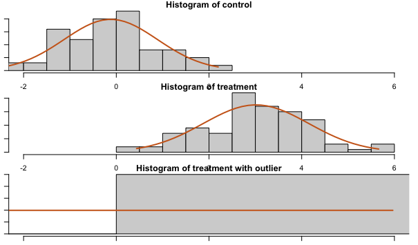
Remember that this is the distribution of the population, and not the distribution of the sample mean.
Note
Resolve outliers in your data
Some options to address long-tailed distributions are winsorization, removing outliers, bootstrapping, and non-parametric tests. Winsorization and removing outliers reduce the skew, allowing a smaller sample size where the sample mean approximates a normal distribution (in other words the Central Limit Theorem).
Often, the best approach to handling outliers depends on the type of metric you’re using. This section discusses some options for several common metric types.
Totals
When using a totals metric, you have several options for resolving outliers.
Visualization and deeper analysis
Visualizing your data is often a good starting point. For example, create a segmentation chart of your dataset and click Frequency to find out if certain users trigger a particular event significantly more than most other users. Next, change the frequency chart into a bar chart to view it as a histogram (adjust the bin size as needed).
Session replays can also help you understand why certain users act as outliers in your dataset. First, define the number of times a user must trigger an event to qualify as an outlier. Then look for sessions where a user triggered the event you’re interested in enough to meet that threshold. Pay attention to the ways their general behavior differs from other users, as this can help to get a sense of why these users are outliers.
A situation where this can be helpful is debugging a spike in event volume for a particular event; it’s possible a small number of users are responsible for it, which might suggest a different interpretation than if the activity is more evenly distributed throughout your user base.
FREQPERCENTILE
Continue analyzing your frequency chart by using this formula in a segmentation chart to get percentiles.
Computations
Use a computation to aggregate the count of events. Examine the distribution and individual user values in the charts, search to find specific values, and sort the sample to get an idea of the range of valid values.
Winsorizing
Winsorizing is the transformation of data by limiting extreme values in it to reduce the effect of outliers. A complete explanation of the process is beyond the scope of this article; instead, this section will explain how to apply it to outliers in Amplitude.
For example, if you want to know how many charts the average user creates, but you already know some power users create a lot more than most users, winsorize at a value that seems reasonable (learn more about how to select a winsorization value here). For this example, that value is 100. Open a segmentation chart, select Formula from the Measured As block, and enter this formula:
(TOTALS(A1) + 100*UNIQUES(A2)) / (UNIQUES(A1) + UNIQUES(A2))
In this formula, only event A for segment 2 is winsorized (100 * UNIQUES(A2)). Amplitude counts the number of users who are subject to winsorization, and then multiplies by the winsorization value selected in the first step (100 in this case).
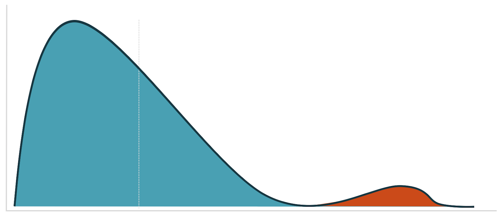
There are several options for picking your winsorization value. A good starting point is to refer to your visualization and look for a good cutoff point for separating the data into two distinct modes:
Filtering out users
Use the Experiment Results chart to filter out users who triggered the event more than a specified number of times by adding a who performed filter to each chart segment. You can get a pre-filled Experiment Results chart by clicking Open in chart on the Analysis card in Amplitude Experiment.
Sum of property
Winsorization
In cases where it’s difficult to know the best value for winsorization, you can use derived properties to help you:
- Run both min and max winsorization, either together or separately, by making a derived property of
min(max(1, X), 100)where X is the property you’re interested in, and 1 and 100 are the lower and upper values for X. - Use derived properties for transformations. For instance, this transformation
POWER(x, .5)gives you a square root. Some other transformations that reduce skew arelog,sqrt, or a Box Cox transformation.
Note
Visualize with a histogram
As with the frequency chart, adjust the bin sizes to visualize outliers at the event level. Depending on the size of the values range, change the range of the examined data to zoom into different parts of the histogram. The last bin in the histogram is larger than the other bins to account for outliers; as a result, the rightmost bar is often taller than the others.
Then use the Microscope to look at session replays for these users. Or use the filters on the session replay page to get more insight into the user who, for example, spends $1000 when most people spend $50.
PERCENTILE
Use the PERCENTILE formula to see the percentiles of the event property at a per-event level.
Computations
Create a computation that’s a sum of a property and explore the charts created at the bottom of the page.
Filter out users
Use the computation in a cohort and filter out users generating the outliers. Or create a cohort with a total sum of property filter, and then filter out users in that cohort. You can do this in both Amplitude Experiment and Amplitude Analytics.
Winsorization in Amplitude Analytics
Open a segmentation chart, select Formula from the Measured As block, and enter this formula:
(PROPSUM(A1) + W*UNIQUES(A2)) / (UNIQUES(A1) + UNIQUES(A2))
Where W is your winsorization value.
Who performed doesn’t support propsum, but you can make a cohort with a total sum of property, then add that cohort as a segment filter.
Average of property
All the methods discussed for sum of property events work for average of property events; simply replace sum with average.
Funnel totals
Approximate this as totals of the last step of the funnel.
Sum of last step of funnel
Approximate this as a prop sum of the last step of the funnel.
Prop min / prop max
Cohorts don’t support prop min or prop max; however, computations do. Add filters on computations in the segment controls to access them.
Winsorization in Experiment
Amplitude Experiment supports max winsorization for all metric types except uniques, funnel uniques, and retention. This is only available for users on Enterprise plans.
When switched on, Amplitude Experiment applies winsorization at the per-metric level. Change the default value to one you want to use for winsorization.
In the metrics table, hovering over the cell will show how many users were winsorized.
As a best practice, avoid winsorizing more than 5% of your data. If, for example, 10% of your data are outliers, it’s better to investigate that group separately and run two different analyses. You can also find out if there are more outliers in one variant than another. For formula metrics, Amplitude applies the same winsorization value to each term.
Log transform in Experiment
Like Winsorization, Amplitude Experiment also supports log transforms as an alternative solution to outliers. This is only available for users on Enterprise plans.
When enabled, Amplitude Experiment applies the log transformation at a per-metric level. It uses logarithm with base e. Experiment uses ln(1+x) to deal with the case where x = 0. x is the metrics value for a particular user. If 1+x <= 0, Experiment returns 0 for the metric value for that individual user.
If you enable both winsorization and log transform, winsorization applies first and then the log transform.
Related resources
- Block bot web traffic: Prevent bot traffic from affecting your metrics.
- Block and filter internal users: Learn how to exclude internal user data from your metrics.
September 8th, 2025
Need help? Contact Support
Visit Amplitude.com
Have a look at the Amplitude Blog
Learn more at Amplitude Academy
© 2026 Amplitude, Inc. All rights reserved. Amplitude is a registered trademark of Amplitude, Inc.