Custom formulas: Syntax and definitions
Amplitude Academy
Create Advanced Visualizations with Custom Formulas
Create advanced comparisons, apply rolling and cumulative metrics, and visualize trends—all within a single chart.
Get startedChoose from more than 20 custom formulas to plot the metrics you need. You can plot up to ten formulas on the same chart, separated by semicolons.
This article explains the mechanics of custom formulas, with examples of formulas you can use right now.
Formula syntax
In your formulas, refer to events selected in the Events Module by their corresponding letter. Functions and parameters aren't case sensitive. You can also perform the following arithmetic operations:
- Parenthesis ().
- Addition (+).
- Subtraction (-).
- Multiplication (*).
- Division (/).
For example, the letter A in the formula UNIQUES(A) refers to the event View Item Details, while the letter B in the formula UNIQUES(B) refers to the event Add Item to Cart. This setup displays the ratio of users that viewed an item's details to users that placed an item in their cart.
You can write a formula that consists of events, grouping each event by a property or properties. For the formula to be valid, the properties must have matching values across all events you segment.
For example, if you have an event called Page Name, the following property values don't match:
TutorialandTUTORIAL(matching is case sensitive).1and1.0(non-matching characters).
The order in which you group properties also matters. Both events must have the grouped by values in the same order; otherwise, Amplitude shows a warning that events have no matching group-by values.
Ranking with multi-term formulas
When you use multi-term formula metrics with group-bys, Amplitude ranks groups by the sum of unique users across all metrics in the formula, not by the final calculated values. This ranking can affect which groups appear in high-cardinality results. For more details, refer to Column ranking behavior in Data Tables.Use custom formulas to uncover how many more times users in one cohort trigger a particular event than users in another cohort do.
To compare a metric between two different cohorts or user segments, add the segment number to the letter that designates the event: UNIQUES(A1)/UNIQUES(A2). This setup displays a ratio of your cohorts' performance on the same event as a single plotted line on your graph.
You can also view your metrics in percentages or dollars by adding the following prefixes to your formula:
- Percentage (%:).
- Dollars ($:).
List of available formulas
This section lists available formulas by type: Metric, Aggregation, and Function. Click a formula name to review its syntax.
Metrics formulas
With metrics formulas, you can query a metric for a particular event that interests you. These formulas use green color-coding. Each metrics formula requires a letter that corresponds to the event you're interested in as a parameter.
Aggregation formulas
Aggregation formulas let you query a rolling average or rolling window for the metric and event that interests you. These formulas use purple color-coding. Each aggregation formula requires three components: the metric to aggregate, the event that interests you, and the interval to aggregate by.
Function formulas
Function formulas let you query a mathematical function for a particular event and metric you're interested in. These formulas use blue color-coding. Each function formula requires a value that's either a constant or another formula that contains an event.
Metrics formulas
ACTIVE
Syntax
ACTIVE(event)
Parameters
| Parameter | Description |
|---|---|
event | A letter that corresponds to an event in the Events card. |
Returns
The percentage of active users that triggered the event, in decimal fraction form.
Returns the percentage of active users that triggered the event.
This is the same as theActive %metric in the Measured card, but here it displays in decimal fraction form.Example
ACTIVE(A) displays the percentage of active users that have triggered the View Item Details event.
ARPAU
Syntax
$:ARPAU(event)
Parameters
| Parameter | Description |
|---|---|
event | A letter that corresponds to a revenue event in the Events card. |
Returns
The aggregate sum of the revenue event property formatted as a currency, divided by the number of unique active users in that same time period. Equivalent to PROPSUM(event) / UNIQUES(any active event).
Returns the aggregate revenue per active user, formatted as a currency.
ARPAU works only when you group by a numerical property on the event. The $: prefix is optional; its presence ensures the output format is a currency.
Example
Use ARPAU to calculate the average revenue per active user of a generic e-commerce company.
ARPAU in conjunction with aggregation formulas.AVG
Syntax
AVG(event)
Parameters
| Parameter | Description |
|---|---|
event | A letter that corresponds to an event in the left module of the chart control panel. |
Returns
The average number of times users triggered the event. Equivalent to TOTALS(event)/UNIQUES(event).
Returns the average number of times users triggered the event.
Example
AVG(A); AVG(B) displays the average number of times users triggered View Item Details (event A) and the average number of times users triggered Add Item to Cart (event B) on the same chart.
FREQPERCENTILE
Syntax
FREQPERCENTILE(event, percentage)
Parameters
| Parameter | Description |
|---|---|
event | A letter that corresponds to an event in the Events card. |
percentage | The percentile that interests you. Must be less than or equal to 1. |
Returns
The event frequency at the specified percentile across all users.
Example
FREQPERCENTILE(A, 0.9) shows the 90th percentile of users that triggered the View Item Details event.
HIST
Syntax
HIST(event)
Parameters
| Parameter | Description |
|---|---|
event | A letter that corresponds to an event in the Events card. |
Returns
The distribution of the event frequency per unique user over the selected time period.
Returns the distribution of the event frequency per unique user over the selected time period.
Syntax
HIST(session)
Parameters
| Parameter | Description |
|---|---|
session | A letter that corresponds to a session in the Sessions card. |
Returns
The distribution of session durations, in seconds, over the selected time period.
HIST varies slightly for the User Sessions chart because sessions are the focus of the metrics.Use this variant when you want to understand how long user sessions last.
PERCENTILE
Syntax
PERCENTILE(event, percentage)
Parameters
| Parameter | Description |
|---|---|
event | A letter that corresponds to an event in the Events card. |
percentage | The percentile that interests you. Must be less than or equal to 1. |
Returns
The value of the grouped-by property at the specified percentile.
This function works only when you group by a numerical property on the event.
Example
PERCENTILE(A, 0.9) returns the 90th percentile for revenue of all Complete Purchase events. PERCENTILE is also useful when tracking load times to ensure that a particular percentage of load times stays below a certain threshold.
PROPAVG
Syntax
PROPAVG(event)
Parameters
| Parameter | Description |
|---|---|
event | A letter that corresponds to an event in the Events card. |
Returns
The average of the grouped-by property values. Equivalent to PROPSUM(event)/TOTALS(event).
Returns the average of the property values you are grouping by.
PROPAVG works only when you group by a numerical property on the event. If you group by multiple properties, the formula runs the calculation with the first group-by clause.
The PROPAVG formula ignores events where the selected property value is (none).
Example
Use PROPAVG to calculate the average revenue generated by completed purchases on a given day.
PROPCOUNT
Syntax
PROPCOUNT(event)
Parameters
| Parameter | Description |
|---|---|
event | A letter that corresponds to an event in the Events card. If you group by multiple properties, the formula runs the calculation with the first group-by clause. |
Returns
The number of distinct property values for the property the event is grouped by.
Returns the number of distinct property values for the property the event is grouped by.
PROPCOUNT is an estimate of distinct property values. The estimate comes from a HyperLogLog algorithm, and its accuracy depends on the amount of data it has to work with. Expect a relative error in the range of 0.1% for fewer than 12,000 unique values, and up to 0.5% for more than 12,000 unique property values, depending on the cardinality of the property.Example
In a DAU chart, PROPCOUNT(A) retrieves the number of different countries that had an active user during the given period.
PROPCOUNTAVG
Syntax
PROPCOUNTAVG(event)
Parameters
| Parameter | Description |
|---|---|
event | A letter that corresponds to an event in the Events card. If you group by multiple properties, the formula runs the calculation with the first group-by clause. |
Returns
The average number of distinct values each user has for the grouped-by property.
Returns the average number of distinct values each user has for a specified property.
Example
A music app captures a Genre_Type property on each Play Song or Video event. Running PROPCOUNTAVG on Play Song or Video grouped by Genre_Type returns the average number of unique Genre_Type values per user that fires Play Song or Video.
PROPHIST
Syntax
PROPHIST(event)
Parameters
| Parameter | Description |
|---|---|
event | A letter that corresponds to an event in the Events card. |
Returns
The distribution of the grouped-by property values over the selected time period.
Returns the distribution of the property values you are grouping by over the selected time period.
PROPHIST works with numeric group-by properties on the event. If you group by multiple properties, the formula runs the calculation with the first group-by clause.
Example
PROPHIST(A) displays a histogram of cart values of users that completed a purchase during the selected window.
PROPMAX
Syntax
PROPMAX(event)
Parameters
| Parameter | Description |
|---|---|
event | A letter that corresponds to an event in the Events card. The grouped-by property must be numeric. If you group by multiple properties, the calculation uses the first group-by clause. |
Returns
The maximum value of the grouped-by property for the specified event.
Returns the maximum value of the property you are grouping the event by.
PROPMIN
Syntax
PROPMIN(event)
Parameters
| Parameter | Description |
|---|---|
event | A letter that corresponds to an event in the Events card. The grouped-by property must be numeric. If you group by multiple properties, the calculation uses the first group-by clause. |
Returns
The minimum value of the grouped-by property for the specified event.
Returns the minimum value of the property you are grouping the event by.
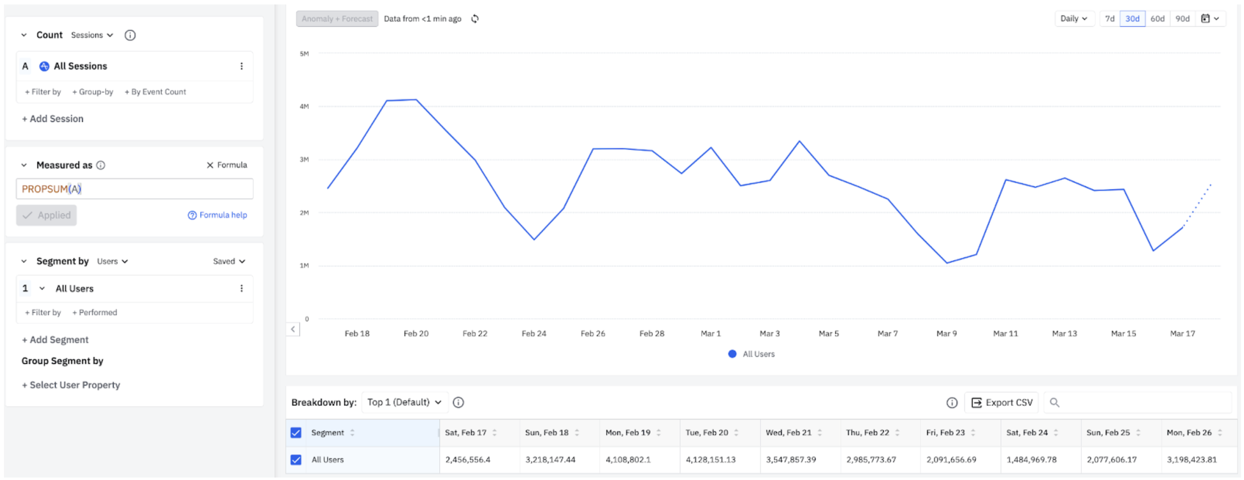
PROPSUM
Syntax
PROPSUM(event)
Parameters
| Parameter | Description |
|---|---|
event | A letter that corresponds to an event in the Events card. The event must be grouped by the property you'd like to sum. |
Returns
The sum of the grouped-by property values for the specified event.
Returns the sum of the property values you are grouping the event by.
PROPSUM works only when you group by a numerical property on the event. If you group by multiple properties, the formula runs the calculation with the first group-by clause.
Example
PROPSUM(A) shows the total revenue generated by the Complete Purchase event.
Syntax
PROPSUM(session)
Parameters
| Parameter | Description |
|---|---|
session | A letter that corresponds to a session in the Sessions card. |
Returns
The total time, in seconds, summed across all matching sessions.
PROPSUM varies slightly for the User Sessions chart because sessions are the focus of the metrics.The chart below shows the total time, in seconds, summed across all sessions.
REVENUETOTAL
Syntax
$:REVENUETOTAL(event)
Parameters
| Parameter | Description |
|---|---|
event | A letter that corresponds to a revenue event in the Events card. |
Returns
The aggregate sum of the property, formatted as a currency. Equivalent to PROPSUM(event).
Returns the aggregate sum of a revenue property, formatted as a currency.
REVENUETOTAL works only when you group by a numerical property on the event. The $: prefix is optional; its presence ensures the output format is a currency.
Example
$:REVENUETOTAL(A) shows the total revenue by day generated by purchases.
TOTALS
Syntax
TOTALS(event)
Parameters
| Parameter | Description |
|---|---|
event | A letter that corresponds to an event in the left module of the chart control panel. |
Returns
The total number of times users triggered the event.
Returns the total number of times users triggered the event.
Example
TOTALS(A); TOTALS(B) shows the total number of times users viewed an item's details (event A) plus the total number of times users added an item to a cart (event B).
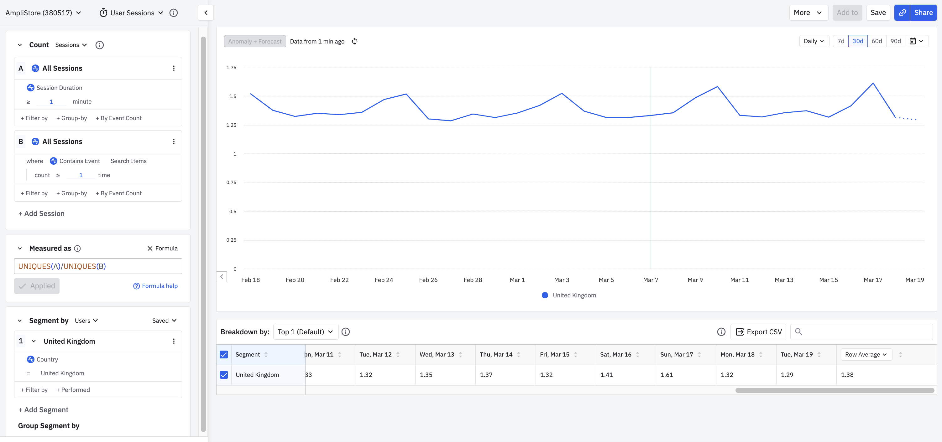
UNIQUES
Syntax
UNIQUES(event)
Parameters
| Parameter | Description |
|---|---|
event | A letter that corresponds to an event in the Events card. |
Returns
The number of unique users that triggered the event.
Returns the number of unique users that triggered the event.
Syntax
UNIQUES(session)
Parameters
| Parameter | Description |
|---|---|
session | A letter that corresponds to a session in the Sessions card. |
Returns
The number of unique users that engaged in the specified session.
UNIQUES varies slightly for the User Sessions chart because sessions are the focus of the metrics.Example
UNIQUES(A)/UNIQUES(B) shows the ratio of users that engaged in sessions longer than one minute to the users that engaged in sessions that contained at least one Search Items event.
EVENTTOTALS
Syntax
EVENTTOTALS(session)
Parameters
| Parameter | Description |
|---|---|
session | A letter that corresponds to a session in the Sessions card. |
Returns
The total number of events triggered during each session.
Returns the total number of events triggered during each session.
This formula metric is only available in the User Sessions chart.Example
EVENTTOTALS(A) returns the number of Page Viewed events across all sessions.
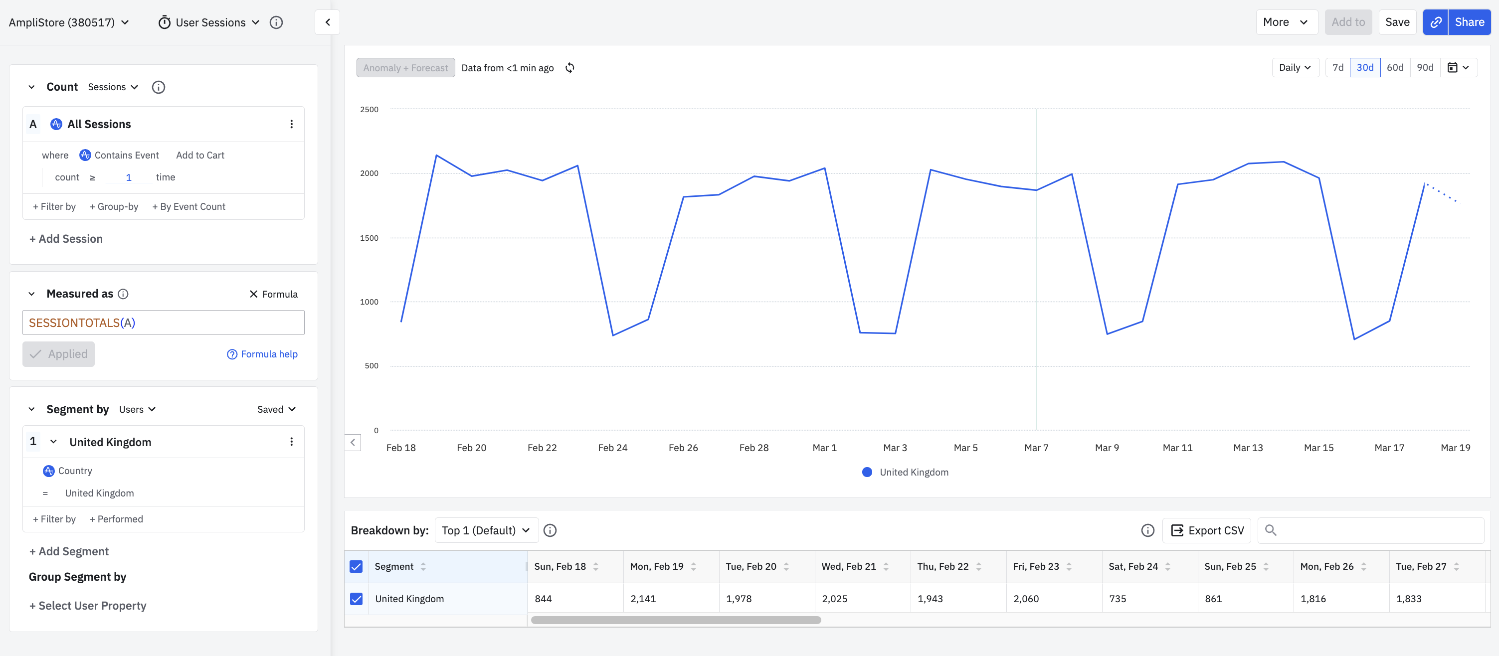
SESSIONTOTALS
Syntax
- User Sessions chart:
SESSIONTOTALS(session) - Event Segmentation chart:
SESSIONTOTALS(event)
Parameters
| Parameter | Description |
|---|---|
session | A letter that corresponds to a session in the Sessions card. |
event | A letter that corresponds to an event in the Events card. |
Returns
- For
SESSIONTOTALS(session): the number of sessions that match the specified session label. - For
SESSIONTOTALS(event): the number of sessions that contain the specified event at least once.
The value you pass to SESSIONTOTALS depends on the chart you're using.
Example
The setup below shows the total number of sessions by day over the last 30 days for all users in the United Kingdom who completed at least one Add to Cart event during each session.
SEMANTICTOTALS
Syntax
SEMANTICTOTALS(event, semantic)
Parameters
| Parameter | Description |
|---|---|
event | A letter that corresponds to an event in the Events card. |
semantic | How totals are calculated when grouped by cart properties (array properties). Supported values: UNIQUE_ARRAY_VALUES performs "Counting Events" by deduplicating array property values. ALL_VALUES performs "Counting Items" by counting each item within the array property without deduplication. |
Returns
The total number of times the event occurred, counted according to the chosen semantic.
Returns the total number of times an event occurred, with explicit control over how array properties are counted.
This gives you formula-based access to the same counting options available in the Event Totals and Average measurement controls when grouping by cart properties.
Example
A Checkout event has the cart property item_list.product_category. If a single Checkout event contains two tacos (one Crunchy Taco and one Soft Taco) under the same product category "tacos":
SEMANTICTOTALS(A, UNIQUE_ARRAY_VALUES)counts 1 Checkout event.SEMANTICTOTALS(A, ALL_VALUES)counts 2 Checkout items.
The default behavior for TOTALS remains unchanged (equivalent to "Counting Items"). Use SEMANTICTOTALS when you need to explicitly choose between counting events and counting items.
Aggregation formulas
CUMSUM
Syntax
CUMSUM(metric, event)
Parameters
| Parameter | Description |
|---|---|
metric | One of the metrics formulas listed above. |
event | A letter that corresponds to an event in the Events card. |
Returns
The metric for the selected event with a running total of days, weeks, or months over the chart's time frame.
Returns a metric for the selected event with a running total over the chart's time frame.
CUMSUM(UNIQUES, A) returns a deduplicated count of unique users for each data point.
Example
A daily cumulative sum of revenue fromComplete Purchase events in the last 30 days. The data point for February 22 is the sum of revenue generated on February 20, 21, and 22.ROLLAVG
Syntax
ROLLAVG(metric, event, intervals)
Parameters
| Parameter | Description |
|---|---|
metric | One of the metrics formulas listed above. |
event | A letter that corresponds to an event in the Events card. |
intervals | The number of five-minute intervals, hours, days, weeks, or months to include in the rolling average. The maximum ranges are 36 five-minute intervals (three hours), 72 hours, 90 days, 12 weeks, or 12 months. |
Returns
The rolling average of the metric for the event over the specified number of intervals.
A daily chart allows rolling averages over daily intervals only.
Example
A weekly rolling average superimposed on top of daily active users. The blue line shows daily active users and the green line shows the weekly rolling average. Use this comparison to see if your daily active user count is higher or lower than the rolling average.
ROLLWIN
Syntax
ROLLWIN(metric, event, intervals)
Parameters
| Parameter | Description |
|---|---|
metric | One of the metrics formulas listed above. |
event | A letter that corresponds to an event in the Events card. |
intervals | The number of five-minute intervals, hours, days, weeks, or months to include in the rolling window. The maximum ranges are 36 five-minute intervals (three hours), 72 hours, 90 days, 12 weeks, or 12 months. |
Returns
The metric for the event over the rolling window. The rolling window aggregation applies after a cohort filter, if one is in use.
The day, week, or month the chart displays is the last day of the window.
Example
This chart first calculates the new users for each time interval, then performs the rolling window aggregation on top of that.
ROLLWINBEFORE
Syntax
ROLLWINBEFORE(metric, event, intervals)
Parameters
| Parameter | Description |
|---|---|
metric | One of the metrics formulas listed above. |
event | A letter that corresponds to an event in the Events card. |
intervals | The number of five-minute intervals, hours, days, weeks, or months to include in the rolling window. The maximum ranges are 36 five-minute intervals (three hours), 72 hours, 90 days, 12 weeks, or 12 months. |
Returns
The metric for the event over the rolling window. The rolling window aggregation applies before a cohort filter, if one is in use.
Example
This chart first calculates the rolling active users for each time interval, then applies the new user cohort filter on top of that.
Function formulas
EXP
Syntax
EXP(value)
Parameters
| Parameter | Description |
|---|---|
value | A constant or another function (for example, UNIQUES of an event). The maximum value accepted is 700. |
Returns
e raised to the power of value.
Example
EXP(AVG(A)) computes e to the power of the average number of times users purchase tickets.
LN
Syntax
LN(value)
Parameters
| Parameter | Description |
|---|---|
value | A constant or another function (for example, UNIQUES of an event). |
Returns
The natural logarithm of value.
Example
LN(UNIQUES(A)) calculates the natural logarithm of the number of unique users that triggered event A.
LOG
Syntax
LOG(value, base)
Parameters
| Parameter | Description |
|---|---|
value | A constant or another function (for example, TOTALS of an event). |
base | A constant. The base must be a constant and can't contain another function. |
Returns
The logarithm of value to the specified base.
Example
LOG(UNIQUES(A), 3) returns the logarithm of the count of unique active users to base 3.
LOG10
Syntax
LOG10(value)
Parameters
| Parameter | Description |
|---|---|
value | A constant or another function (for example, AVG of an event). |
Returns
The base-10 logarithm of value.
Example
LOG10(AVG(A)) returns the base-10 logarithm of the average number of times users triggered Complete Purchase.
POWER
Syntax
POWER(value, exponent)
Parameters
| Parameter | Description |
|---|---|
value | A constant or another function (for example, TOTALS of an event). |
exponent | A constant. The exponent must be a constant and can't contain another function. |
Returns
value raised to the power of exponent.
Returns the value raised to the specified exponent.
Example
POWER(UNIQUES(A), 2) returns the squared number of unique users that triggered event A.
SQRT
Syntax
SQRT(value)
Parameters
| Parameter | Description |
|---|---|
value | A constant or another function (for example, AVG of an event). |
Returns
The square root of value.
Example
SQRT(TOTALS(A)) returns the square root of the total number of times users triggered event A.
TRENDLINE
Syntax
TRENDLINE(value)
Parameters
| Parameter | Description |
|---|---|
value | A constant or another function (for example, UNIQUES of an event). |
Returns
The ordinary least-squares linear regression trend line of value.
Strongly consider plotting another custom formula alongside this one for comparison. Otherwise, the TRENDLINE function gives you a straight line with no context on a chart.
Example
Use TRENDLINE to understand the trend line of the number of users that purchase a song or video and compare it to the unique number of users.
Was this helpful?