Interpret your Lifecycle chart
Amplitude Academy
Track the Growth of Your User Base with Lifecycle
Learn to measure the change in your product's active user base over time.
Get startedInterpret your Lifecycle chart
The Lifecycle chart's default display is a histogram with two buckets for each of your usage intervals. The blue buckets contain active users; the red bucket contains dormant users.
This is your Growth chart. It shows the distribution of active users and the count of dormant users for a particular day, week, or month. Use it to identify which group of users affects your active user counts the most.
All your active users fall into one of three groups: new, current, or resurrected (formerly inactive). The different shades of blue in the histogram's blue bar represent each group. Amplitude defines the three active user groups as follows:
- A new user (light blue) is one who is new in Amplitude as a whole within one usage interval of when they performed the event. Amplitude bases New classification on the user's Amplitude account first-seen time, not the first time the user performed the selected event. Amplitude counts that user as New for one full interval after the interval in which their first event arrives. For example, if your chart uses weekly intervals, Amplitude considers a user New during Oct 1 through Oct 7 if they fired the event and were new to Amplitude during that same interval.
- A current user (medium blue) is one who logged the specified event in the current interval and also in the previous usage interval (day, week, or month). For example, Amplitude considers a user who fired the specified event during Oct 1 to Oct 7 and Oct 8 to Oct 14 a current user on October 9.
- A resurrected user (dark blue) is a user who logged the specified event in the current interval, doesn't qualify as New because the user's Amplitude account first-seen time is older than one interval, and didn't log the event in the immediately previous interval. Because Amplitude uses the user's account first-seen time instead of the first occurrence of the selected event, a pre-existing Amplitude user who triggers a newly instrumented event for the first time can appear as resurrected, not new. For example, Amplitude considers a user who was active on September 30, didn't fire the event during the week of Oct 1 to Oct 7 (previous interval), then fired it again on October 9 (current interval) a resurrected user during Oct 8 to Oct 14.
You also have dormant users, which the red bar represents. A dormant user is one who didn't log the event you specified, but who logged the specified event during the previous time period (day, week, or month). For example, Amplitude considers a user who was active on January 1st but wasn't active on January 2nd a dormant user on January 2nd.
Breakdown table
Below the chart is a breakdown table of lifecycle data. You can export the data table as a .CSV file by clicking Export CSV.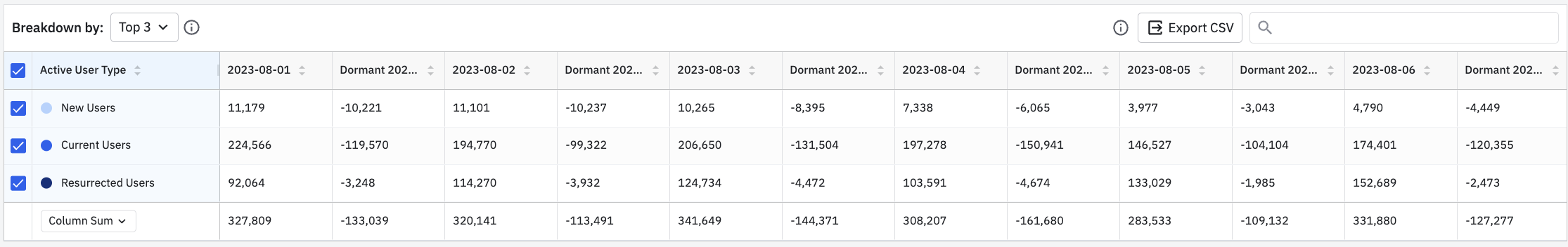
Switch between views
The Lifecycle chart has two other views: Dormant and Pulse.
Dormant
The Dormant chart shows the distribution of dormant users for a particular day, week, or month. For example, a dormant new user during Oct 8 to Oct 14 is a user who was new during Oct 1 to Oct 7 but became dormant on October 8.
Pulse
The Pulse chart shows the ratio of incoming (new and resurrected) users to outgoing (dormant) users for a particular day, week, or month. The ratio shows how many active users you gain for each user who goes dormant.
Pulse uses the following formula:
(# of new users + # of resurrected users) / (# of dormant users)
- Pulse > 1 means you're gaining users faster than you're losing them. Your product is experiencing growth.
- Pulse < 1 means you're losing more users than you're gaining. Your product isn't growing.
For example, in the chart below, pulse was 0.96 during the week of Oct 8 to Oct 14. You lost more users in that interval than you gained or resurrected.
Was this helpful?