Interpret your Impact Analysis chart
Interpret the results of your Impact Analysis chart
The Impact Analysis chart plots the outcome event on a relative n-day basis, starting from the first time each user triggered the treatment event. Amplitude aligns each user's relative timeline so you can see the pattern. The center line represents the day or week users first triggered the event.
Choose your metric
Amplitude offers four metrics for the Impact Analysis chart: average, active percentage, frequency, and properties.
Average
When you use Average, the chart's Y axis shows the mean number of times users triggered the outcome event in each n-relative-day or n-relative-week interval. Amplitude counts only users who triggered the event at least once. Hover over each data point to see how many users triggered the outcome event at least once in each interval.
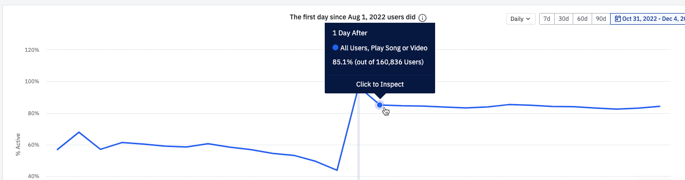
Active %
The Y axis shows the percentage of people who triggered the outcome event at least once in each n-relative-day or n-relative-week interval. Amplitude includes users who triggered any active event in that interval. Hover over each data point to see how many users triggered the outcome event at least once in each interval.
In the example below, 160,836 users were active the day after favoriting a song for the first time, and 85.1% played a song or video.
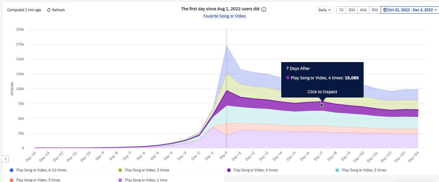
Frequency
The chart's Y axis shows the distribution of the number of times people triggered the outcome event at least once in each n-relative-day or n-relative-week interval.
In the example below, 15,085 users played four songs or videos on the seventh day after favoriting a song for the first time.
Properties
The Properties metric lets you compute either the average or sum of an event property for a given outcome event. These calculations cover every instance of that outcome event triggered in each n-relative-day or n-relative-week interval. For example, plot the average length of all songs or videos played by users in the weeks before and after favoriting a song.
Causal inference interpretation best practices
Impact Analysis helps you validate hypotheses to better understand the effects between user behaviors. It doesn't replace randomized experimentation, which is still the gold standard for determining causal effects. Treat the Impact Analysis chart as a tool to determine where to focus your experimentation program, to help users engage more successfully with your product.
Consider these factors before making causal conclusions:
- Alternate hypotheses: Have you considered other potential actions users take around the same time they fire your treatment behavior for the first time? These actions might also contribute to the change in the rate of the outcome behavior. If those alternative actions have instrumentation, create other Impact Analysis charts using those actions as the treatment event. If the results look similar, investigate how much each treatment event contributes to the change in outcome, through user research and randomized experiments whenever possible.
- User counts: If your outcome metrics show high volatility (changing dramatically between intervals) or a dramatic change relative to the intervals before versus after the treatment, check your user count. A small user count can explain these inconsistencies or their magnitudes. A small handful of users can swing the metric in one direction, while large user counts typically have a smoothing effect that gives the metric more stability. Use caution when making conclusions with small user counts, because they don't necessarily reflect a broader pattern.
Was this helpful?