Interpret your Compass chart, part 1
Amplitude's Compass chart shows how a new user firing an event correlates with that user retaining. Understanding which user events lead to retention is critical to driving sustainable product growth.
Before you begin
Refer to the article about building a Compass chart before you start to interpret one.How to read your Compass chart
When you first launch a Compass chart, you might have a specific hypothesis about which events are likely to drive retention. Even if you don't, Compass can help you develop one.
In the previous article, you saw how Compass generates a heat map of user events and correlations by default when you select Any Event.
This is a quick summary of the events most correlated with members of a base cohort converting to a target cohort. It's a good place to start if you don't have much data yet.
You can sort the table in ascending or descending correlation for a given day by clicking the day labels across the top. Clicking a specific cell displays a popup with more detailed information about the event/day combination you selected.
This summary report is useful for looking at your data from a bird's-eye view, for example, identifying events that should rank at the top but don't.
After you choose an event to focus on, Compass replaces the heat map view with a more detailed breakdown.
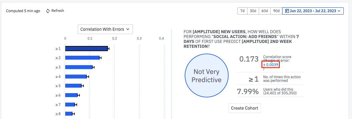
As an example, look at how triggering the event Social Action: Add Friends within the first seven days of becoming a new user correlates with second-week retention. The following sections walk through the different components of the reports Compass generates.
On the left, you see the correlation scores of that event, sorted by the frequency with which your users have triggered it. By default, the report shows you the frequency with the highest correlation. Users who triggered Social Action: Add Friends at least once had the highest correlation score, and are most likely to have ended up in the second-week retention cohort. The correlation between triggering Social Action: Add Friends and second-week retention is weak.
Correlation and causation aren't the same thing. A high correlation score may suggest a causal relationship between two events, but it can also mean that each of those events is highly correlated with another, as-yet-unidentified event.
Click any of the buckets to view a detailed breakdown of that event/frequency combination, particularly when looking at smaller numbers of initial days for each user.
Amplitude categorizes correlation scores like this:
- Highly Predictive: correlation >= 0.4.
- Moderately Predictive: 0.3 <= correlation < 0.4.
- Slightly Predictive: 0.2 <= correlation < 0.3.
- Not Predictive: correlation < 0.2.
Choose a different metric
Compass defaults to showing correlation scores. You can select a different metric if it better suits the needs of your analysis. Select the metric you want from the Correlation dropdown menu, such as Positive Predictive Value.View statistical significance
Compass lets you toggle the 95% confidence interval of the correlation on and off. Click the blue numerical text on the right side of the table to display the interval on the left-side bar chart.
Was this helpful?