The cumulative exposures graph: Increasing and decreasing slopes
The cumulative exposures graph shows how many users your experiment exposed over time. The x-axis shows the date of each user's first exposure. The y-axis shows a running total of users exposed to the experiment.
Amplitude counts each user one time, unless the user receives more than one experiment variant. Users who receive more than one variant count once for each variant.
Interpreting the cumulative exposure graph
This article covers cumulative exposure results with:
- Increasing slope: the lines consistently go up and to the right.
- Decreasing slope: the lines go up and to the right, but the cumulative exposure slows over time.
Other articles cover cumulative exposure results with:
Increasing slope
In a standard cumulative exposure graph with an increasing slope, each line represents a single variant. For example, March 20 might be the first day of the experiment, when 158 users trigger the exposure event for the control variant. A day later, a total of 314 users receive the control variant. That number is the sum of exposures on March 20 and March 21.
The slope of each line is the change in the y-axis divided by the change in the x-axis:
∆y / ∆x = (cumulative users exposed as of day T1 — cumulative users exposed as of day T0) / (number of days elapsed between T0 and T1) = Number of new users exposed to the experiment, per day, from day T0 to day T1.
Additional aspects of this graph:
- The graph is cumulative, so the y-axis doesn't decrease. The slope of the line is the number of new users exposed to your experiment each day. The line may slow or stop growing, but a cumulative exposures graph never peaks and then drops.
- A dotted line at the end marks dates with incomplete data. Refer to Amplitude's incomplete data guidance for more information.
- The two lines don't track each other exactly. Each line represents a unique variant, and exposures can differ slightly between variants, even when each variant receives the same amount of traffic.
- Both variants follow a steady growth path, which indicates no seasonality. If users were more likely to engage with your product (and therefore more likely to receive an experiment) on weekdays, the chart would show this pattern. On weekends, the y-axis value would increase more slowly.
Hourly versus daily setting
Changing the x-axis to hourly instead of daily often reveals new patterns in your chart.
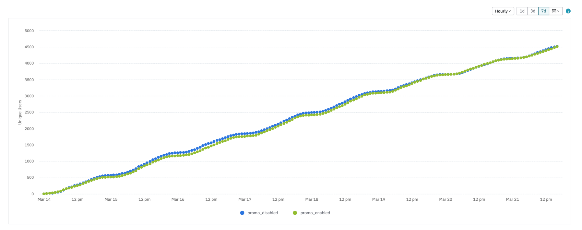
The trend is still linear. Because this is an hourly graph, from 9 PM to about 5 AM, almost no additional users receive the experiment. Users are likely asleep and not using the product during these hours. The daily version of the graph doesn't show this pattern.
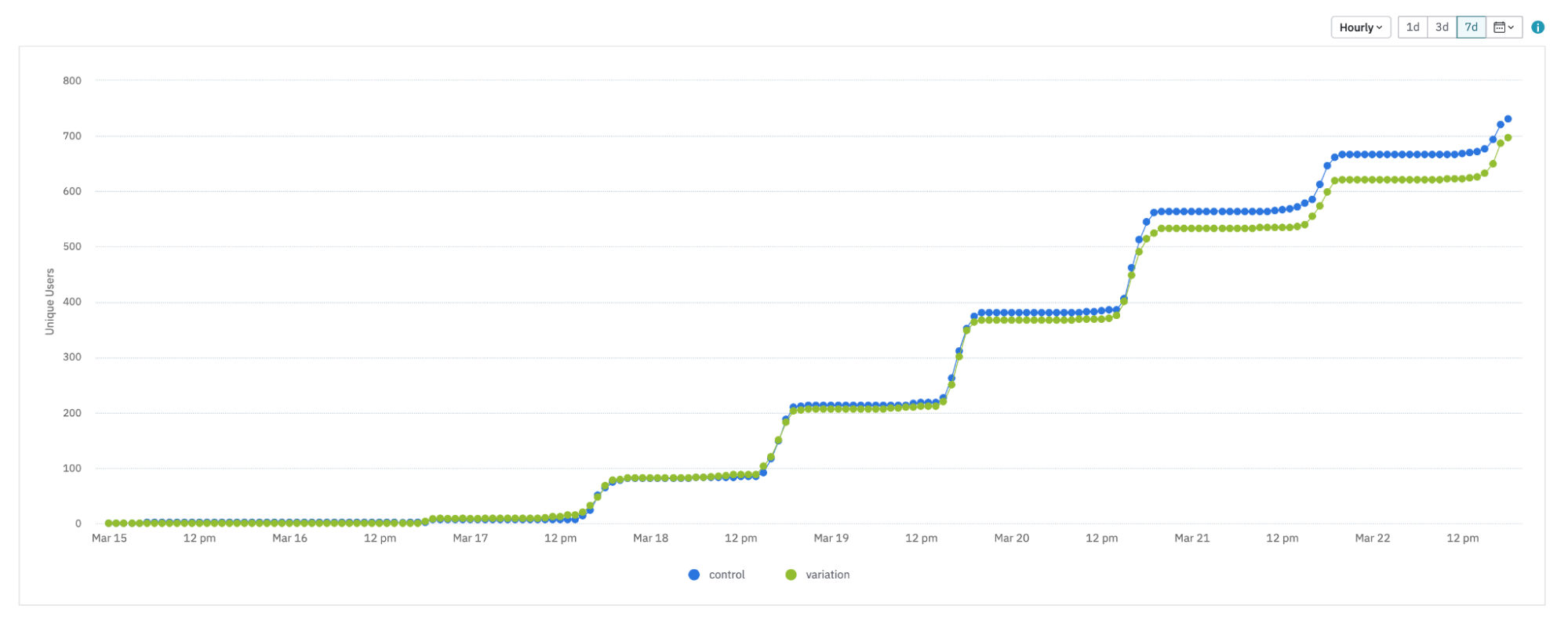
This is a more extreme example. The exposures look like a step function. In this case, users who already received the experiment at least once may be evaluating the feature flag again during these flat time periods.
Decreasing slope
An experiment's cumulative exposures can start strong, then slow over time.
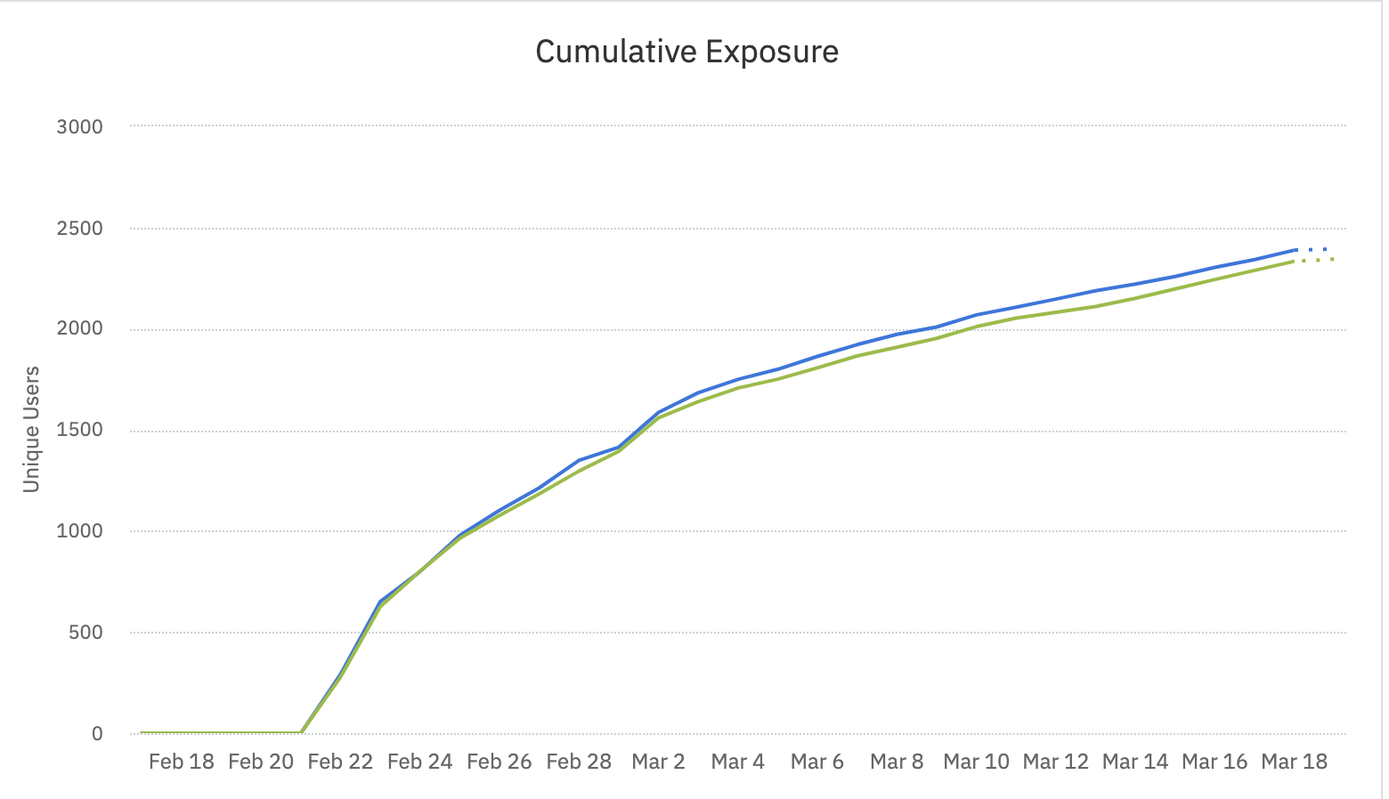
When this experiment launched, about 280 new users received each variant each day. By the end, exposure rates dropped to about 40 new users per variant, per day.
Static cohorts can limit your experiment
Cumulative exposures can flatten over time when you target a static cohort: a cohort that doesn't grow or shrink on its own.For example, consider a static cohort with 100 members. On the first day, 40 of those users receive your experiment. Only 60 eligible users remain. Each day, fewer users can enter the experiment, and the slope of your cumulative exposures graph flattens.
If you use a static cohort in an experiment, reconsider how you use the duration estimator. Instead of solving for sample size, ask what level of lift you can reasonably detect with this fixed sample size.When you use a cohort this way, ask whether the cohort represents a larger population that could show a similar lift if more users received the winning variant. Don't assume it does. That assumption is like running an experiment in one country and then assuming the same impact in any other country.
Other possible causes for decreasing slope
- The dynamic cohort isn't growing quickly enough, or the number of users that interact with your experiment is limited.
- Your sticky bucketing configuration: if users enter the cohort and then exit, decide whether they continue to receive the experiment (for consistency) even after they no longer meet the targeting criteria.
- The experiment first reaches a group of users that don't represent users exposed later. Users who used your product for 30 days may interact with the feature you test differently than users active for 100 days. Run your experiment longer than originally planned to study the treatment effect on a steady state of users.
- Users gradually become numb to your experiment and stop responding after repeated exposures.
A flattened cumulative exposures graph doesn't always mean the experiment has limited impact. The specifics of your users' behavior determine the result.
This pattern has serious implications for how long your experiment needs to run. The standard method calculates experiment duration by dividing the estimated sample size by the average traffic per day. That method doesn't apply here. You typically need to run the experiment longer than expected, because the estimate overstates the denominator.
Was this helpful?