Winsorization in Experiment
Outliers are data points that occur on the far fringes of a dataset. These data points typically rest far from measurements of central tendency like the mean, and can skew an analysis.
Outliers in your dataset sometimes result from instrumentation issues. For example, if your users primarily interact with your app through their mobile devices, but your web instrumentation sends event properties at a different rate (milliseconds) than iOS and Android instrumentations (seconds), the data from web-based users may look like outliers.
Outliers can also appear for many other reasons, some of which you can't control.Find outliers in your data
You can often spot outliers by examining the tails of a histogram, but no single correct method defines what counts as an outlier.
One common method uses standard deviations from the mean. This works well if your data aligns with a normal distribution. If it does, you can expect 68 percent of your data points to fall within one standard deviation, 95 percent within two, and 99.7 percent within three. Depending on your situation, you might decide that anything more than three standard deviations out is an outlier.Standard deviation can be sensitive to outliers. As skew in the distribution increases, so does the sample size you need to ensure the sample mean approaches a normal distribution. In datasets with fewer than millions of users, you can't always assume the sample mean has a normal distribution.
Boxplots are another way to identify outliers. Boxplots calculate the "inner fences" for outliers using the 25th percentile (Q1) and the 75th percentile (Q3):
- Upper Bound:
75th percentile + 1.5 * (75th percentile - 25th percentile). - Lower Bound:
25th percentile - 1.5 * (75th percentile - 25th percentile).
You can also choose a specific percentile and designate everything beyond it as an outlier. Don't do this at random. Examine the plot of your dataset first, and work from there.
The correct definition for an outlier varies from case to case and often depends on your business use case. Use your domain knowledge to decide what counts as an outlier.
Amplitude's outlier analysis depends on the type of metric you're using. For example, binary metrics like uniques and retention don't have outliers, so the methods below don't apply to them.
Outlier examples
The following example shows how outliers can distort your analysis. In a dataset of {1, 2, 5, 1000}, 1000 is the obvious outlier. Without this data point, the mean is 2.67. With it, the mean becomes 252. This is technically correct, but it misrepresents the dataset's actual character.
In this example, including an outlier in the dataset removes the statistical significance you'd get without it:
set.seed(29)
control = rnorm(100)
treatment = rnorm(100, 3)

t.test(control, treatment)

treatment_with_outlier = c(rnorm(100, 3), -1000)
t.test(control, treatment_with_outlier)
Without the outlier, the p-value is basically 0. With the outlier, the p-value is .495.
| Mean | Standard deviation | |
|---|---|---|
| With outlier | -6.92 | 99.81 |
| Without outlier | 3.01 | 1.14 |
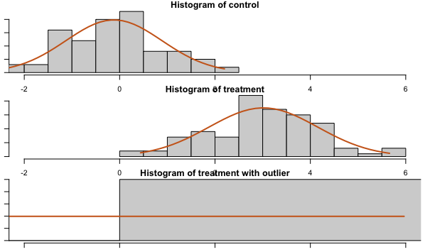
This is the distribution of the population, not the distribution of the sample mean.
Instead of using means, you can use percentiles such as the median, which are more resistant to outliers.
Resolve outliers in your data
Options to address long-tailed distributions include winsorization, removing outliers, bootstrapping, and non-parametric tests. Winsorization and removing outliers reduce skew, which allows a smaller sample size where the sample mean approximates a normal distribution (the Central Limit Theorem).The best approach to handling outliers often depends on the type of metric you're using. This section covers options for several common metric types.
Totals
When you use a totals metric, you have several options for resolving outliers.
Visualization and deeper analysis
Visualizing your data is often a good starting point. For example, create a segmentation chart of your dataset and select Frequency to find out if certain users trigger a particular event more often than most other users. Next, change the frequency chart into a bar chart to view it as a histogram. Adjust the bin size as needed.
Session replays can also help you understand why certain users act as outliers. First, define the number of times a user must trigger an event to qualify as an outlier. Then look for sessions where a user triggered the event enough to meet that threshold. Pay attention to how their behavior differs from other users to understand why they're outliers.
This approach helps when debugging a spike in event volume for a particular event. A small number of users might be responsible for the spike, which suggests a different interpretation than if the activity is evenly distributed across your user base.
FREQPERCENTILE
Continue analyzing your frequency chart by using this formula in a segmentation chart to get percentiles.
Computations
Use a computation to aggregate the count of events. Examine the distribution and individual user values in the charts, search to find specific values, and sort the sample to determine the range of valid values.
Winsorizing
Winsorizing transforms data by limiting extreme values to reduce the effect of outliers. A complete explanation of the process is beyond the scope of this article. This section explains how to apply winsorizing to outliers in Amplitude.
For example, to find out how many charts the average user creates when some power users create many more than most users, winsorize at a reasonable value (learn more about how to select a winsorization value here). For this example, the value is 100. Open a segmentation chart, select Formula from the Measured As block, and enter this formula:
(TOTALS(A1) + 100*UNIQUES(A2)) / (UNIQUES(A1) + UNIQUES(A2))
In this formula, only event A for segment 2 is winsorized (100 * UNIQUES(A2)). Amplitude counts the number of users subject to winsorization, then multiplies by the winsorization value selected in the first step (100 in this case).
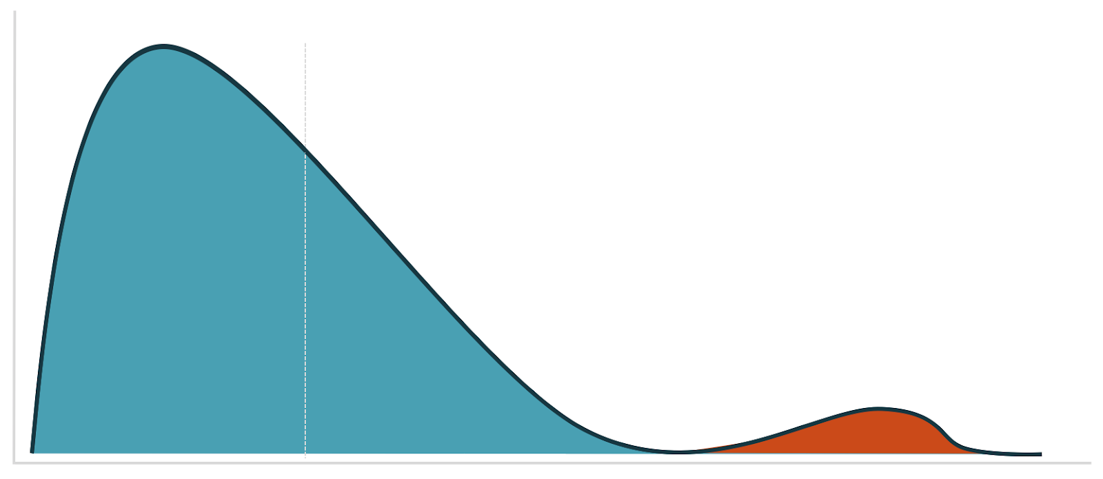
You have several options for picking your winsorization value. A good starting point is to refer to your visualization and look for a cutoff point that separates the data into two distinct modes:
Filtering out users
Use the Experiment Results chart to filter out users who triggered the event more than a specified number of times. Add a who performed filter to each chart segment. To get a pre-filled Experiment Results chart, select Open in chart on the Analysis card in Amplitude Experiment.Sum of property
Winsorization
When it's difficult to know the best value for winsorization, use derived properties to help you:- Run both min and max winsorization, together or separately, by creating a derived property of
min(max(1, X), 100), where X is the property you're interested in, and 1 and 100 are the lower and upper values for X. - Use derived properties for transformations. For instance,
POWER(x, .5)gives you a square root. Other transformations that reduce skew arelog,sqrt, or a Box Cox transformation.
Visualize with a histogram
As with the frequency chart, adjust the bin sizes to visualize outliers at the event level. Depending on the size of the value range, change the range of the examined data to zoom into different parts of the histogram. The last bin in the histogram is larger than the other bins to account for outliers, so the rightmost bar is often taller than the others.
Then use the Microscope to view session replays for these users. You can also use the filters on the session replay page to gain more insight into a user who, for example, spends $1000 when most people spend $50.PERCENTILE
Use the PERCENTILE formula to view the percentiles of the event property at a per-event level.Computations
Create a computation that's a sum of a property, then explore the charts at the bottom of the page.
Filter out users
Use the computation in a cohort and filter out users who generate the outliers. You can also create a cohort with a total sum of property filter, then filter out users in that cohort. You can do this in both Amplitude Experiment and Amplitude Analytics.
Winsorization in Amplitude Analytics
Open a segmentation chart, select Formula from the Measured As block, and enter this formula:
(PROPSUM(A1) + W*UNIQUES(A2)) / (UNIQUES(A1) + UNIQUES(A2))
Where W is your winsorization value.
Who performed doesn't support propsum, but you can create a cohort with a total sum of property, then add that cohort as a segment filter.
Average of property
All methods listed for sum of property events work for average of property events. Replace sum with average.
Funnel totals
Approximate this as totals of the last step of the funnel.
Sum of last step of funnel
Approximate this as a prop sum of the last step of the funnel.
Prop min / prop max
Cohorts don't support prop min or prop max, but computations do. Add filters on computations in the segment controls to access them.
Winsorization in Experiment
Amplitude Experiment supports max winsorization for all metric types except uniques, funnel uniques, and retention. Winsorization is only available for users on Enterprise plans.
When you turn winsorization on, Amplitude Experiment applies it at the per-metric level. Change the default value to the value you want to use for winsorization.
In the metrics table, hover over the cell to view how many users were winsorized.
As a best practice, avoid winsorizing more than 5% of your data. For example, if 10% of your data are outliers, investigate that group separately and run two different analyses. You can also find out if there are more outliers in one variant than another. For formula metrics, Amplitude applies the same winsorization value to each term.
Log transform in Experiment
Like winsorization, Amplitude Experiment also supports log transforms as an alternative for handling outliers. Log transforms are only available for users on Enterprise plans.
When you enable log transforms, Amplitude Experiment applies the log transformation at a per-metric level. It uses logarithm with base e. Experiment uses ln(1+x) to handle the case where x = 0. x is the metric value for a particular user. If 1+x <= 0, Experiment returns 0 for the metric value for that individual user.
If you enable both winsorization and log transform, Amplitude applies winsorization first, then the log transform.
Related resources
- Block bot web traffic: Prevent bot traffic from affecting your metrics.
- Block and filter internal users: Exclude internal user data from your metrics.
Was this helpful?