이 페이지에서

User Sessions: Track engagement frequency and duration

이 페이지는 아직 귀하의 언어로 번역되지 않았습니다. 현재 작업 중이므로 곧 다시 확인해 주십시오.

Amplitude Academy

사용자 세션을 통해 사용자가 제품에서 시간을 얼마나 보내는지 파악하세요

사용자 세션 차트를 사용하여 사용자가 제품에 소비하는 시간을 분석하는 방법을 알아보십시오.

시작하기

The User Sessions chart analyzes your users through session-based metrics like the distribution of session lengths, average session length, and average sessions per user. Use it to answer questions like:

  • How frequently do users engage with your product?
  • How long do they engage with your product?
  • How do these metrics compare to other user segments?

See also

To analyze session metrics and event metrics together in a single chart, try Metric Explorer (Beta).

Before you build a user sessions chart, get familiar with building charts in Amplitude and session IDs and how Amplitude tracks sessions.

Set up a user sessions chart

Most Amplitude charts rely on the Events Module to build an analysis. The User Sessions chart works differently because it uses a Sessions Module.

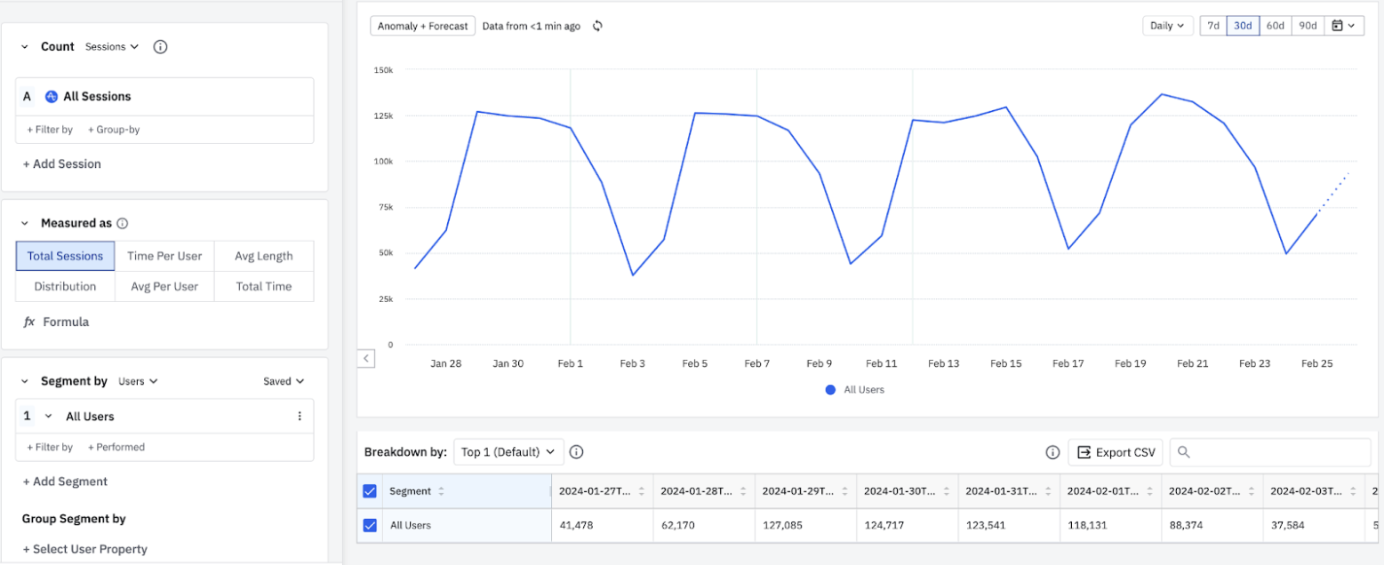
Total sessions follow a strong weekly rhythm, plateauing around 118k–137k on weekdays and dropping to roughly 37k–52k on weekends.
Total sessions per day
DateAll Users
2026년 1월 27일41,478
2026년 1월 28일62,170
2026년 1월 29일127,085
2026년 1월 30일124,717
2026년 1월 31일123,541
2026년 2월 1일118,131
2026년 2월 2일88,374
2026년 2월 3일37,584
2026년 2월 4일58,917
2026년 2월 5일126,418
2026년 2월 6일124,873
2026년 2월 7일122,146
2026년 2월 8일108,327
2026년 2월 9일71,284
2026년 2월 10일45,093
2026년 2월 11일104,312
2026년 2월 12일123,847
2026년 2월 13일124,631
2026년 2월 14일122,918
2026년 2월 15일118,276
2026년 2월 16일79,438
2026년 2월 17일52,147
2026년 2월 18일84,623
2026년 2월 19일129,736
2026년 2월 20일135,412
2026년 2월 21일137,251
2026년 2월 22일128,394
2026년 2월 23일101,237
2026년 2월 24일50,418
2026년 2월 25일68,932

This chart plots total sessions per day across all users, with one point per day. It shows a strong weekly cadence: sessions hold a weekday plateau in the low hundreds of thousands and fall to weekend troughs near 40,000. Use it as the baseline session volume that other session metrics, such as bounce, entry, and exit rate, break down into finer segments. The dashed tail marks the most recent day, whose data is still incomplete.

A user sessions analysis breaks out your users into groups based on characteristics of their sessions in your product.

You can also use this chart to count the number of events users fire during their sessions. This lets you assess engagement during a particular period of activity, instead of during an entire day, week, or month.

Build a user sessions chart

To build your own user sessions chart, follow these steps:

  1. In the Sessions Module (where you'd usually find an Events Module), use the Count dropdown to specify whether your User Sessions chart measures sessions or events performed within sessions.

  2. If you're counting events performed within sessions, specify the event to count by clicking Select Event under Event Count. If you're measuring sessions instead, skip this step.

  3. Add properties to your starting event by clicking + Filter by and choosing one of the available properties: Session Duration, Contains Event, First Property value, or Last Property value.

    Enter the session's minimum length in seconds, minutes, hours, or days for Session Duration. Choose an event the user must trigger during each session for Contains Event. Or choose a property each session must contain for First Property value or Last Property value.

  4. To group your sessions by a property, click + Group by and choose the property. You can apply a single group-by to each Sessions object in the Sessions module, and add multiple group-bys in the Segment By module.

  5. If you selected Sessions in Step 1, choose from the following options in the Measured As Module:

    • Total Sessions: Graphs the total number of sessions across all users. Amplitude calculates this by counting the total number of valid sessions in the interval. (When you instrument session IDs, "valid" means a session with an ID other than 'none' or -1.) Total Sessions doesn't count sessions containing only inactive events.
    • Time Spent: Graphs the total sum of all session lengths in the interval.
    • Time Spent per User: Graphs the average time spent in sessions per interval. Amplitude calculates this by taking the sum of all session lengths in the interval, and dividing by the total number of active users in the interval.
    • Avg Length: Graphs the average session length. Amplitude calculates this by taking the sum of all session lengths in the interval, and dividing by the total number of sessions in that interval.
    • Length Distribution: Displays the distribution of session lengths in a histogram. Customize the shape of the distribution by setting the minimum and maximum session lengths. The minimum value is inclusive, and the maximum value is exclusive. The example above shows session length distribution for sessions between 1 and 30 minutes long in 5-minute intervals.
    • Avg Per User: Graphs the average number of sessions per user. Amplitude calculates this by dividing the total number of valid sessions in an interval by the total number of active users in the same interval.
    • Formula: With formulas, you can create your own custom metrics, such as bounce, entry, and exit rates. The following metric formulas are available in User Sessions analyses: EVENTTOTALS, HIST, PROPSUM, SESSIONTOTALS, and UNIQUES. These metric formulas work like the definitions in the custom metric formulas Help Center article, but the syntax refers to sessions instead of events.

    If you selected Events performed within sessions, choose from the following chart options instead:

    • Average Events per Sessions: Graphs the average number of times users perform a selected event per session. The time series plots the number of times users perform the event in a session per interval (day, week, month, and so on). Use this to analyze average engagement.
    • Total Events Across Sessions: Graphs the total number of times users perform a selected event in sessions. Like plotting totals in Event Segmentation, this shows the number of times users have performed a particular action across all sessions in an interval.
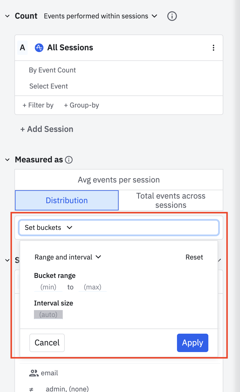
    • Distribution: Graphs a distribution of the number of sessions that include a selected event. The x-axis shows a range of the number of times users performed the selected event, and the y-axis plots the number of sessions in the time range. This analysis shows which of your users have the highest or lowest in-session engagement. To set individual ranges for each bucket, click Set buckets:

    userSessions_setBuckets.png

  6. In the Segment By module, identify the user segment to include in this analysis. To import a previously saved segment, click Saved and select the one you want from the list. Otherwise, Amplitude targets all users by default.

  7. To build your own user segment instead, add properties. Click + Filter by, choose the property to include, and specify the property value you're interested in.

  8. To narrow the focus further to users who already performed certain actions, click + Performed, then choose the event you're interested in.

  9. To add another user segment, click + Add Segment and repeat steps 5 through 7.

  10. Use the datepicker to set the timeframe of your analysis.

Amplitude excludes sessions lasting longer than a day from analyses.

Read on to learn more about interpreting your User Sessions chart.

이 내용이 도움이 되었나요?