Root Cause Analysis: Track down anomalies in your data
When working with product analytics, understanding why something happens can matter more than understanding what happened. This is especially true when Amplitude shows anomalous data, such as events and properties that differ significantly from expected behavior. With anomalous data, you need to determine whether the data point is random noise or the beginning of a shift in user behavior.
Historically, that insight has not always been easy to find. For example, you might need to navigate from Platform > OS > Device family to discover that users on a specific device type drive an observed change.
Amplitude's Root Cause Analysis (RCA) feature analyzes the properties of anomalous events and adds external context like country-specific holidays and product releases. RCA can explain the anomaly or rule out obvious causes. Use RCA to answer questions like "Which user groups best explain this change?" or "How are other correlated metrics affected?"
- This feature supports Event Segmentation charts only. It doesn't support formulas.
Analyze an anomalous data point
To use RCA, you must have an analysis in Amplitude that displays anomalous data.
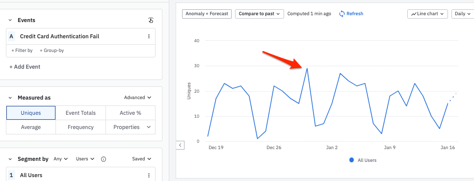
For example, this Event Segmentation chart has an unusual-looking peak for December 30th:
To examine this anomalous data point using Root Cause Analysis, follow these steps:
- Click Anomaly + Forecast to confirm that the result you're interested in is actually a statistical anomaly. Amplitude enhances the chart to display the statistically-expected values for each day, as well as a range of values that would not be considered anomalous (in other words, values that could be attributable to random chance).
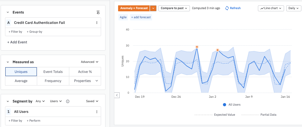
In this example, the December 30 data point is inside the range of statistically normal values, but close to the edge.
Click on the data point to bring up the Microscope. Then click Run Root Cause Analysis. Scroll down to view the Root Cause Analysis tab.
Amplitude scans the properties of the anomalous event and compares them to a baseline. It then generates a time-series graph for each property, so you can understand how each value tracks with the anomalous data point.
You can expand any of these graphs into a standalone Event Segmentation chart by clicking Open Chart for the graph you're interested in.
You can also give feedback on the chart by clicking the thumbs-up or thumbs-down icon. This tells Amplitude whether you found the chart useful or not, and helps improve the ranking algorithm over time.
RCA scans event properties in batches of 30 to present the most relevant properties first. RCA automatically pauses scanning to avoid overwhelming you with graphs. To scan more properties, click Continue Scanning.
Holidays are frequently the cause of anomalous data points. The Microscope alerts you if the anomaly you're investigating falls on a holiday.
Configure your analysis
Amplitude automatically starts scanning with the thirty most-queried properties. If you'd like a specific event property to be included in future scans, click Configure to open the Configure Analysis modal. Then click Select property... and select the property you're interested in from the list.
Was this helpful?