Interpret your Retention Analysis chart: Usage interval

이 페이지는 아직 귀하의 언어로 번역되지 않았습니다. 현재 작업 중이므로 곧 다시 확인해 주십시오.

Amplitude Academy

리텐션 분석을 통해 제품 도입 촉진

리텐션 차트가 제품 도입을 촉진하는 데 어떻게 도움이 되는지 알아보십시오.

시작하기

In a retention analysis, the usage interval shows the percentage of active users who triggered the selected events with a specified daily, weekly, or monthly median frequency. Amplitude includes users only if they triggered these events on at least two different days.

Your usage interval is important for drawing accurate conclusions about your retention numbers. Some products support daily use, while others might serve much less frequent use. Knowing how often users actually use your product helps you gauge the health of your product when looking at Retention Analysis and Lifecycle charts.

To view the usage interval, click Usage Interval in the Measured As module.

Suppose your product's critical event is Purchase Song or Video. Select this event and use the usage interval view to find the usage interval for that event. To calculate this, Amplitude plots the distribution of each user's median return period: for each user, Amplitude looks at all Purchase Song or Video events they triggered in the last 15 days, and then determines the median length of time between each of these events.

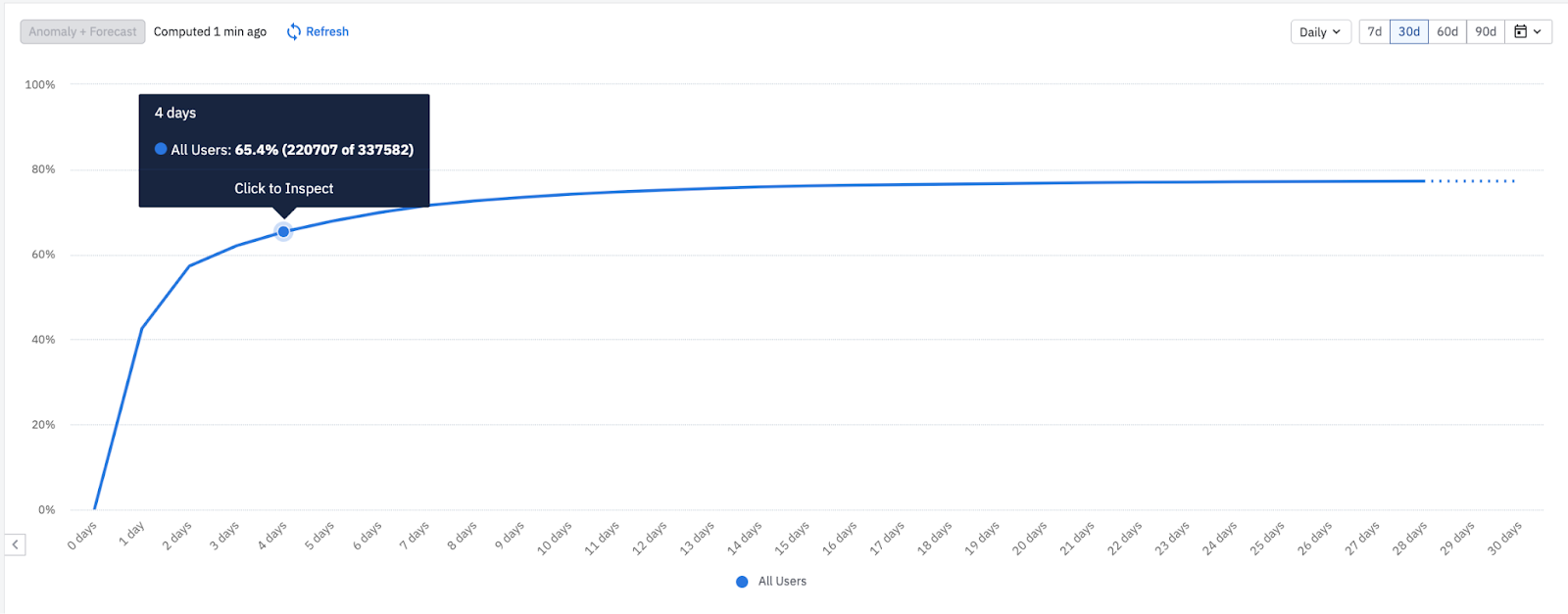
For example, the highlighted data point shows that 65.4% of your users have a median interval of four days or fewer between each Purchase Song or Video event. Interpret this inflection point as your usage interval. Use this usage interval to create a Return On (Custom) chart or a Lifecycle chart. In this case, four days is the expected usage interval for active users with the critical event of Purchase Song or Video.

Cumulative share of users by median return interval, climbing to 65.4% by the four-day bucket and flattening toward a plateau near 77%.
Usage interval distribution
Median intervalAll Users
0 days1
1 day42
2 days57
3 days62
4 days65.4
5 days68
6 days70
7 days72
8 days73.5
9 days74.5
10 days75.3
11 days75.9
12 days76.4
13 days76.8
14 days77

This chart is a cumulative distribution of users by their median return interval. Reading left to right, each bar adds the users whose median interval falls at or below that number of days, so the line only climbs: by the four-day bucket it has accumulated 65.4% of your users, and it flattens toward a plateau near 77% after that. The point where the curve stops rising steeply and levels off is your usage interval, the value to use when you set custom retention brackets or a Lifecycle window. Here that inflection lands at four days.

To learn more about how to find your critical event, refer to this blog post.

You can see how the median frequency between events changes over time by selecting the Usage Interval Over Time view. Amplitude doesn't plot averages in this view; instead, it shows the actual percentages.

For example, the following data point shows that of the users who triggered Purchase Song or Video on March 10th, 89.1% of them fired it again within seven days.

이 내용이 도움이 되었나요?