이 페이지에서

Interpret your retention analysis

이 페이지는 아직 귀하의 언어로 번역되지 않았습니다. 현재 작업 중이므로 곧 다시 확인해 주십시오.

Amplitude Academy

리텐션 분석을 통해 제품 도입 촉진

리텐션 차트가 제품 도입을 촉진하는 데 어떻게 도움이 되는지 알아보십시오.

시작하기

The Retention Analysis chart shows how often users return to your product after they trigger an initial event. This article explains how the chart works and how to interpret the data it shows.

You can use Global Agent to interpret retention charts with natural language. Ask questions like "Why did week 2 retention drop?" or "Show me 7-day retention for users who signed up last month" to analyze your retention data.

Analyze your retention analysis data in the chart area. There, you can:

If you haven't already read the overview of Amplitude's Retention Analysis chart, start there before continuing.

If you find the references to time in this article confusing, this Help Center article explains how time works in a retention analysis.

Interpret your Retention Analysis chart: Retention view

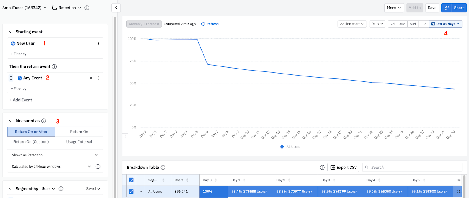
Interpreting your Retention Analysis chart is simpler than it may at first appear, because you can read through the parameters like a sentence. For example, the following chart shows you (1) new users who came back and triggered (2) any event (3) on or after the first day of your retention analysis over (4) the last 45 days:

Retention Analysis chart with Return On or After parameters for new users and any event

Change all these parameters to reflect the needs of your analysis.

The rest of this section explains how to measure retention, what the parameter options mean, and how to use them to generate the data you want.

Different ways to measure retention

The Retention Analysis chart offers several options for measuring retention, based on when your users triggered their return event:

  • To discover how many of your users triggered your return event on a specific day or after triggering your starting event, use Return On or After retention.
  • To learn what percentage of users came back to fire your return event only on a specific day after they performed your starting event, use Return On retention.
  • To create custom brackets for your Return On retention instead of using predefined units of time (like weeks or days) as retention brackets, use Return On (Custom) retention.

In all cases, the day a user triggers the starting event is their cohort entry date, an important concept when seeking to understand how Amplitude Analytics calculates retention.

Return On or After (formerly known as Unbounded)

Return On or After retention tells you how many of your users triggered your return event on a specific day or after they triggered your starting event. When using Return On or After, the retention value for Day 7 tells you the percentage of users who returned seven days or more after their first use.

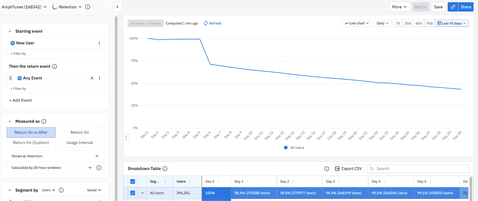
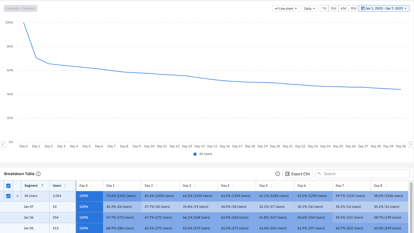
Retention holds near 99% through Day 5, steps down to about 71% on Day 6, then decays slowly to about 43% by Day 30.
Return On or After retention, day by day
Days since first useAll Users
Day 0100
Day 198.4
Day 298.8
Day 398.9
Day 499
Day 599.1
Day 671
Day 769.3
Day 867.7
Day 965.3
Day 1063
Day 1162.1
Day 1261.3
Day 1360.4
Day 1459.6
Day 1558.3
Day 1657
Day 1755.7
Day 1854.4
Day 1953.2
Day 2052
Day 2151
Day 2249.9
Day 2348.9
Day 2448
Day 2547
Day 2646.2
Day 2745.4
Day 2844.6
Day 2943.9
Day 3043.1

This chart plots Return On or After retention for each day since a user's first use. Read it left to right. Because "on or after" counts a user as retained if they return on that day or any later day, the early days sit near 99% and hold nearly flat through about Day 5. Retention then steps down to about 71% on Day 6 as the first weekly cohort churns, and it decays slowly from there to roughly the low 40s percent by Day 30. The takeaway: most new users come back at least once well after their first session, and the steepest single drop marks where that first wave of churn lands.

When you first open the Retention Analysis chart, the Return On or After retention graph by default shows retention for new users who returned any event. To see exact percentages, hover over the data point for the day you're interested in, or click it to inspect the users at that interval (refer to the Help Center article on Amplitude's Microscope feature to learn more).

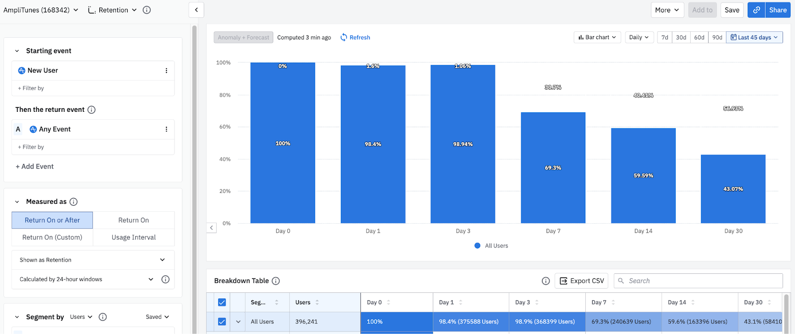
To see this data as a bar chart, click the Line chart dropdown. You can still use Microscope to get more details on users who weren't retained.

The same Return On or After data shown on the default day buckets, from 100% on Day 0 to about 43% on Day 30.
Return On or After retention on key days
Days since first useRetention
Day 0100
Day 198.4
Day 398.94
Day 769.3
Day 1459.59
Day 3043.07

This bar chart tells the same Return On or After story, summarized at Day 0, 1, 3, 7, 14, and 30. Use it for a quick read of the drop-off milestones without scanning every day: retention stays near 99% through Day 3, falls to about 69% by Day 7, holds around 60% at Day 14, and settles near 43% by Day 30.

In bar chart format, the X axis includes the most common units of time (days, weeks, months) by default.

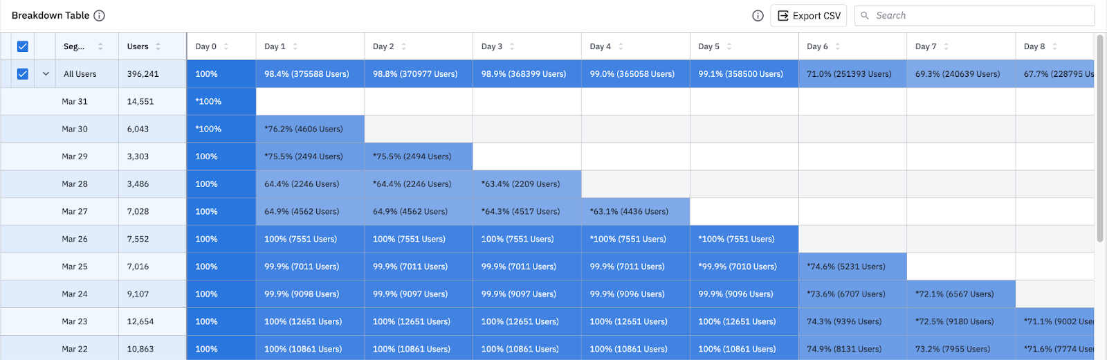
Amplitude also displays a detailed table breaking down the data, broken out by each user cohort and into individual day buckets.

Retention breakdown table by cohort entry date and day buckets

The method Amplitude uses to calculate Return On or After retention depends on whether you're looking at retention for all users or for a specific cohort entry date for your segment. Both the chart and the first row of the breakdown table below it show overall retention by default.

Overall Return On or After retention across all users, holding near 99% through Day 5 before decaying to about 43% by Day 30.
Overall Return On or After retention
Days since first useAll Users
Day 0100
Day 198.4
Day 298.8
Day 398.9
Day 499
Day 599.1
Day 671
Day 769.3
Day 867.7
Day 965.3
Day 1063
Day 1162.1
Day 1261.3
Day 1360.4
Day 1459.6
Day 1558.3
Day 1657
Day 1755.7
Day 1854.4
Day 1953.2
Day 2052
Day 2151
Day 2249.9
Day 2348.9
Day 2448
Day 2547
Day 2646.2
Day 2745.4
Day 2844.6
Day 2943.9
Day 3043.1

This chart shows overall Return On or After retention across all users, the default view in both the graph and the first row of the breakdown table. It holds near 99% through Day 5, steps down at Day 6, and decays to about 43% by Day 30, the same shape as the day-by-day view above. Compare this all-users curve against a single cohort entry date to see whether a particular day's users retained better or worse than your baseline.

Learn more about how the Retention Analysis chart calculates retention.

Return On (formerly known as N-Day)

Return On retention tells you the percentage of users that came back to trigger your return event on a specific day after triggering your starting event. The retention value for day 7, for example, tells you the percentage of users who returned on day 7 after their first use.

Regardless of whether you're looking at retention for all users or for specific cohort entry dates, Amplitude uses only one method to calculate Return On retention (unlike Return On or After). Both the chart and the first row of the breakdown table below it show overall retention by default.

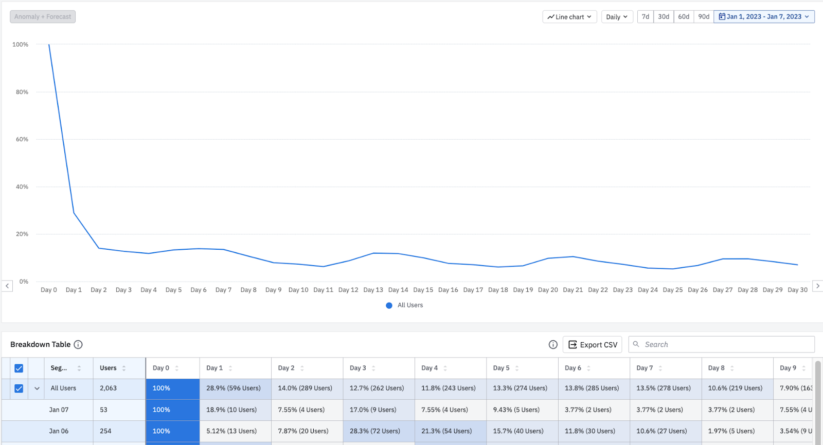
Return On retention collapses from 100% on Day 0 to about 29% on Day 1 and 14% on Day 2, then wobbles between roughly 6% and 12% through Day 30.
Return On retention (specific day)
Days since first useAll Users
Day 0100
Day 128.9
Day 214
Day 312.7
Day 411.8
Day 513.3
Day 613.8
Day 713.5
Day 810.6
Day 97.9
Day 108.5
Day 116.2
Day 129
Day 1311.8
Day 1411.5
Day 159.5
Day 167.4
Day 177
Day 186.3
Day 196.8
Day 209.8
Day 2110.2
Day 228.5
Day 236.5
Day 245.4
Day 255.2
Day 266.8
Day 279
Day 288.6
Day 297.6
Day 307

This chart shows Return On retention, which counts only users who return on exactly that day. Contrast it with Return On or After above: because each user counts toward a single day rather than every day up to their return, the curve collapses after Day 0, falling to about a third on Day 1 and roughly 14% on Day 2, then settling into a low single-to-low-double-digit band through Day 30. Use single-day retention when you care whether users come back on a specific cadence, such as the day after onboarding, and use on-or-after retention when you care whether users come back at all by a given point.

Learn more about how the Retention Analysis chart calculates retention.

Return On (Custom) (formerly known as Custom)

By default, Amplitude assumes you want to use predefined units of time, such as days, weeks, or months, as retention brackets for your retention analyses. Change this by using Return On (Custom) and instead create custom brackets for your Return On retention.

Because the custom brackets feature uses the same logic as Return On retention, you can use it to generate the equivalent of a Return On retention chart while defining the relevant units of time yourself.

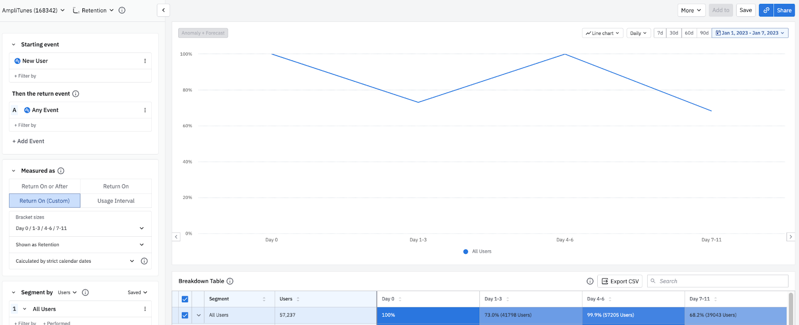
In the image above, there are four custom brackets defined:

  • First bracket: one day (Day Zero).
  • Second bracket: three days (Day 1-3).
  • Third bracket: three days (Day 4-6).
  • Fourth bracket: five days (Day 7-11).

The line graph shows the weighted averages of all the bracket retention numbers from the user cohorts within the selected timeframe.

Weighted-average Return On (Custom) retention across four brackets, 100% on Day 0, 73.0% on Day 1-3, 99.9% on Day 4-6, and 68.2% on Day 7-11.
Return On (Custom) retention by bracket
BracketAll Users
Day 0100
Day 1-373
Day 4-699.9
Day 7-1168.2

This chart shows Return On (Custom) retention, with one bar per custom bracket: Day 0, Day 1-3, Day 4-6, and Day 7-11. Each bar is that bracket's retention measured on its own, not a running total, so the bars don't step down from left to right. Because the brackets span different widths and each counts only the users who returned within its own window, a later bracket can read higher than an earlier one. Read each bar on its own terms rather than as a decrease from the bar before it.

In the table below, on Jan 4th there were 3,172 new users.

The Day 1-3 retention is 75.1%, meaning that 2,382 of the 3,172 users triggered the return event anywhere between one and three days after their starting event.

The Day 4-6 retention is 99.7%, meaning that 3,164 of the 3,172 users triggered the return event four to six days after their starting event.

Each chart can have a maximum of 100 custom brackets. Results for days with incomplete data show an asterisk.

Retention vs change over time

Sometimes you may need more than a straightforward view of your retention rates on specific days. You may want to know how a new release has affected your product's Day 1 retention rates, or if a new training program has had an impact on your Day 14 retention rates. In these cases, view your retention data over time by selecting Change Over Time from the Shown as dropdown.

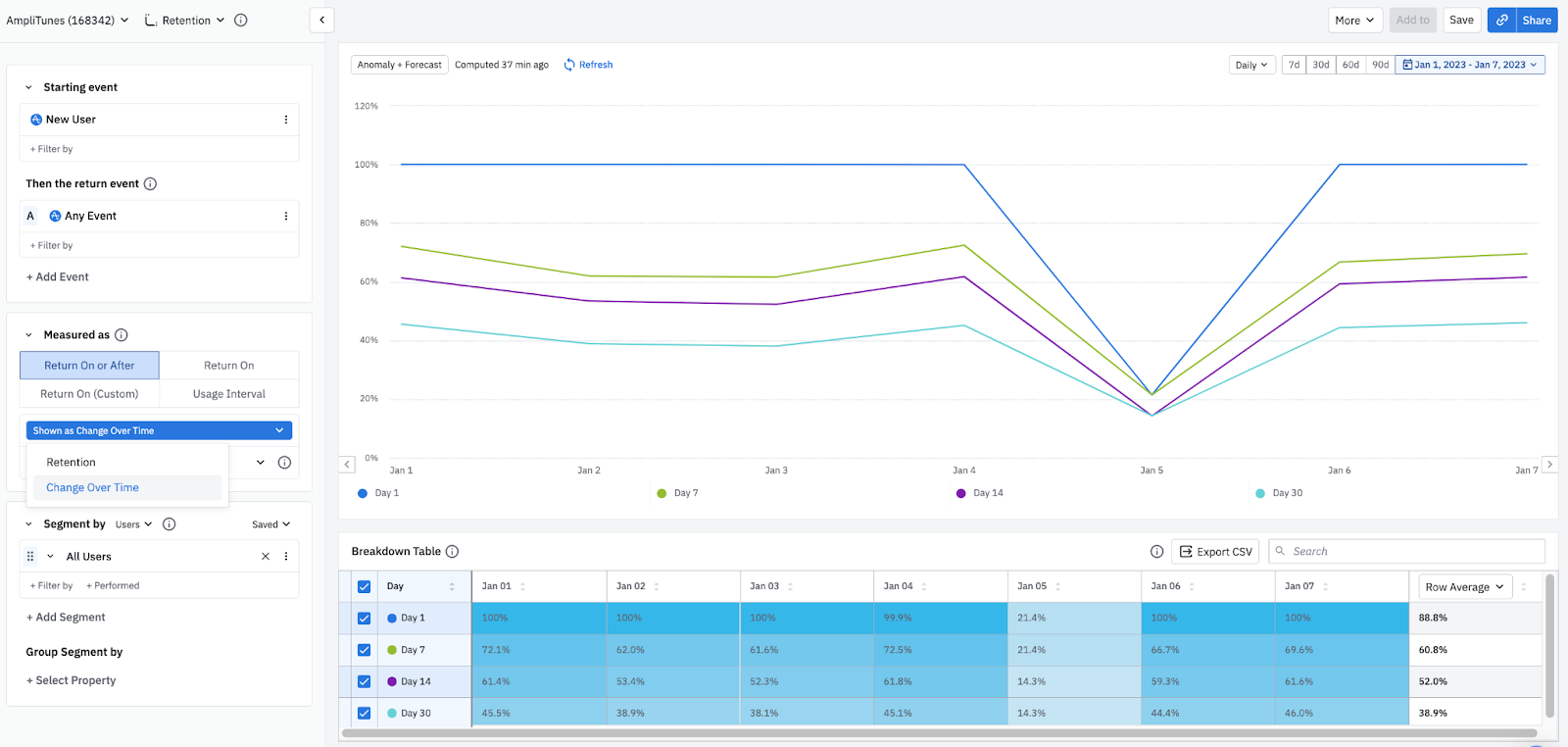
In this chart, the data shows all users who were new on January 1st. 100% of them triggered the return event on Day 1, and 72.1% triggered it on Day 7.

Day 1, Day 7, Day 14, and Day 30 retention for each new-user cohort from January 1 to January 7, with a shared dip on January 5.
Retention change over time
DateDay 1Day 7Day 14Day 30
2026년 1월 1일10072.161.445.5
2026년 1월 2일1006253.438.9
2026년 1월 3일10061.652.338.1
2026년 1월 4일99.972.561.845.1
2026년 1월 5일21.421.414.314.3
2026년 1월 6일10066.759.344.4
2026년 1월 7일10069.661.646

Each of the four lines follows one retention milestone, Day 1, Day 7, Day 14, and Day 30, across the new-user cohorts by calendar date. Read the chart date by date rather than as a single cohort's decay curve: it shows how each milestone moves day over day. When a cohort underperforms, all four lines dip together on the same date, and that shared drop is the signal to investigate: it usually points to a release, outage, or event that moved retention for everyone who started that day. Use this view to line a dip up against your release calendar and confirm what changed.

Amplitude calculates this percentage by dividing 1) the number of users from each new user cohort who triggered the return event on each retention day, by 2) the number of users who were new on the selected day.

The Return On Change Over Time data table shows the same data as the Return On Retention data table, but with the X-axis and Y-axis switched.

Further reading

The retention view is only one way of working with a Retention Analysis chart. You can also use the usage interval view to view the percentage of active users who triggered your selected events with a specified daily, weekly, or monthly median frequency.

Understanding how time works in a retention analysis is crucial to correctly interpreting your results.

You may also need more details on how the Retention Analysis chart calculates retention.

이 내용이 도움이 되었나요?