
If you haven’t stopped caring about vanity metrics—unique views, app downloads, registrations, etc.—you should.
A lot of entrepreneurs have; they’ve read The Lean Startup or heard about Facebook’s “7 friends in 10 days” growth hack and they’ve started to focus on metrics like daily active users (DAU).
There are two problems with DAU:
- It’s not actionable. You can’t do anything with a falling DAU except wonder what’s going wrong, and vice versa.
- It can be easily manipulated. Every company that releases its DAU numbers calculates them in a different way, making them effectively useless even for comparisons between apps.
When Facebook hit a billion active users in a day, every blog covering tech rushed to write about it. But according to Facebook’s stock prospectus, you don’t even need to be anywhere near Facebook to be counted as a “user.” All you have to do is interact with their third-party integrations, and that could mean anything from clicking a tiny blue thumbs up on an ESPN article or sharing a song on Spotify.
And this points to the real problem with measuring “active users.” Active is a functionally meaningless word. It is whatever you want it to be.
To actually improve your product and make it supremely sticky, you need to connect your definition of “active” to your growth goals: figure out what kinds of activities and characteristics lead to retention and then build your idea of an active user around those. Otherwise, you might have a serious problem on your hands.
You need to connect your definition of “active” to your growth goals.
Before we really get into it, let’s get on the same page with the definition of daily active users.
What Is Daily Active Users?
Daily active users (DAU) is the total number of users that engage in some way with a web or mobile product on a given day. In most cases, to be considered “active,” users simply have to view or open the product. Web and mobile app businesses typically consider DAU as their primary measure of growth or engagement.
Monthly active users (MAU) is the aggregate sum of daily active users over a period of one month. In most cases, to be considered a “monthly active user,” a person has to open or view an app at least once in the period of one month. The ratio of DAU/MAU is typically a measure of ‘stickiness’ for internet products.
Why It’s Dangerous To Rely On Your DAU
Let’s say you put your social music playing app in the App Store a couple days ago. Growth is slow and steady until a couple tech blogs find your app and start talking up how great it is—suddenly you’re getting thousands of downloads every hour.
Then you wake up one morning to an email from Apple: they’re going to feature you in the App Store! Things couldn’t be better.
To understand how fast your app is growing, you decide to measure your number of daily active users. Your definition of “active” is your measurement of user activity of anyone who has logged in on a given day. The resulting graph might look something like this:
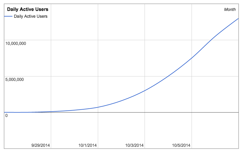
Time to break out the bubbly, right?
Well, not necessarily. You just launched, got a press bump, and got featured. If all a user has to do is download your app and open it once, then your “active users” are bound to go up as registrations increase—people are curious and downloading an app is a low-friction transaction with zero commitment.
The danger of defining your “active user” by a minimal metric like logins is that you’re just seeing a reflection of press and hype. It doesn’t measure real usage of your app.
Downloading an app is a low-friction transaction with zero commitment.
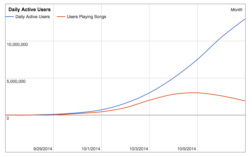
While your DAU is skyrocketing, the number of people playing songs is not. People are downloading your app and logging in, but most of them aren’t really using it the way it’s meant to be used. If you’re only paying attention to your DAU, you’ll miss the fact that real usage is dropping off—you won’t hear the canary in the coal mine of your app.
In the short term, this looks fine—new user registration is masking lost users from lack of engagement. But churning through users isn’t a long term sustainable strategy, and over time, you’ll face a harsh correction.
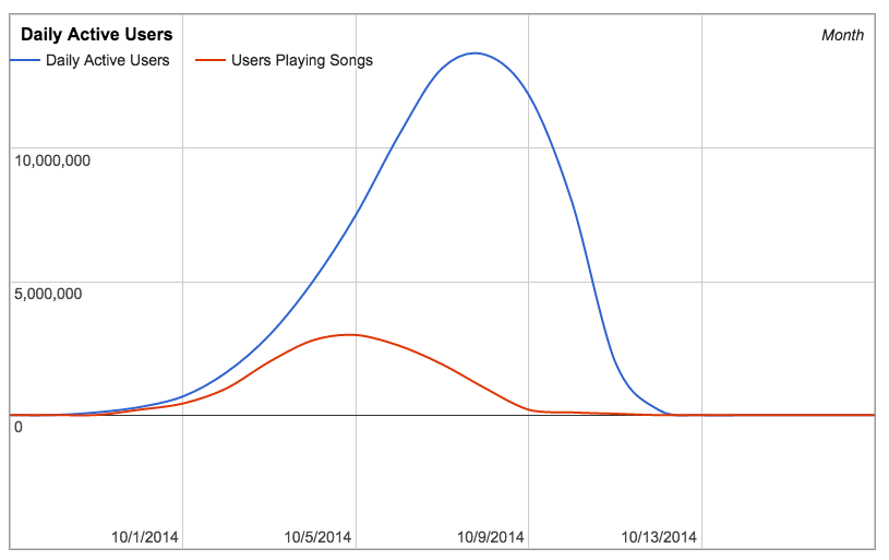
While your DAU might grow very quickly early on thanks to external factors, at some point your app’s growth is going to become dependent on its real usage. Media attention doesn’t create retention: you need stickiness to do that.
Stickiness is the stuff of Candy Crush, Instagram and WhatsApp. You know your app is really sticky when it becomes a part of your users’ lives, when it is opened not just once in a day but several times. That’s not a result you achieve just with good marketing: you get there when you build features that your users just can’t resist.
If you don’t have that real usage, your DAU is going to plummet as the novelty wears off—and your app will be sunk. Fortunately, there’s a simple solution: don’t let things get that far. Look at your real usage metrics and identify the features that get people coming back over and over again.
How To Identify Real Usage In Your App
The premise of DAU is basically solid—you measure the amount of activity in your app. Everyone wants to build an app that people are going back to every day. The problem is finding the right way to measure that activity so that you know how you’re actually doing, not how well the press is portraying you.
In other words, you want to figure out how often users are getting to the core value of your app. That’s the only thing that matters. Not download counts, not logins. To get there, you need to change the way you think about measuring activity.
It’s not about looking at a single kind of action over a period of time. It’s about looking at multiple actions and the people that perform them multiple times over a period of time. It’s about going through your app feature by feature and seeing how often people come back to use them.
How you interpret this data will depend on the type of app you have and how much activity you expect on the part of your users. If you’re Facebook, you expect users to be checking their Newsfeed, chatting and posting every day. If you’re an expensive, upmarket lunch delivery service, you might want to see people ordering at least once a week.
You want to figure out how often users are getting to the core value of your app.
First, you want a graph that lets you see what percentage of your overall users returned to your app day-by-day in the last week. Unlike your DAU graph, this graph doesn’t care about the total number of users you have, just the percentage that came back:
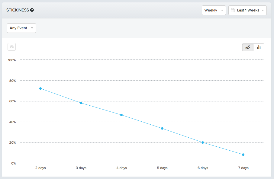
72% of users returned two days or more out of the week, 58% returned three days or more, and 33% returned five to seven days a week. Only 8% of users came back every day.
These kinds of numbers aren’t out of the ordinary. Even for apps without hockey stick-like DAU graphs, real usage is often just a fraction of DAU. And you’re just measuring how often people opened the app. Now you need to start investigating what features are driving the usage you do have.
Deliver on your core value
Analyzing your app’s usage often means confronting somewhat grim realities, especially if you’re used to measuring a loose metric like active users. But like a bitter medicine, looking at real usage is the only way that you’re going to figure out whether or not you’re delivering the core value of your app to your users or whether your popularity is just a flash in the pan.
What you want to do now is start focusing on real usage and forget about DAU. You want to see people engaging with your app and coming back every day. To make that happen, you need to look at your app feature-by-feature and identify how well it’s hooking your users. First, check out the percentage of users that came back to play songs:
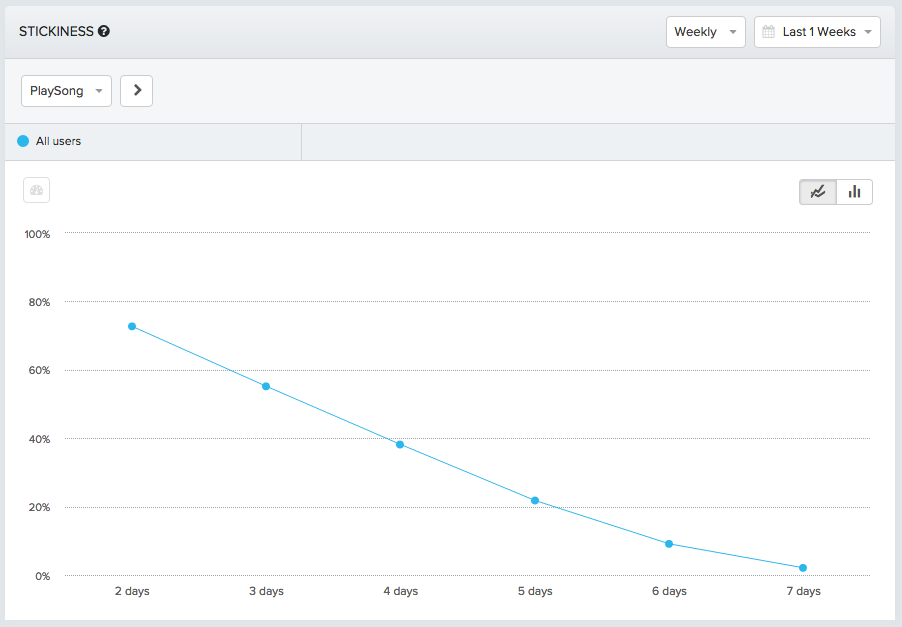
72% of users returned two days or more a week. 54% returned three days or more out of the week, 21% returned five days or more, and 2% came back every day.
Interestingly, the percentages of users who returned two or three days a week to play songs are about identical with the percentages of overall users who returned at all. From this, you can surmise that playing songs is the primary action that your most casual users perform.
Towards the power user end of the spectrum, though, you start to see drift between the two graphs. 8% of your users returned to your app every day, but only 2% returned to play songs everyday. Perhaps as your usage increases, other features take occasional precedence over playing songs.
This is the reason you don’t just check out one feature. If you want to really understand what’s going on, you’ll do a full-scale stickiness audit and check out every feature in your app. You might be surprised: sometimes the real core value of your app just isn’t what you designed it to be.
If you want to understand what’s going on in your app, you’ll do a full-scale stickiness audit.
Find Out Where Most Usage Happens
You probably have a pretty comprehensive plan for how your app is going to be used. Your users, however, don’t care. To quote Mike Tyson, “Everyone has a plan until they get punched in the face.”
The first time your users download and start using your app will be a kind of punch in the face. The features you thought would be popular won’t be; the features you thought were ancillary will be the core experience for some of your users.
To really understand what’s going on with your app, you need to see what features are vastly outperforming others. No matter what you thought the core value of your app would be or what an active user would look like, the only way to truly define those terms is to see what features are keeping people coming back the most.
Because your app is based around both song playing and being social, you could look at the rates at which users return to add songs to playlists:
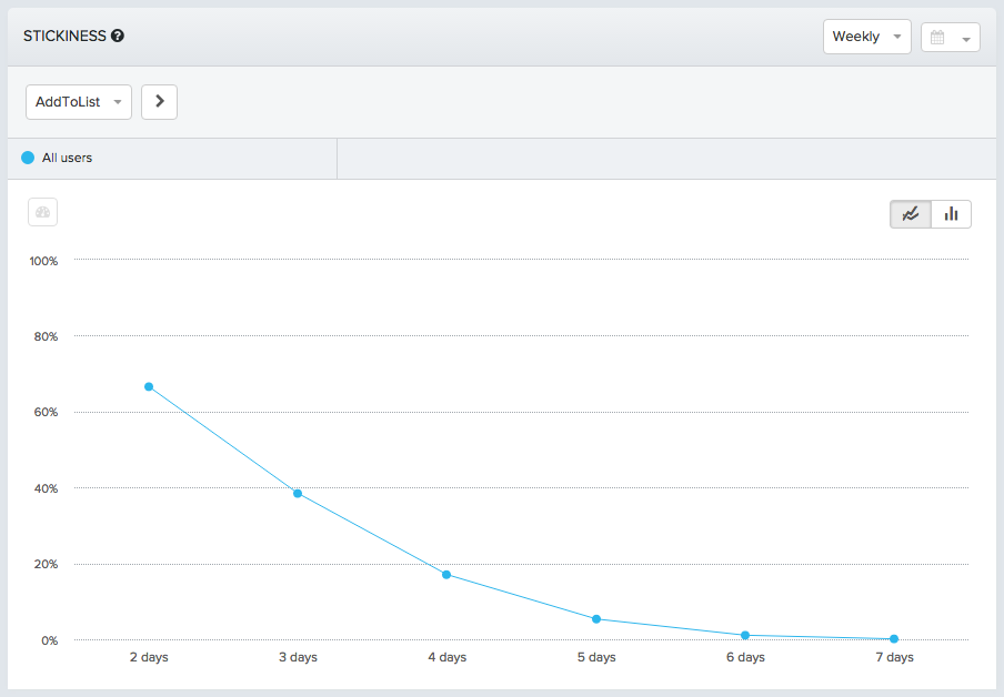
Not amazing—66% did it twice a week, 5% five days a week, and only .11% seven days a week. Of course, you probably wouldn’t see any music apps with metrics indicating that many users are adding songs to playlists every day. Most people make playlists so they won’t have to manage their music later.
But you can set that aside because you’re just looking for a good definition of active user, and that means finding features that people come back often for.
Try looking at who’s coming back to post community comments:
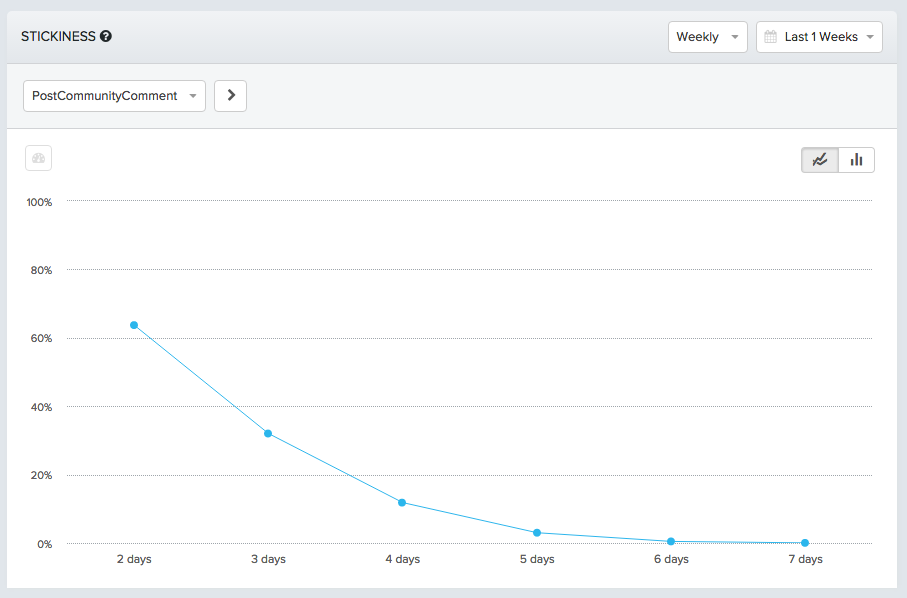
63% came back twice a week, 3% five days a week, and .04% seven days a week. These aren’t numbers that suggest posting comments is part of your app’s core value, but they’re not necessarily bad either; a sizable portion of your user base is posting a couple times a week, and music apps aren’t usually the most talkative.
Go through your app like this, feature by feature, and you will eventually be left with one that performs better than the rest. Once you find it, pin that feature to your definition of active user—next, you want to see how well that feature predicts retention over time.
Identify Features That Lead To Retention
When you define “active user” in terms of the feature in your app that keeps users coming back the most, you solve the central problem with DAU: measuring hype and popularity rather than real usage. What you can start to measure instead is how many users are actually getting to the core value of your app. You can use those measurements to plan for the future. And when it comes to the future of your app, nothing matters more than retention.
When you identify the feature that brings users back the most frequently to your app and best predicts long-term retention, then you have a feature around which to rally your entire team. This is the beauty of it: simply by re-defining your idea of “active user” with real usage metrics, you build a structure that incentivizes you to build your app in the right direction.
Here’s what an overall retention graph of your social music app looks like: for all users who signed up a month ago, it charts what percentage of them came back day-by-day.
Only 46% of users came back after a day, 20% after four days in, and about 4% after a month. Totally average for a mobile app, actually. But you don’t want average. Perhaps experiment with song-playing as a factor in retention. To do that, you just change your start action to Play Song. This way, the data collection begins:
- On a particular day (Day 0)
- For all customers who played songs on that day
The resulting graph will show how many of that cohort came back day-to-day for the next month.
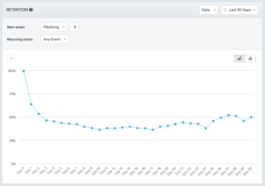
Users who play songs are retained to a much higher degree than your average user: 63% of users came back after a day, 45% after four days in, and about 50% came back on Day 30.
This is not just an improvement over the generic retention graph: these results indicate the beginnings of sustainable growth. Users who play songs are having your app’s core value delivered to them early, and they’re subsequently coming back quite often. Towards the end of the month, you even begin to see re-engagement from some users who’ve dropped off.
When you first check out your usage metrics, it’s not usually cause for celebration. But then these aren’t vanity metrics. Celebration’s not the point. The point is that even within a generally negative trend line you can still find out what features are performing well and what direction your app needs to go. It’s not a silver bullet, but it is a silver lining.
Take The Vanity Out Of Activity
The biggest problem with startups today, Chamath Palihapitiya says, is that ego gets in the way of delivering core value. Vanity metrics, flashy valuations and shimmering offices take precedence over product and business sense. K-factors, download counts and DAUs trounce experimentation, iteration and repetition.
At Facebook, Chamath ran the Growth team like a laboratory, constantly experimenting and trying new things to see what worked. What all their testing, experimenting and analyzing taught them, in the end, was one simple fact: that if users added 7 friends in 10 days they were retained with Facebook.
From then on, the entire company was united around a single goal: 7 friends in 10 days. That was the sweet spot for the delivery of Facebook’s core value.
It may also be true that Facebook could have achieved similar results going after something like “6 friends in 9 days” or “11 friends in 2 weeks.” But that’s not the point. The reason you delve into your data and come up with a metric like that, a kind of threshold point for long-term retention, is not to paint a scientifically precise picture of your app’s stickiness. It is to give your team something concrete to work towards, something that will be a goal for some time to come yet has also been proven to predict success.
It’s certainly a lot more achievable than “let’s get to a billion users!” That’s a huge number, and no one can conceptualize how to get there. But getting more users to friend 7 people within 10 days? That seems hyper-achievable. It’s the ultimate carrot, just dangling in front of your face.
Your app’s core value won’t be expressed in exactly the same way. You’ll have to find your own direction, and you won’t find it without extensive analysis of your features, usage and retention numbers. When you do, you won’t have a silver bullet.
You’ll have something better—a framework that drives you and your entire team to build out your app in the right direction, in the direction that leads to beloved products and long-term retention.