The (data-informed) Design Edition
Will Newton is a Principal Product Designer at Amplitude. He's worked in tech for his entire career, building strong habits and research practices. But it was when he invested in his analytics habits that he saw a profound shift in his ability to influence product decisions. In this session of "How I Amplitude," Will shares how he identifies user behavior patterns in data.


“Start with the user journey, identify persuasive metrics to build support for improving the user experience.”


A guide for using data to make design decisions
As you become more senior in your role, your work shifts from having your work defined for you to figuring out what things to do and getting people on board with your design decisions. And the best way to do that is by leveraging data.
We asked Will Newton, Principal Product Designer at Amplitude, to talk through his process. Here are the steps that he takes and we’ll share each step with examples on how to do this work in Amplitude.
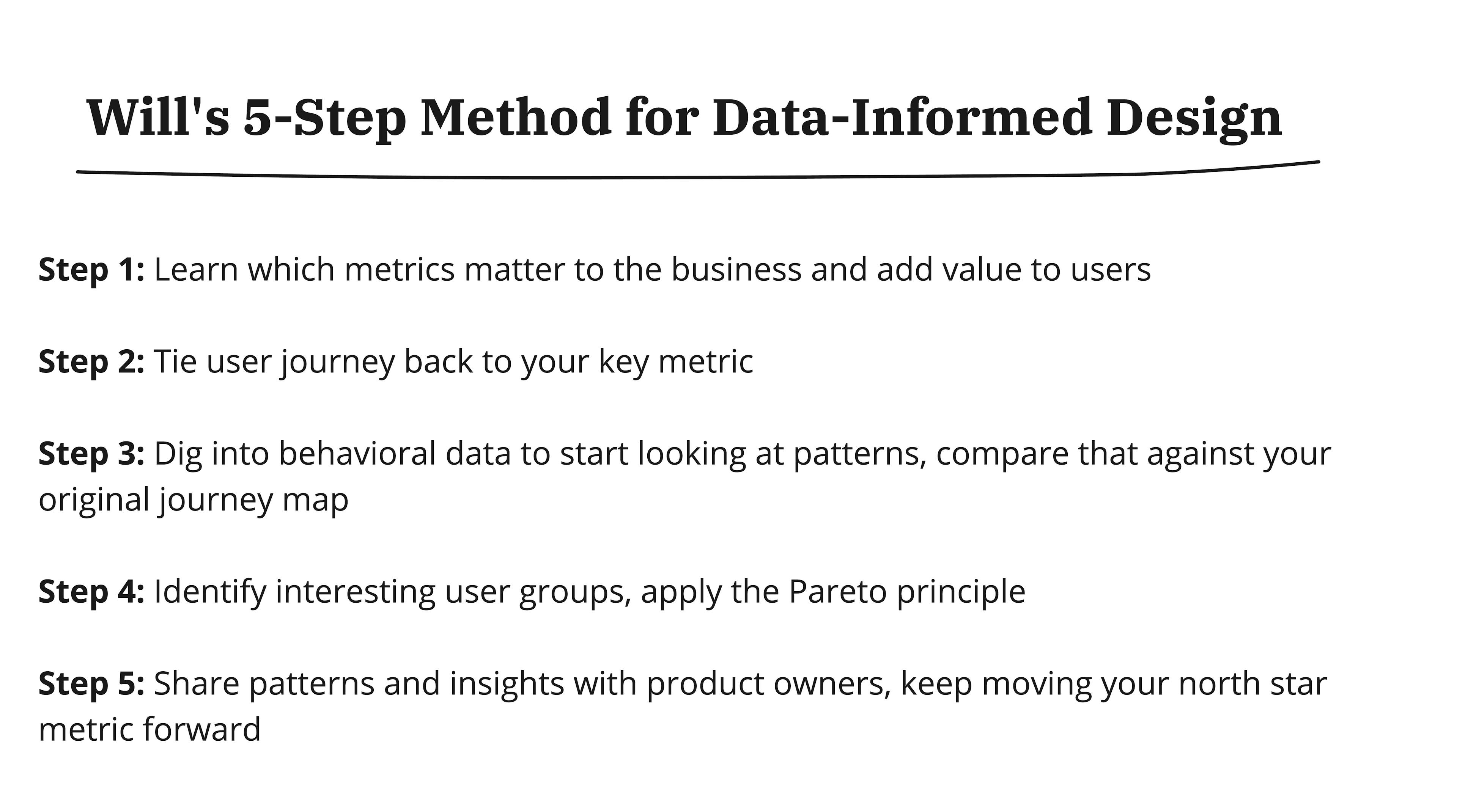
Step 1: Learn which metrics matter to the business and adds value to users
Data is a language and every company speaks it a little bit differently. It’s important to learn the lingo of your own company and figure out what matters to the business.
Your responsibility as a designer is use those metrics to break down the user journey to understand what is the experience that users are going through that ladders up to your key metrics.
Often times, companies will have a North Star metric that can be broken down into more sensitive input metrics. And that North Star metric is a leading indicator of those key metrics that the business cares about.
At Amplitude, our North Star metric is weekly saving users - how many users saved content on the platform every week. And this ladders up to account retention, a leading indicator of people continuing to buy Amplitude.
But getting people to save every week is tricky. And it’s really driven by the input metrics below - new user activation, save conversion, and improving efficiency to cut down time it takes to create charts.


Step 2: Map user journey back to your key metric
So start by mapping your user journey and use that as a starting point you can identify metrics in Amplitude and use those to make decisions.
Let’s go through this right now using Amplitude’s North Star metric as an example - weekly saving users. This means mapping out what happens before someone saves a chart.
Step 3: Build initial user journeys in Amplitude to start looking at patterns, compare that against your original journey map.
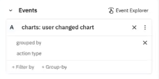
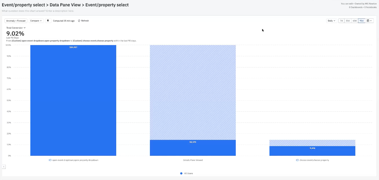
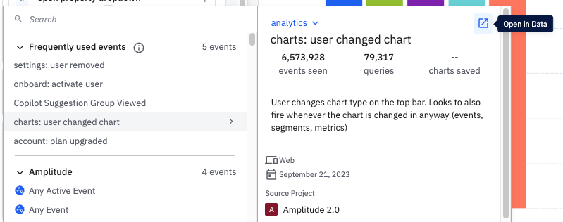
Take the three key events you identified in your user journey - in our case, we identified view chart, user changed chart, and save chart.


In this view, about 78% of the time, a user will change the chart, and about 25% of the time, they’ll save a chart.
But, when we mapped the user journey, we identified that the starting point might be creating a chart or viewing and editing an existing chart. So, how does the conversion rate change from making a new chart vs. editing an existing chart?
In Amplitude, we can compare these two metrics by grouping users who are creating new charts from scratch or working from a previously saved chart and are now editing it.

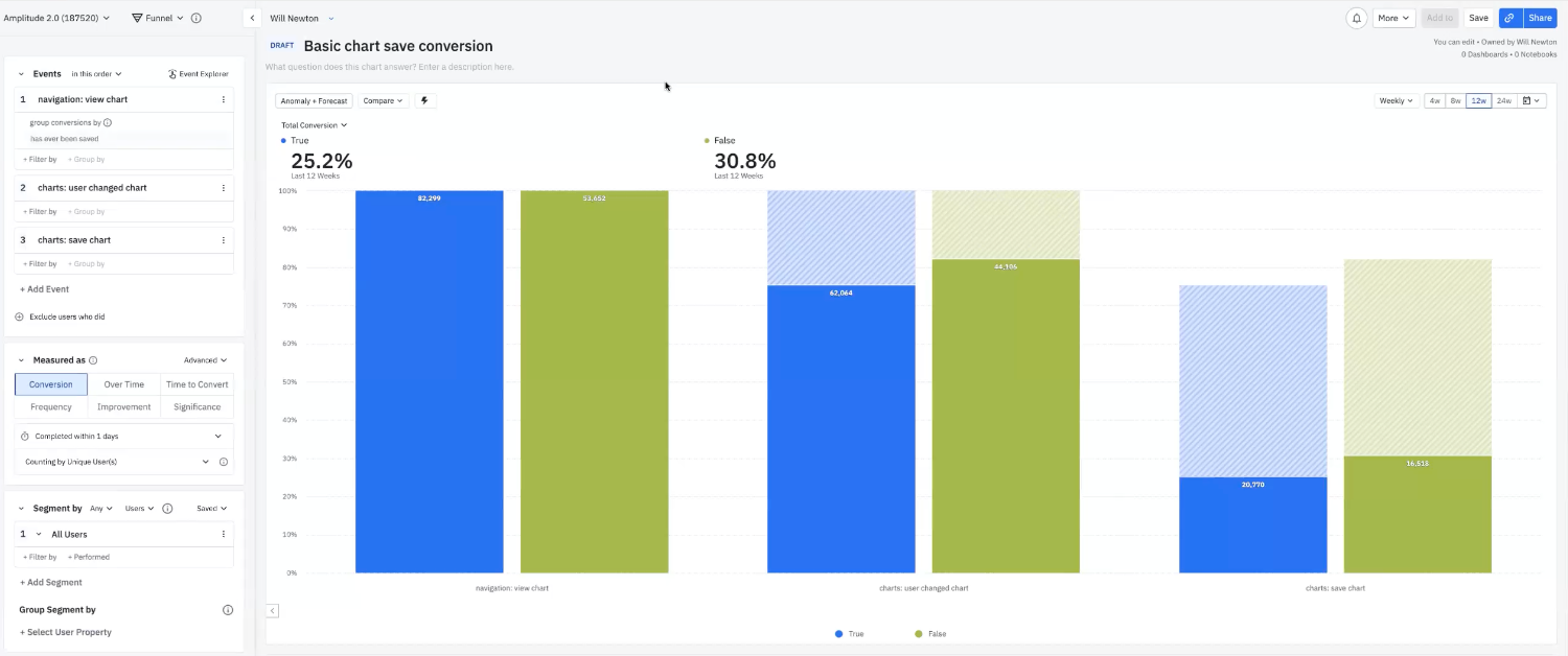
And it looks like charts that haven’t been saved before have a slightly higher conversion rate than charts that are being edited.
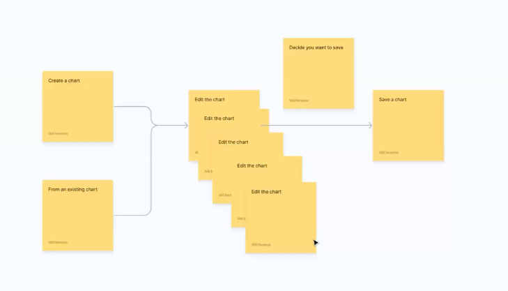
Now let’s look at other key steps in the journey. In our case, editing is a key step that happens before a user saves a chart. But how many edits happen before a save happens?
By looking at frequency, we can view the distribution of how many times people changed charts between viewing and saving.

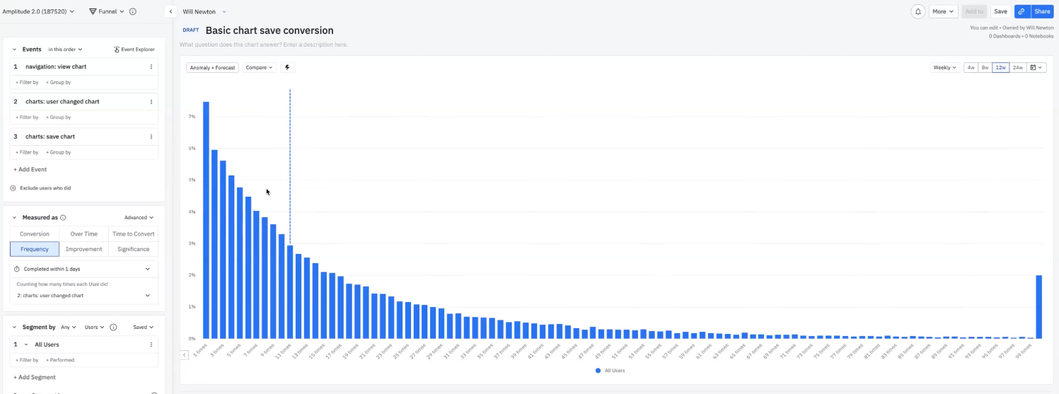
So the user flow is actually something more like this.

A few questions that come out of this are what types of edits are the most important? And what are the most common types of edits? We used the Engagement Matrix chart to show a two-way distribution between the percentage of monthly active users vs. the average number of times people triggered an event.

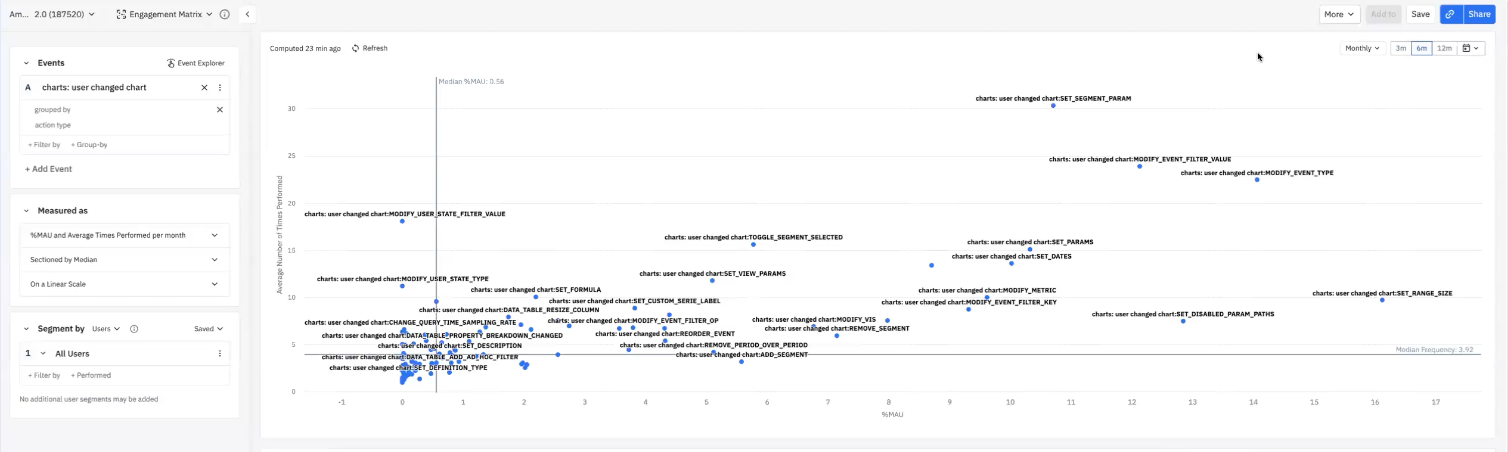
The most frequently performed edit is all the way to the right of the chart, and it’s to “set range size” which is changing the date. The other ones are to change event types, event filters, and then changing segment types
Which is why these edit types are grouped right next to each other in the design.

Going back to the user journey, what are the most common types of edits? And which of these might impact the conversion rate?
We want to create a feedback loop by cross-referencing what we know about the product experience, user journey map, and what we’re seeing in the data.
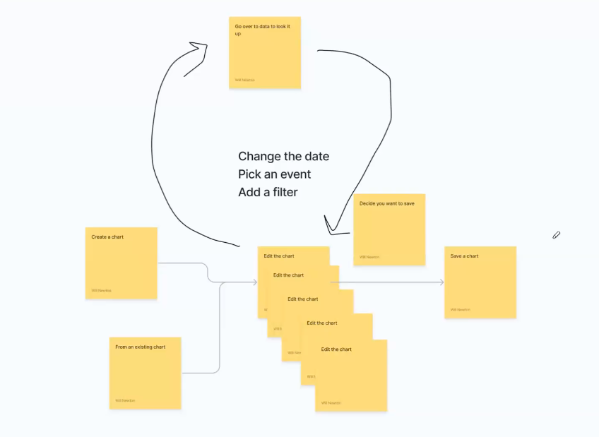
We can build a multi-funnel that compares key events that users are taking. In this case, we looked at the most frequently used edits before someone saves the chart - choose event, choose property, and choose date.


What’s interesting here is that maybe changing the date (purple bar) happens often, but this isn’t necessarily the best indicator that it will lead to someone saving a chart.
Hypothesis: Picking events and properties are important drivers to get people to save.
What happens when people are doing that? Let’s say we do some research and people show us the process of making charts. And what we learn that newer users who are more advanced actually go to “Data” to figure out which events and properties are the right ones. Because Data has more advanced capabilities to look at which events and properties to use. But now the user is being forced to toggle between different tabs to go from Data to Charts.
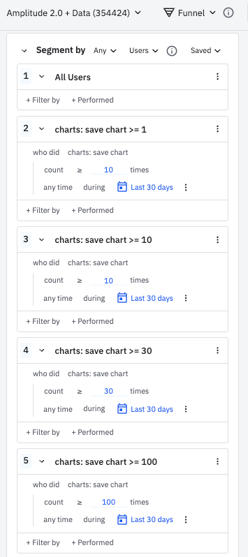
Step 4: Identify interesting user groups, apply the Pareto principle

Now we have a new flow in the user journey, and we want to know how frequently that happens. So we go back and build that journey.

And it turns out 9% of users toggled between the Chart and Data tabs.

But is 9% significant? According to the Pareto principle, it does matter! It depends on who makes up that 9%. If we dig into the data, what you’ll normally see is a smaller group of power users that are experts and a long tail of more casual users. So this might not be the majority of users when it comes to the flow, but it’s a very important workflow.
Step 5: Share patterns and insights with product owners, keep moving your north star metric forward
So let’s take this back to our North Star metric of weekly saving users. And what does it look like across people saving charts in the last 30 days? Let’s also look at segments based on usage, to help identify power users.

If we assume a power user can be identified by saved charts, then toggling between Data and Charts is a very frequent user journey path. And there’s a lot of friction in this experience.


And that’s exactly what happened. This insight was shared with the Product Manager of Analytics and the team implemented easier ways to toggle between the Analytics and Data tabs.

Final Thoughts from Will
Get in there and start understanding what’s real and what’s actually happening in the product. This starts to create a feedback loop between what users are actually doing back to what you think the user journey is. And finally a loop between user behavior, user journey, and your North Star metric!
Join the community!
Connect with Will and other practitioners in our community. The Cohort Community exists to help people become better analysts. We focus on actionable programs, sharing best practices, and connecting our members with peers and mentors who share in the same struggles.