User Return Time Retention Chart
Analyze the time intervals at which users return to the platform, providing insights into user behavior and engagement patterns. Suitable for product teams, marketers, and analysts aiming to optimize user retention strategies.

About this template
Marketing teams use this chart to analyze how quickly users return after their initial engagement. This helps improve retention strategies and optimize user experience.
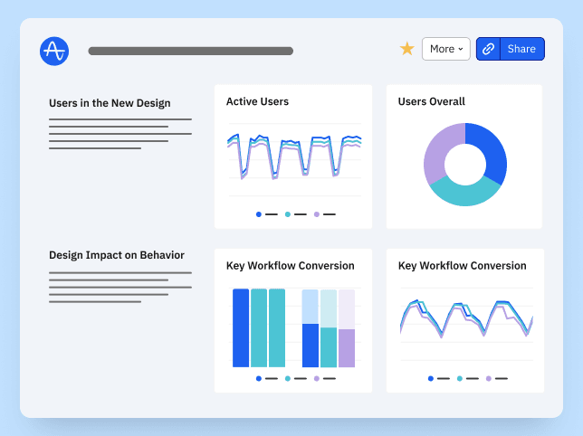
This chart template is a part of Amplitude’s template library, which compiles multiple charts, like this User Return Time Retention Chart, into a User Activity Dashboard Template. We have other User Activity templates that you can use to get more insights from your product.
How this template works
About Amplitude
Recommended Integrations
- Google Ads - Google Ads is an online advertising platform developed by Google, where advertisers bid to display brief advertisements, service offerings, product listings, or videos to web users.
- The Trade Desk - The Trade Desk allows advertisers to access a wide range of digital advertising inventory, including display ads, video ads, mobile ads, native ads, and more. Advertisers can use the platform to target specific cohorts based on various parameters such as demographics, interests, browsing behavior, and location.
- Customer.io - Customer.io helps you send automated email, push, SMS, and webhooks based on your customers’ activities and makes conversion tracking, optimization, and re-marketing easier.
Frequently Asked Questions
Amplitude is a leading digital analytics platform that helps companies unlock the power of their products. Amplitude guides companies every step of the way as they capture data they can trust, uncover clear insights about customer behavior, and take faster action. When teams understand how people are using their products, they can deliver better product experiences that drive growth.
Yes, Amplitude is free to get started. Our Free plan includes 2 million events per month, out-of-the-box Analytics and templates, Session Replay, Web Experimentation, and more—all at no cost.
Related templates

User Activity Dashboard Template

Product Design Leader @ Amplitude
UX Release Dashboard by Will Newton
Twilio Segment User Activity Dashboard


