Website KPI Dashboard
Boost web performance with our concise dashboard. Track daily users, session length, and user origins. Explore popular pages, post-landing actions, and user demographics. Perfect for marketers, analysts, and product teams optimizing web experiences.

About this template
Amplitude's website KPI dashboard is made up of useful charts to help evaluate your website KPIs and performance metrics.
- How many users are active each day?
- How long is the average session?
- Where are users coming from?
- What are the most popular pages viewed in any range of time?
- What do users most commonly do after landing on your product?
- What percent of active web users are returning?
- How long does it take for returning users to come back?
- What percent of active users are new users?
- Breakdown of these users by country
- Breakdown of these users by device family
- Breakdown of these users by platform
How this template works
About Amplitude
Frequently Asked Questions
Amplitude is a leading digital analytics platform that helps companies unlock the power of their products. Amplitude guides companies every step of the way as they capture data they can trust, uncover clear insights about customer behavior, and take faster action. When teams understand how people are using their products, they can deliver better product experiences that drive growth.
Yes, Amplitude is free to get started. Our Free plan includes 2 million events per month, out-of-the-box Analytics and templates, Session Replay, Web Experimentation, and more—all at no cost.
Related templates

Senior Product Manager at The Stepstone Group
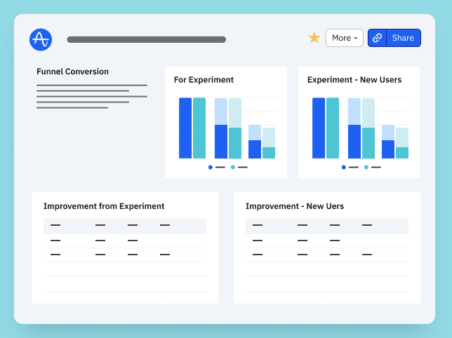
Dr. Bart's A/B Experiment Dashboard Template

Advisor (PLG / Product / Growth) @ The Product-Led Geek
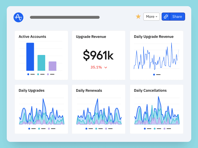
The Product-Led Geek Monetisation Dashboard by Ben Williams

ABM Dashboard Template


