Feature Value Frequency Chart
Analyze the frequency of users getting value from the feature, providing insights into feature effectiveness and user satisfaction. Useful for product teams, marketers, and analysts aiming to optimize feature usability and satisfaction.

About this template
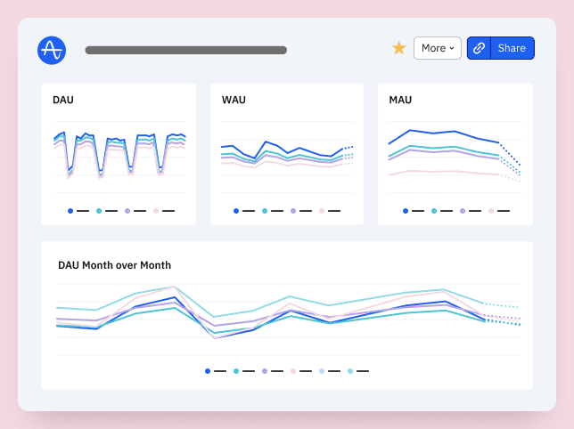
Data analytics and engineering teams use this chart to track how frequently users engage with high-value features. This helps identify power users and prioritize enhancements to key features.
This chart template is a part of Amplitude’s template library, which compiles multiple charts, like this Feature Value Frequency Chart, into a Feature Adoption Dashboard. We have other Feature Adoption templates that you can use to get more insights from your product.
How this template works
About Amplitude
Recommended Integrations
- Snowflake - Snowflake makes it easy to amass all your data, enable rapid analytics, and glean data-driven insights for all your business's users.
- Databricks - Databricks is a cloud-based platform that provides a unified environment for data engineering, data science, and analytics. Built on Apache Spark, it offers collaborative notebooks for teams to work with data, build models, and automate workflows across big data processing and machine learning tasks.
- Census - Census empowers data and business teams to sync cloud data warehouses to business tools so they have access to the data they need.
Frequently Asked Questions
Amplitude is a leading digital analytics platform that helps companies unlock the power of their products. Amplitude guides companies every step of the way as they capture data they can trust, uncover clear insights about customer behavior, and take faster action. When teams understand how people are using their products, they can deliver better product experiences that drive growth.
Yes, Amplitude is free to get started. Our Free plan includes 2 million events per month, out-of-the-box Analytics and templates, Session Replay, Web Experimentation, and more—all at no cost.
Related templates

Feature Usage by Device Chart

Head of Data & Analytics
Mobile Subscription App Engagement and Retention Dashboard by Olga Berezovsky from MyFitnessPal

Product Thought Leader
Feature Tracking Dashboard by John Cutler

