Don’t Let Big Data Cleanup Get in the Way of Insights
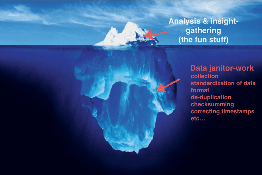
Data scientists spend between 50 - 80% of their time on the mundane work of big data cleanup.
A recent article in the New York Times expounded on the woes of working in one of today’s most buzz-worthy fields: big data. The article estimated that data scientists spend between 50 – 80% of their time on the mundane work of big data cleanup.
As Monica Rogati, VP for data science at Jawbone, put it:
“It’s something that is not appreciated by data civilians. At time, it feels like everything we do.”
If you’re reading this blog, chances are you already know that raw data is incredibly messy, and there’s a lot of data wrangling that needs to be done before you can start to run fancy algorithms over your data to glean insights. If you’re a data scientist tasked with discovering insights from user behavior on your app, you definitely know this.
Imagine for a moment just how many ways data can get mangled when you’re collecting streaming data from hundreds of millions of smartphones and tablets, which have hundreds of thousands of different software configurations, which are running on tens of thousands of different platforms — at the same time. Think about how much work it would take a team of data scientists to cleanup that data and transform it into a uniform, readable format, and face the daunting task of deduplicating and validating that data.
And only then is it time to find ways to analyze that data and draw out useful insights — the stuff your CEO actually wants to know.
Leave the data cleanup to us
Luckily for you, we’ve got the data cleanup covered. We’ve already figured out all the ways that your data can go wrong and how to fix them, so that you don’t have to. (In fact, our CEO Spenser recently gave a tech talk on this very topic, so check it out.)
We’ve also put your data in a nice, tidy format that’s ready for you to explore on our dashboards or, if you’re really into it, stored in a SQL Redshift database for you to run queries on to your data-loving heart’s content.
Don’t forget about data visualization
Once the data is cleaned up, of course, there’s the problem of figuring out how to represent the data visually. Once again, we do the dirty work so you can get straight to the fun part. We constructed our dashboards with the sole purpose of visualizing and investigating user data in useful, actionable ways, so that you can easily see metrics like daily active users, funnel dropoffs, and nth day user retention.
One example of the data visualization we do: real-time retroactive funnels. You can set up your funnel steps in a few clicks and visualize conversion rates for different segments, or user groups. Funnels show you exactly where your users are dropping off, and segmenting by user properties helps you figure out why.
In addition, there are a number of companies that specialize in visualizing whatever data you send their way: just hook it up and you’ll get beautiful graphs and pie charts ready for presentation. These include Tableau, Chartio, Periscope, and Looker, to name a few. These tools can take data from multiple sources — for example, Google Analytics, your CRM, and Amplitude — and create custom visualizations based on your needs.
Some of our customers integrate their Amplitude SQL Redshift database to one of these visualization tools for even more custom, in-depth analysis of their data.
More time to focus on your product
So what does all of this mean? If you want to understand how users are interacting with your app, you don’t have to spend 80% of your precious time on data janitor work.
That leaves more time for the really important stuff: finding user insights and improving your product.

Alicia Shiu
Former Growth Product Manager, Amplitude
Alicia is a former Growth Product Manager at Amplitude, where she worked on projects and experiments spanning top of funnel, website optimization, and the new user experience. Prior to Amplitude, she worked on biomedical & neuroscience research (running very different experiments) at Stanford.
More from Alicia


