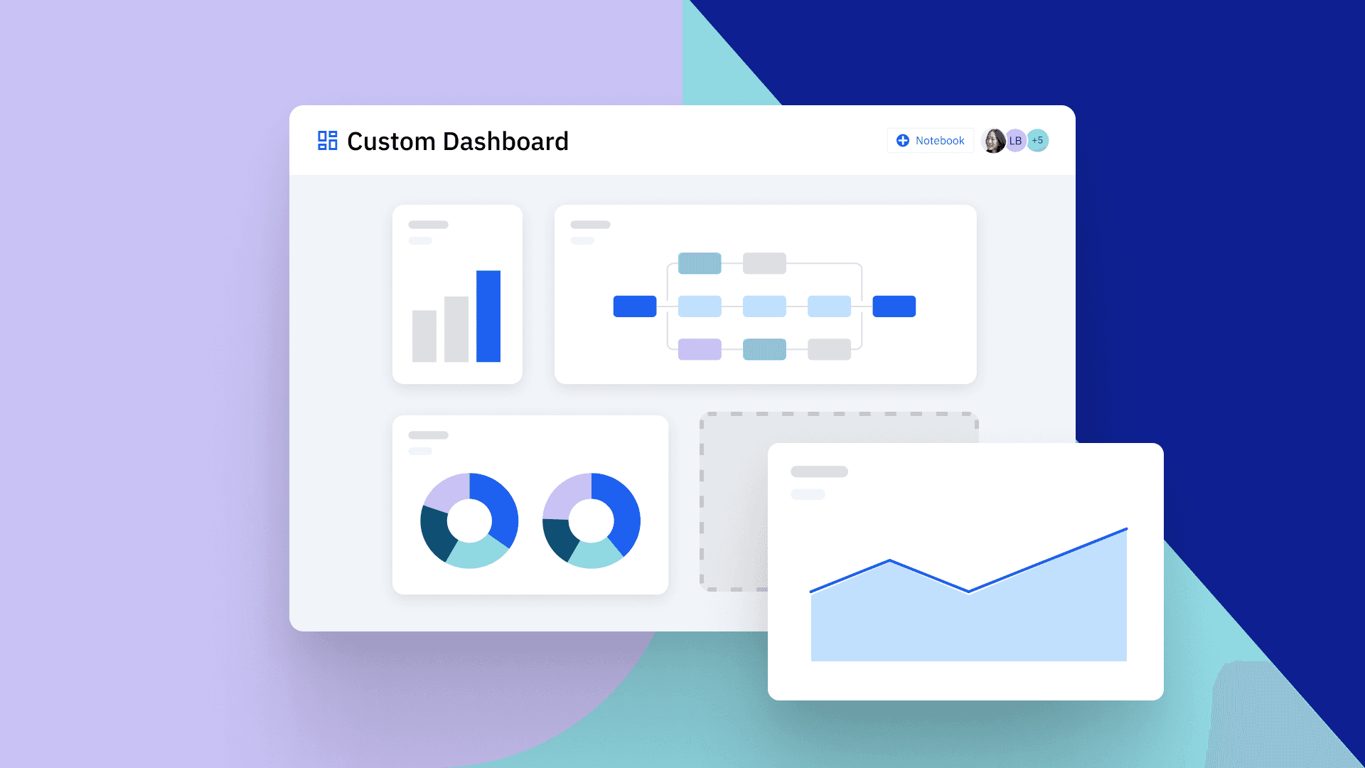
How to Build the Perfect Analytics Dashboard (7 Examples)
Learn what elements are part of an effective analytics dashboard and how to build the perfect one for your unique needs across product analytics, web analytics, digital marketing, and more.

Originally Published on June 10, 2022
An analytics dashboard is a data collection focused on critical metrics presented neatly on a user interface. It enables analysts to easily monitor the performance of a digital product or website by tracking various metrics like online conversions, engagement, retention, and more.
- An analytics dashboard shows an assortment of metrics that give you a picture of the status of your digital product or website. It enables you to see overall performance in only a few moments.
- Dashboards enable you to view analytics data at a glance, collaborate with others in your company by sharing the dashboard, and act on current and accessible data.
- Many people use analytics dashboards, such as C-suite executives, sales executives, product managers, marketers, etc. Dashboards are built with key design principles to help their audience make quick decisions.
- There are different types of analytics dashboards, such as product analytics, web analytics, digital marketing, ecommerce, social media, and content dashboards—all serving different purposes.
What is an analytics dashboard?
An analytics dashboard is any setup that visualizes important metrics and KPIs in real-time. They can be used for multiple purposes and track any number and array of metrics.
Typically, these dashboards include data from multiple sources and are curated to help audiences quickly understand how a product, website, or campaign is performing. Well-designed web or product analytics dashboards help you quickly make strategic decisions and track their impact.
Why use analytics dashboards?
There are multiple reasons why analytics dashboards should be used. For example, analytics dashboards can:
Help you act on current and accessible information. They report, analyze, and present data in real-time, enabling analysts to act on this current, reliable data. Since these dashboards are cloud-based, users can access them on any internet-enabled device.
Give you a bird’s-eye view of all analytics data. Dashboards make it easy to collect and organize relevant data into a single, convenient view. They improve the overall efficiency of business analytics by making it easy to analyze information visually, in whatever format you like (e.g., bar chart, pie chart, etc.).
Deloitte recently surveyed Chief Data Officers (CDOs) across multiple industries and found that nearly seven in 10 want to refine how they use insights and analytics—with three in 10 specifically mentioning dashboards and reporting as a key area of focus.
Enable you to share your data with people across your company. Sharing the dashboard with multiple people in your company enables cross-functional collaboration and brings everyone on the same page.
You can start a discussion around your analysis alongside the charts on a dashboard or use Amplitude notebooks to share additional context and key takeaways. You can mention team members in your comments or even integrate the dashboard into a team communication tool like Slack. This collaboration is helpful for teams to discuss and iterate on their findings and ultimately make great product decisions.
5 questions to shape your analytics dashboard
There is no one-size-fits-all approach to what an analytics dashboard should contain. A useful dashboard is custom-built to fulfill a certain purpose. When building a dashboard, work from data visualization best practices and ask the following questions to determine what to include.
1. Who is the dashboard being created for?
Start by establishing who the audience is for the dashboard. For example, if you’re creating a marketing dashboard, your dashboard might contain metrics like conversion rates, campaign ROI, and more. Adopting a human-centered approach will help you build dashboards that serve their audiences’ core purposes.
2. What questions should your dashboard answer?
Consider your dashboard’s audience's questions when deciding which reports to include. If the dashboard is being built for an ecommerce product manager, they might want the answers to questions like: What is the total sales revenue? What are the most popular product categories contributing to the total revenue?
On the other hand, a marketing manager might have questions like, which channels are bringing the most people to our website? What demographic or audience segment converts most often?
3. What are your data sources?
Analytics dashboards promise to bring together data from multiple places, but more data is not always better. It’s important only to include reliable and trustworthy data. Otherwise, there’s no guarantee your “informed” decisions will be the right ones for your business.
Primary sources (like Amplitude) are more reliable than secondary sources for data.
4. Does the dashboard tell a story?
When an analytics manager views their dashboard, it should provide a narrative about their progress or efforts. Craft a story from your data by ordering reports so they provide a clear, logical flow from top to bottom. This enables audiences to extract more meaningful insights from your dashboard.
Storytellers also consider what isn’t necessary to communicate their point. Avoid unnecessary information and be minimalistic in your selection of data for your dashboard.
5. Have you chosen the right type of data visualization?
Choosing the right type of visualization to include in your dashboard enables your audience to digest the data that’s presented to them easily. A bar chart or column chart might be best if you're comparing values. If you’re visualizing hierarchies or relationships, you might opt for a tree map. Percentages of a total make sense when displayed in pie chart form, whereas any metrics that include dates will be easier to read when displayed in a time series. Aesthetics matter, but functionality is a more important consideration when choosing visuals.
How to create an analytics dashboard
Tools like Amplitude make it easy to assemble an analytics dashboard, but they can’t do all the work for you. Follow these steps to create an analytics dashboard:
1. Define your goals and set KPIs: A clear purpose will guide you throughout the process, so make sure you know why you’re building a dashboard before you start. The questions you need answered, as well as the KPIs you’re tracking, will determine the type and amount of data you include.
2. Choose the right metrics: Only metrics that directly relate to your questions and KPIs have a place in an analytics dashboard. It’s tempting to pull in all sorts of data just because you can, but including unnecessary information makes a dashboard harder to use.
3. Choose your data sources and integrate them into your dashboard: Your company likely uses multiple sources of data—from site or product analytics to social media metrics to customer or sales data that lives in your CRM. Make sure your dashboard pulls in important and relevant data from every source. (On a related note, you’ll want to use a tool—like Amplitude—that offers a variety of easy integrations.)
4. Clean your data: Not every source provides complete data, and bringing together multiple sources may result in duplicate data or inconsistent formatting. Preparing and cleaning data takes time, but you won’t get useful insights until you have quality data to base them on. Using a tool like Amplitude with built-in data governance features is helpful so you don’t have to validate everything manually.
5. Design your dashboard: Now it’s time to put together the visualizations. Focus on clarity—data that’s easy to read is easy to act on. Also, keep in mind that your users may not be as technically savvy as you, so simplicity is better than a setup that asks users to do extra work.
6. Add interactive elements: Sometimes, teams want to dig deeper into the data to look for more (or better) answers. Make it easy for audiences to sort and filter data, zoom in on datasets, or compare metrics so they can get the answers they’re looking for.
7. Be ready to iterate: The way companies use data is always evolving, and as your teams become more data literate, they may think of additional questions that will help them perform better (or think about existing questions in a different way). Updating your analytics dashboard to keep up with changing needs will help your team stay on top of its process and continue to make smart, data-driven decisions.
Common challenges when creating an analytics dashboard
Ultimately, an analytics dashboard is only as useful as the insights you can glean from it. Avoid these issues that can get in the way of an effective dashboard build.
No defined objective
Without a goal to drive it, an analytics dashboard is just a fancy collection of stats. If your dashboard isn’t organized around a specific question or aim, it won’t be able to provide any useful answers. The context surrounding the metrics is as important as the metrics themselves if you want to make data-driven decisions.
Too much data
If a metric or dataset doesn’t further the efforts an analytics dashboard was built to guide, it doesn’t belong on the dashboard. Any extra data you include risks muddying the decision-making process.
Teams with a wall of metrics may stall rather than make any decisions because they’re unsure what to tackle first. Focusing your dashboard on key metrics makes it easy for teams to stay on mission.
Another complication of a too-full dashboard is teams focusing on the wrong things. Improving a KPI may mean sacrificing less important metrics—for example, decreasing your customer acquisition cost (CAC) by improving your ad targeting may bring in fewer but better prospects. Teams that see the “total visitors” metric decrease may pull back on their efforts even when they’re returning the results you’re after.
Inaccurate or low-quality data
It’s important for teams to trust that the data they’re looking at will lead them in the right direction. They need accurate and high-quality data to guide their important decisions.
First-party data is typically more accurate (and provides more context) and typically leads to more helpful insights. A useful dataset is also complete and consistent: all its fields (including metadata) are filled out to the same standard.
For example, say you’re trying to learn how to increase your ecommerce sales. A dataset that only includes the item(s) bought, the purchase price, and your company’s profits won’t be very helpful. Quality data would include metadata like the date, time, and device your customer used to make the purchase, plus relevant demographic information. It would also include details like whether the customer has shopped with you before, what brought them to your site, how many pages they visited and in what order, and whether they removed anything from their cart at the last minute or responded to in-cart offers or upsells.
Lack of audience awareness
If your users don't understand how to use a dashboard, they won’t get many insights from even the best metrics. Effective dashboards do most of the work for the audience. Carefully curate your metrics, layout reports logically, and make visualization choices that make the data as clear as possible.
7 examples of analytics dashboards and their uses
Analytics dashboards are used by a wide range of stakeholders, from manufacturing managers to customer service executives. Each role requires different data and a different type of analytics dashboard.
- CEOs and Senior Management Executives: Use management dashboards to make strategic decisions and convert complex data into actionable insights. They mainly want to know who their customers are and what their revenue is compared to the same time last year. Revenue dashboards give this information by providing data on total revenue, average revenue per customer, customer lifetime value (CLV), the number of new customers, and customer acquisition cost (CAC).
- CMOs and Marketing Executives: Use digital marketing dashboards to track important marketing KPIs through data visualization, with the goal of boosting overall marketing performance. They use information like the cost of acquiring each lead, conversion rates, and more to set targets for the future and monitor campaign performance.
- CFOs and Finance Executives: Use finance dashboards to gather information like operational expense (OPEX) ratio, gross profit margin, net profit margin, and earnings before interest and taxes (EBIT). They get an overview of all the money the company is earning (and spending).
- Sales Executives: Use customer dashboards to focus on high-level sales metrics, such as the number of sales, sales revenue, most popular products, high-value customers, etc. This information helps them create and implement an effective sales strategy to increase revenue and profits.
- Product Managers: Use product or user analytics dashboards to assess the success of their product. They use a combination of acquisition, activation, engagement, retention, and monetization metrics to know who’s using the product, how engaged they are, and how much money the product is generating.
- Marketers: Use marketing analytics, web analytics, SEO, and social media dashboards to track both top- and bottom-of-funnel metrics like conversions, traffic from different sources, the number and quality of leads, ROI on ad spend, content and campaign performance, and more.
Let’s look closer at some of the dashboards you can build and share with Amplitude.
1. Product analytics dashboard
A product analytics dashboard helps product managers gauge how successful a product or feature is by presenting specific product management KPIs. Some common product management metrics include:
- Reach or acquisition metrics: Paid subscribers, three-month active users, page or ad impressions
- Activation metrics: Percentage of activated users, number of activations
- Demographic metrics: User device type, user location
- Engagement metrics: Average daily active users, time spent on site or app, pages viewed, sessions per user, shopping cart or checkout abandonment
- Retention metrics: Churn, retention rate, or N-day retention
- Transaction or monetization metrics: Monthly recurring revenue (MRR), average revenue per daily active user, customer lifetime value, cost per acquisition
An example of a product analytics dashboard in Amplitude. Get started for free today.
Product managers can use product analytics dashboards to do segmentation or cohort analysis. Both analyses are done on user groups with shared characteristics, such as users who use mobile to access the product versus those who use a laptop to access the product. Data comparisons between user groups are helpful in putting things into perspective so that product managers can focus on the segments or cohorts that matter.
2. Web analytics dashboard
A web analytics dashboard gathers all the important metrics about your website traffic into a single custom dashboard. This dashboard shows you KPIs like:
- Page views, bounce rate, pages per session, session length
- Goal completions, such as form fills, lead generation, or sales conversions
- Performance by traffic channel and traffic source
- Website or landing page visits, bounce rates, and conversion rates
- Statistics for which browser or device the user is using
- Campaign performance data like campaign costs or campaign ROI
An example of a web KPIs analytics dashboard in Amplitude. Get started for free today.
Accessing these KPIs on a web KPIs dashboard enables you to analyze what’s working and what isn’t, so you can drop your less effective marketing efforts and scale up the ones that are most profitable.
3. Digital marketing dashboard
This dashboard allows you to track the results of all your digital marketing campaigns from one place. You can see information like organic search traffic volume, PPC metrics, your email campaigns' performance, and even social media metrics all in one dashboard. A digital marketing dashboard has KPIs like:
- Campaign performance data like cost-per-click, click-through rate, and conversion rate
- Session length, user paths, page depth, and other behavioral analytics
- Bounce rates to know how long users stay on your web pages before they go somewhere else
- Traffic source performance (search engines, social media, paid ads, etc.)
- Conversion rates (sales, email newsletter sign-ups, etc.)
An example of a marketing analytics dashboard in Amplitude. Get started for free today.
Marketing analytics dashboards give a bird’s-eye view of your full marketing funnel to show what’s working and what’s not.
4. SEO dashboard
SEO is a long-term marketing strategy, and small changes can bring big results, so it’s important to know your metrics. This dashboard example gives you a lot of insights into your company’s overall SEO strategy. KPIs included in this SEO dashboard example are:
- Visitor sessions (number of organic visits, bounce rate, page load times, etc.)
- Organic landing pages (how many visits by channel and device, new vs. returning visits, etc.)
- Conversion rates (new conversions, new revenue, and transaction data strictly from organic traffic)
- Top-performing keywords that generate traffic
An example of an SEO analytics dashboard in Amplitude. Get started for free today.
Seeing this information makes it much easier to pick the best SEO and content marketing efforts so you can focus on doing more of the same.
5. Ecommerce dashboard
If you sell products or services on your website, the ecommerce dashboard helps provide data on every stage of the sales process. The ecommerce dashboard includes KPIs like:
- Traffic numbers and source
- Number of ecommerce transactions and ecommerce trends
- Total ecommerce sales revenue
- Product-specific sales (exact quantity sold and revenue generated for each product)
- Product conversion rates by marketing channel and device type
An example of an ecommerce analytics dashboard in Amplitude. Get started for free today.
Viewing broad ecommerce data with this custom dashboard will make it easy to see which products are the most successful, which channels lead to the most sales, and which onsite behaviors correlate with conversion. With this information, you can scale up your most successful ecommerce campaigns and drive more revenue.
6. Social media dashboard
This example dashboard enables you to track your important social media KPIs. A social media reporting dashboard includes metrics like:
- Number of likes and followers
- Number of impressions to assess your content’s reach
- Social engagement metrics (shares, comments, clicks, etc.)
- Popular posts (social engagement metrics on a per-post basis)
An example of a social media analytics dashboard in Amplitude. Get started for free today.
Each social platform has its own unique reporting method, so tracking all this information across multiple social media sites is a lot of work if done manually. Aggregating it all into one single dashboard makes it much easier to see which sites are giving you the best return on your efforts.
7. User analytics dashboard
Track your users’ activity and engagement to guide your product decisions with a user analytics dashboard. These dashboards are useful for teams looking to improve the customer experience or understand how specific audience segments interact with their product.
A user analytics dashboard includes:
- Activity charts (active users, new users, returning users, the average period between sessions)
- Behavioral data (session length)
- Demographic data (device type, country, platform)
An example of a user activity analytics dashboard in Amplitude. Get started for free today.
A first-party data source like Amplitude enables you to gather this information in real-time and build a user activity dashboard that shows how customers are interacting with your product. Behavioral data makes it easy to identify points where your users are dropping off and test UX tweaks to bump your retention.
Data-driven growth is easy with analytics dashboards
Digital products make gathering a lot of data easy, but it’s not always easy to organize and use. An analytics dashboard helps cut through the noise so you and your team can track the metrics and KPIs that matter. With that data at your fingertips, it’s much easier to make product decisions that address your users’ wants and needs.
Analytics dashboards are a flexible medium that can be customized to answer almost any question. And, with a tool like Amplitude, it’s easy to get started with a simple visualization of key metrics. Lead your company to the next level of data-driven decision-making by creating your first one today.
Ready to create an analytics dashboard? Try our self-service demo, or explore your own data with a free Amplitude plan.


Rox Chang
Senior Solutions Architect, Amplitude
Rox Chang is a Senior Solutions Architect at Amplitude, helping startups and large companies maximize the full potential of Amplitude to build better digital products. He is a self-proclaimed Amplitude whiz who finds purpose through coaching and bettering the lives of others. Rox has 8+ years of experience in enterprise software consulting and graduated with a degree in Mechanical Engineering from the University of Florida.
More from Rox


