The Evolution of Amplitude Charts
We're simplifying chart creation and making it easier to go further with your analysis.

Why is a change necessary?
Over the past few years, we’ve learned a lot about how product teams think about data and how they answer their own questions on our platform. And the net: things have changed. Our users have changed, user expectations have changed, the market has changed, and “product analytics” has become more commodified, with established patterns becoming prevalent across tools. It was time to take a step back and think long-term about the evolution of analysis in Amplitude.
At Amplitude, our customers are part of our team and heavily influence our development process. As we’ve learned from our users, we’ve taken those principles and applied them to the foundation of our redesign. We also realized very early on that an orientation shift like this would be difficult but necessary for stepwise change. From initial concept testing and discovery to card sorting and early prototyping — we worked with customers to pilot the experience. At the same time, we iterated on the details and measured improvements over time, significantly impacting the design and our rollout and change management strategy.
How we’re simplifying the chart experience
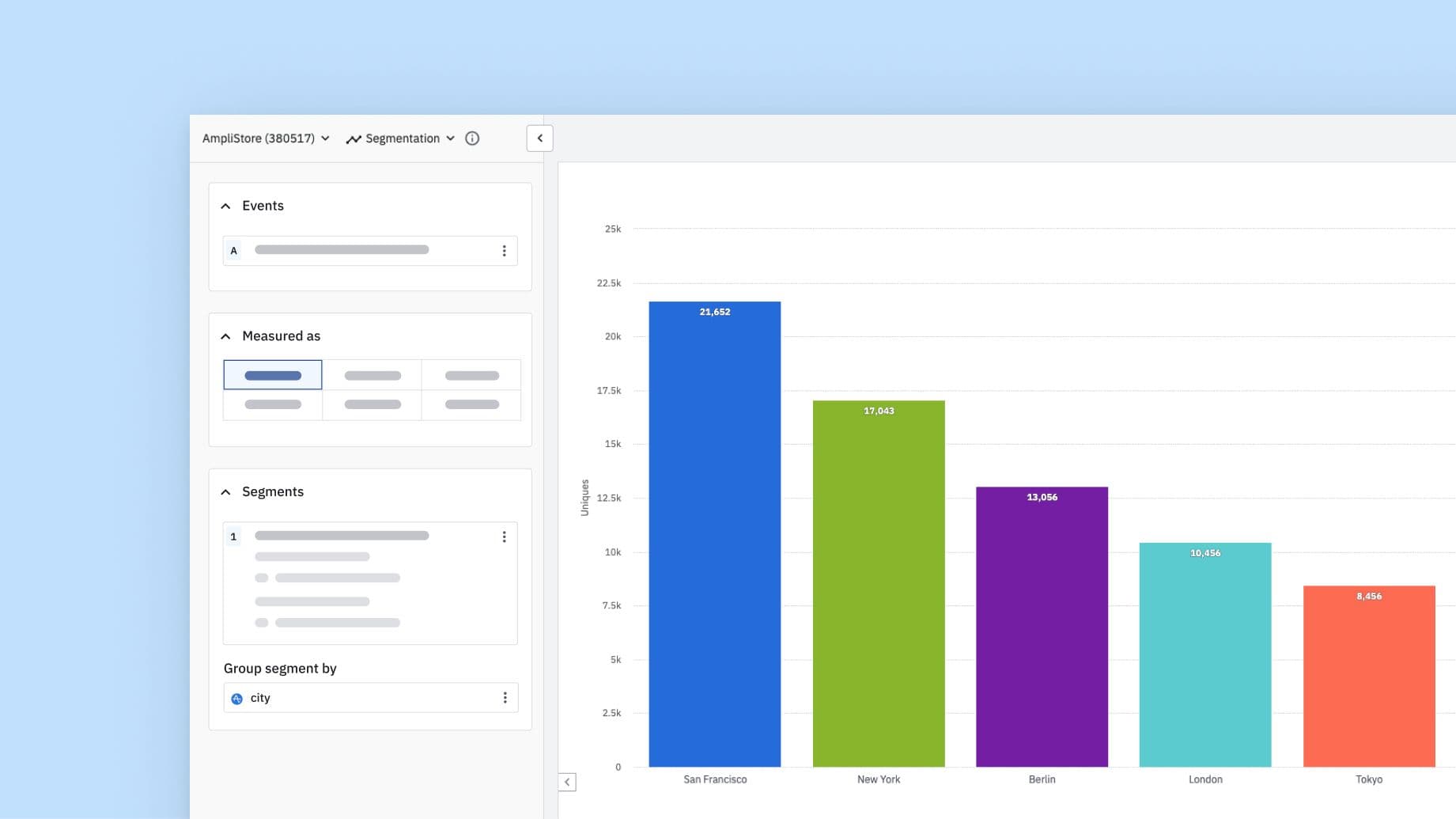
Most charts created in Amplitude take up very little real estate for the controls. Over 60% of saved event segmentation charts contain only one event, and a whopping 90% only contain one user segment. When that’s the case… why should the controls span the entire screen and bump the chart off the bottom of the page? Getting started with Amplitude should be simpler, so we introduced:
- Guided, top-down structure with a linear flow so users can quickly orient themselves, making learning and teaching Amplitude easier than before
- Side-by-side view with controls on the left and the chart on the right enables instantaneous feedback on how changes impact the chart, helping users better explore their data
- Progressive disclosure where less-frequently-used functionality is tucked away (yet accessible when needed) to increase the perceived simplicity of the interface and help graduate users to more advanced concepts
We’re looking out for power users, too…
While our new control design helps new users, advanced users need flexibility; now Amplitude lets you analyze user behavior and business metrics in more ways than ever. We’ve also introduced:
- More real estate for complex queries with a new responsive layout; when you drag the controls, the segment block snaps to the top & provides a more familiar layout with more vertical room to expand on complex queries.
- Flexible inline blocks to unlock powerful new features. In Funnels, you can now compare multiple events, mark them optional, and even define custom events in line without creating new objects!
- Centralized object model that lets you avoid duplicate analysis creation by standardizing on analysis in Amplitude: including custom events, metrics, segments, and cohorts.
Our opinion of the future of analysis in Amplitude
The layout is important – but not as important as trustworthy data. Looking ahead at Amplitude, we leveraged our learnings from data governance and applied design principles to create a chart system that leverages standardization, modularity, and shared patterns.
Standardization: improving data trust and confidence:
One of the most painful parts for new teams learning to use the platform is figuring out what events to use for building their own charts. For many of our users, they care about being able to quickly verify that something is correct. Enabling you to build inputs for re-use is the foundation of this system that improves the confidence of novice and power users alike.
Modularity: managing complexity through progressive disclosure:
Queries are inherently complex. Rather than trying to hide complexity, we’re leaning into managing complexity by leaning on the principle of modularity. Each element has different variants, or modes, so that data analysts and the data curious alike can both use the same elements, but have a different experience based on their situation.
Shared patterns: predictability and learnability:
Because these ‘modules’ of a query each behave in a consistent way, they become easier to learn to re-use. Visually and functionally representing abstractions like events, metrics and users in a consistent way will unlock value for our customers simply by the fact of increased adoption across the org
What can you expect?
We’re very excited about this vision for Amplitude, but we know that change can be hard, especially for a critical tool that you use every day. As the saying goes in product design, “the best interface is the interface you already know.” This is why we are initially releasing the redesigned controls (in Beta) to all Amplitude customers, on an available-to-try basis! All you have to do is click “Try our new look” in the upper right corner of any available chart type. You can opt-out at any time.
This way, you get to try the new experience, send us your feedback, and we’ll continue to make improvements and evolve this system together. As always, we look forward to hearing your feedback and how we can continue to improve the product! You can submit feedback/questions in-app (bottom of the control panel). Happy analyzing!

Will Newton
Principal Product Designer, Amplitude
Will Newton is a designer at Amplitude and lover of coffee and code. He snacks on data for breakfast.
More from Will


