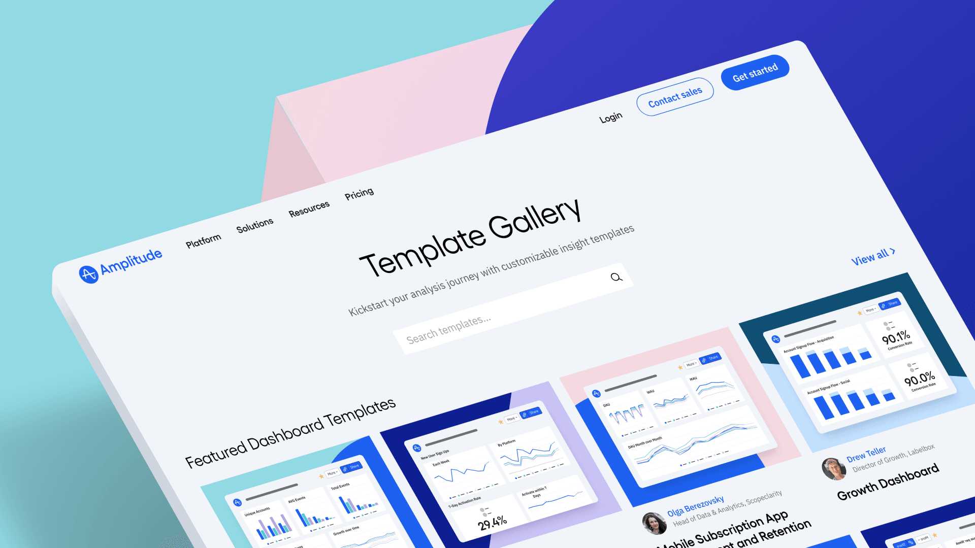
Free Analytics Templates: Introducing Amplitude's Template Gallery
Unlock data-driven insights instantly with Amplitude’s curated charts and dashboards.

Getting started with analytics often feels like an uphill battle. Everyone on your team needs to make data-driven decisions, but not everyone has the technical know-how or time to learn complex analytics tools. And when reaching your goals is upended by data challenges, it’s seriously frustrating (to say the least).
At Amplitude, we understand that struggle. That’s why we’re making analytics easy to start and use right out of the box. One way we’re making it easy is with our new gallery of analytics charts and dashboards.
Now, you don’t need to be an analytics expert or spend hours trying to become one. You don’t even have to know what you want to measure or build a single chart to start getting value. In just a few clicks, you can have a readymade chart or dashboard created by industry experts, for common use cases, or tailored to your industry—saving you time, effort, and frustration. In the gallery, you’ll find plug-and-play analytics templates for your top KPIs and those that dive deeper into areas like acquisition, activation, and retention.
Introducing the Amplitude Template Gallery.
Finding the perfect analytics charts and dashboards
Let’s say, for instance, that you want to know what percent of your daily active users react with emojis. That template’s ready for you. Or if you’re in fintech and want to know how long it takes your users to transfer money, that’s ready for you, too. So are the ones that show you new user channel join times, user resurrection rates, and funnel conversion rates (to name just a few).
When you hop around the Template Gallery, you’ll see use cases and dashboards created by leaders across industries and areas of expertise designed to get to core insights quickly. This not only smooths out the early learning curve but also increases time to value. Check out a few examples of the charts and dashboards you can get started with today:
Feature Adoption Dashboard
Created by OpenView’s Kyle Poyar
Kyle Poyar is a growth strategy expert with vast experience in SaaS and tech industries. As OpenView’s Operating Partner, Kyle advises businesses on go-to-market (GTM) strategies and product-led growth (PLG), specializing in monetization and pricing strategies. Kyle created a dashboard to help you analyze feature monetization more effectively.
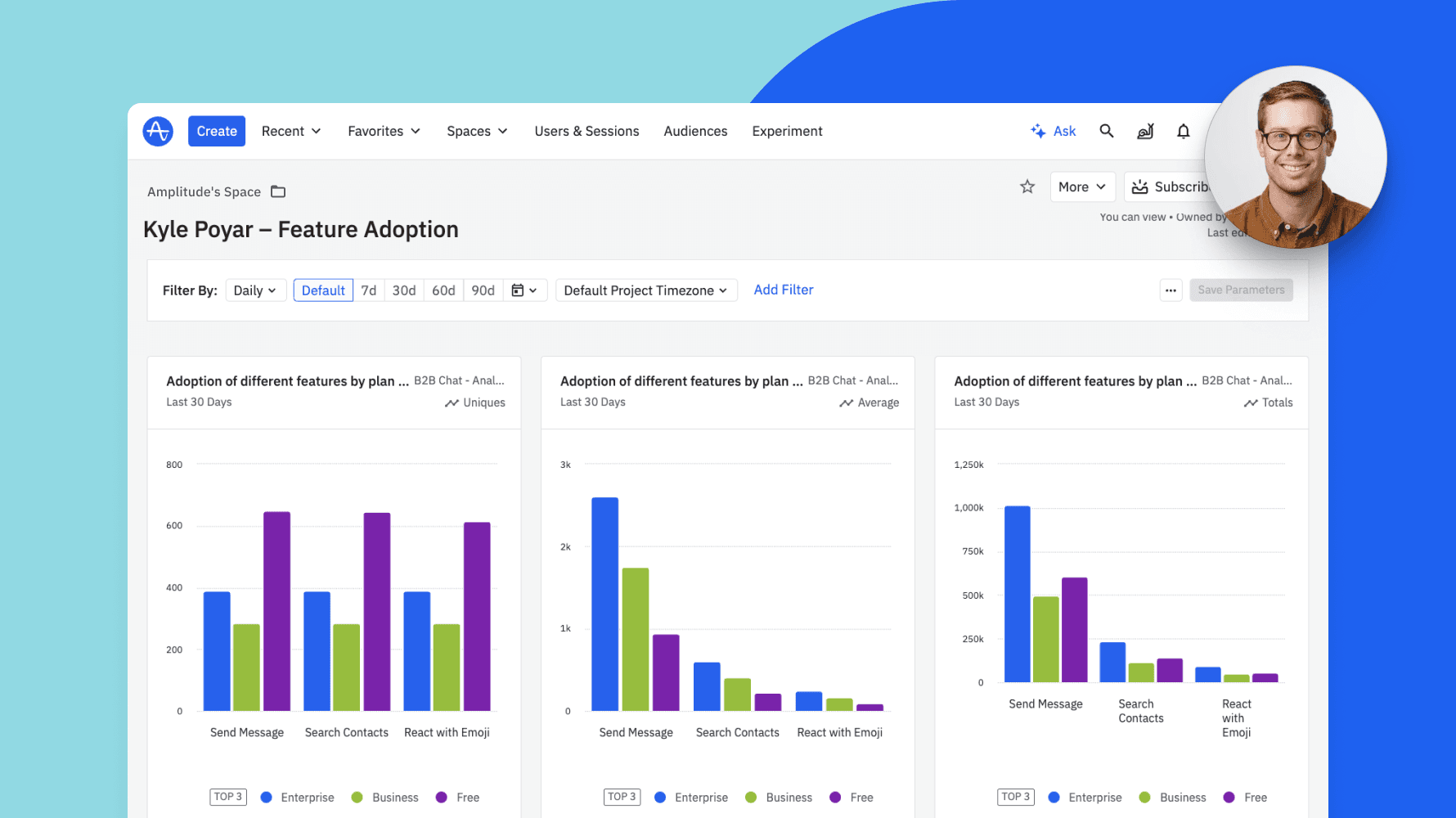
“Monetization improvements are the fastest path to revenue, but we rarely have access to the right data to evolve our strategy. Should we sell our new feature as an add-on or include it in an existing package? Or is it the right time to introduce a new package altogether? Use this dashboard to audit the existing monetization strategy and identify tangible insights into how to improve.”
—Kyle Poyar, Operating Partner, OpenView
Main Topline Activation KPI Dashboard
Created by Dropbox’s Elena Verna
Elena Verna served as Amplitude’s Head of Growth before eventually taking her talents to Dropbox. As one of the foremost specialists in data-driven decision-making, Elena sees the importance of visualizing context into activation events. With the Main Topline Activation KPI Dashboard, you’ll see tailored insights like new user sign-ups, seven-day activation rates, aha moments, and time to value. Of course, you can use Elena’s template to gauge whatever specific activation events are most useful to you.
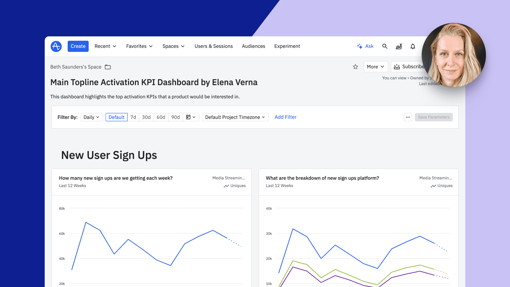
“This dashboard highlights the top activation KPIs that a product would be interested in.”
—Elena Verna, VP, Growth and Data, Dropbox
Mobile Subscription App Engagement and Retention Dashboard
Created by MyFitnessPal’s Olga Berezovsky
Olga Berezovsky is highly regarded for her innovative approach to creating intuitive and impactful digital products that fuel customer retention. Olga created the Mobile Subscription App Engagement and Retention Dashboard to visualize how to engage with customers and retain mobile subscriptions. There, you can understand the frequency and volume of your product’s usage—which is often your first step in understanding user behavior.
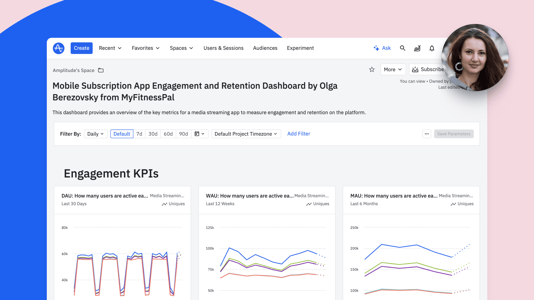
“Use this dashboard to report on essential product usage metrics, such as daily active users (DAU), the DAU/MAU ratio, average usage per user, and key retention metrics. These charts will help you identify specific user behavioral patterns and confirm daily or weekly usage cycles.”
—Olga Berezovsky, Head of Data and Analytics, MyFitnessPal
Ecommerce Monetization Dashboard
Created by Deepskydata’s Timo Dechau
Timo Dechau is a seasoned analytics and growth expert with a particular affinity for helping ecommerce brands optimize performance and revenue through data-driven strategies. With Timo’s dashboard, you can monitor key revenue metrics, analyze your best-performing products, and home in on areas for improvement.
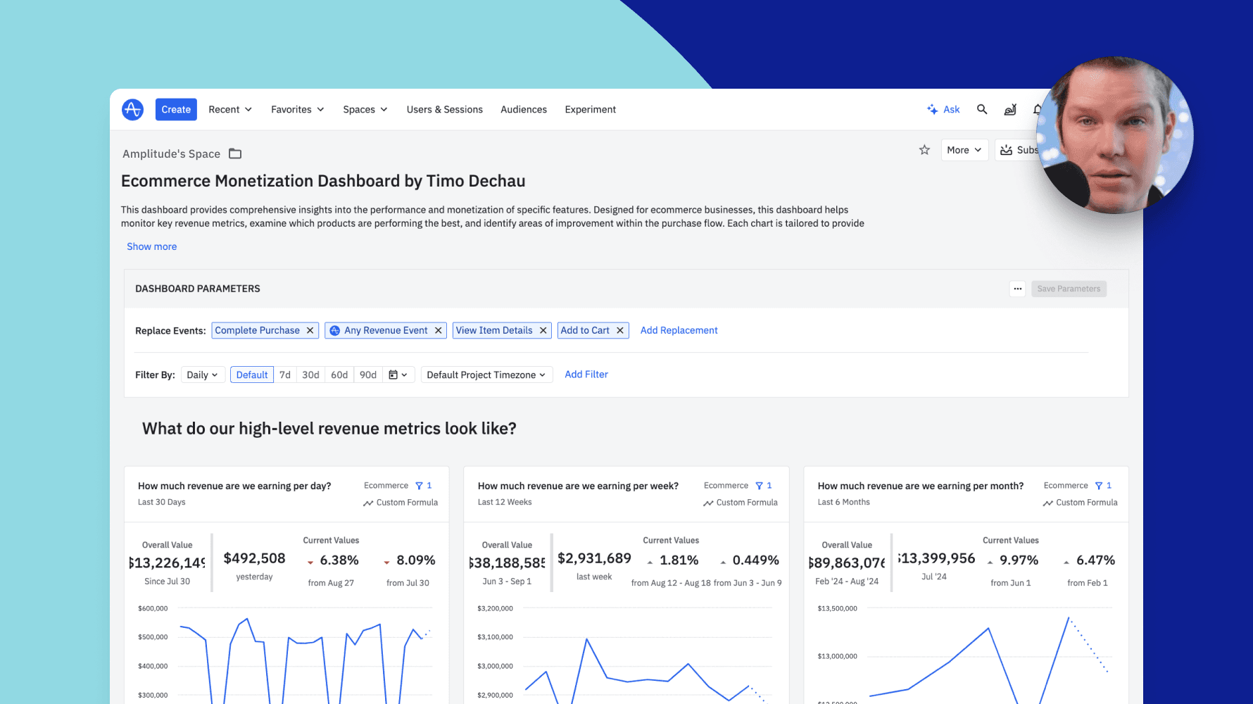
“Designed for ecommerce businesses, this dashboard helps monitor key revenue metrics. Each chart is tailored to provide actionable data to improve an ecommerce product’s experience and, as a result, its revenue.”
—Timo Dechau, Founder and Data Engineer, Deepskydata
The Product-Led Geek Monetization Dashboard
Created by PLG Advisor Ben Williams
Ben Williams is a prominent product-led growth advisor. His background includes advising high-growth tech companies as they seek to enhance their product capabilities and drive revenue. Ben’s custom dashboard showcases a comprehensive view of the monetization funnel, covering everything from acquisition to conversion and revenue retention. It’s designed to help you make data-informed decisions on marketing spend, product development, and sales resource allocation.
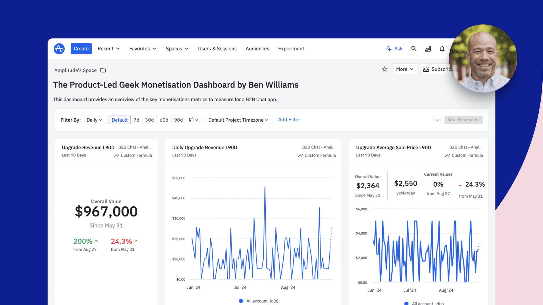
“This dashboard provides an overview of the key monetization metrics to measure for a B2B chat app.”
—Ben Williams, Advisor
Creating and sharing custom templates
With dozens of premade templates ready for use, there’s a good chance you’ll find just what you need. But let’s say you need insights into a highly specialized KPI specific to your industry. We want to work with you to create that template and feature it in our gallery so that others can leverage the incredible work you put together.
Got an idea for a great template? Email us to get started.
Getting started with Amplitude
You’ve seen just a few of the dashboards and charts you can use today, so now it’s time to start leveling out that uphill battle together.
Not a current Amplitude user? You can still access and use these free templates. They’re a great way to get familiar with our capabilities without the frustrating first steps of a typical analytics journey. Get started using Amplitude—for free—today.
Start transforming your data into actionable insights today—explore the Amplitude Template Gallery and find the perfect template for your business goals.

Franciska Dethlefsen
Former Head of Growth Marketing, Amplitude
Franciska is the former Head of Growth Marketing at Amplitude, where she led the charge on user acquisition and PLG strategy and execution. Prior to that, she was Head of Growth at Iteratively (acquired by Amplitude) and before that Franciska built out the marketing function at Snowplow Analytics.
More from Franciska


