How to Use the HEART Framework to Improve Software UX
Dive deep into the HEART Framework with this guide. Learn seven steps to drive action, key caveats to avoid, and examples to follow.

As customers’ expectations around software have become more refined, UX investments are make-or-break for product success and business success. Yet, advocating for UX improvements can sometimes be quite difficult, especially without clear metrics to help galvanize organizations into action. To help make a better case for these investments, we’ve created this guide on the HEART framework for UX metrics, popularized by researchers at Google for simultaneously driving user success, product success, and business success. Use HEART to help clarify which UX metrics to prioritize and establish a sound business case for reinvesting in user experiences.
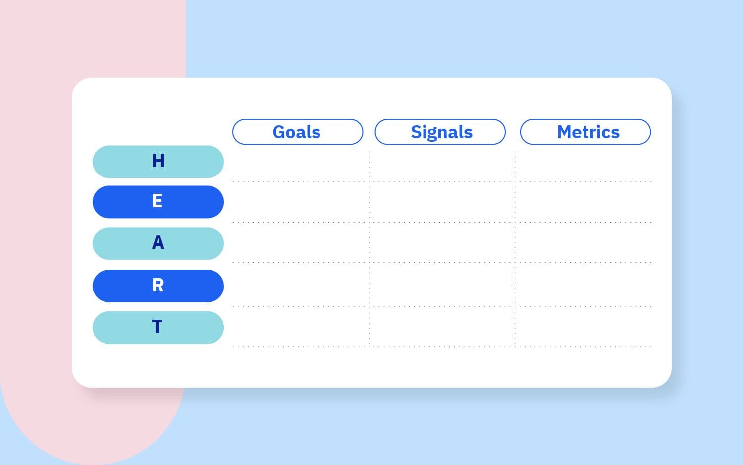
- The HEART framework contains five categories of UX success:
- Happiness
- Engagement
- Adoption
- Retention
- Task success
- Each HEART category relies on three core components to tie user success to business objectives:
- Goals
- Signals
- Metrics
- Both UX designers and product managers can benefit from implementing the HEART framework to prioritize the key metrics, signals, and goals that will yield the most value for their users and for their businesses.
What is the HEART framework?
The HEART framework is an actionable structure for identifying potential areas of user experience (UX) improvement in software products. The acronym “HEART” stands for five categories of user experience: Happiness, Engagement, Adoption, Retention, and Task success. Later on in this comprehensive guide, we define each of these categories in more depth.
Each HEART category contains three distinct components to help drive action and measure progress: goals, signals, and metrics.
- Goals are qualitative business objectives
- Signals are qualitative end user behavior that connect to goals
- Metrics are quantitative measurements of signals
In a later section, we provide definitions and examples of goals, signals, and metrics.
We can visualize this framework into a HEART chart, similar to a real-world product example that we’ll break down later:
Why does the HEART framework exist in the first place?
The HEART framework was published in 2010 by Kerry Rodden, Hilary Hutchinson, and Xin Fu at Google, as a response against an older product health framework called PULSE (“Page views, Uptime, Latency, Seven-day active users, and Earnings”).
Rodden et al. found that the PULSE framework was unable to successfully measure the true impact of UX changes, and sought to establish an alternative that would more accurately “measure user experience quality and provide actionable data.” With those objectives in mind, Rodden et al. crafted the HEART framework, which has found traction within UX design teams and product management teams alike.
Now that we know what the HEART framework is, let’s discuss the benefits of using this framework to drive UX improvements over time.
Benefits of using the HEART framework for UX
Using the HEART framework provides three core benefits:
- HEART ties UX outcomes to business objectives
- HEART helps you decide “what to improve” with clarity and granularity
- HEART is structured towards taking action rather than simple reporting
First, we need to remember that UX enhancements are an investment from the business to provide value to its customers, and therefore must return value to the business at some point. By ensuring that we focus on the UX results that actually move business objectives, we’re significantly more likely to secure the resources and prioritization required to make incremental improvements.
Over the years, I’ve had one-on-one touchpoints with UX designers across dozens of organizations. A recurring top-of-mind pain point for designers was that they had identified a wide range of potential improvements that they passionately believed in, yet were unable to secure the required engineering bandwidth to bring these design improvements into production; some ideas languished for months on end.
The most frequent root cause of this issue was that they hadn’t tied their desired UX outcomes back to business objectives. When I helped them ladder UX objectives into business priorities, they were significantly more likely to move their proposal to the finish line.
Second, HEART uses goals, signals, and metrics to clearly break down potential bottlenecks and identify the highest-value user experience element to address next.
Many times, user interviews or unmoderated user tests can yield treasure troves of qualitative insights, yet some of these insights should not be acted upon. As an example, users might express strong preferences around visual details such as colors, animations, or wording; but, these visual details are typically subject to individual interpretation and can’t be generalized to your entire user base.
By focusing specifically on the categories of Happiness, Engagement, Adoption, Retention, and Task success, we can hone in on the patterns that matter the most for the user segment that we serve through our designs and our products.
Third, HEART naturally drives action. With the HEART framework in place, we immediately know which metrics we seek to move with any UX improvement proposal, we know how exactly it will benefit the end user, and we know how exactly it will feed back into the broader business.
Rather than advocating for a large and unstructured collection of UX metrics, we can prioritize which UX outcomes to focus on first. And, rather than relying solely on qualitative user interviews, we can clearly measure our progress as we ship each iterative design improvement.
The next question for us to address, then: who should take the lead in implementing HEART?
Who should use the HEART framework?
UX designers should spearhead the HEART framework to establish user goals for their designs, and to create user-centered metrics to benchmark and improve end user experiences.
Designers are best positioned to:
- Decide which user goals are relevant for the business
- Identify which feature metrics accurately contribute to user goals
- Use metrics to decide which improvements to make next
- Determine whether improvements had the intended effect
For products that do not yet have a HEART framework in place, product managers should push to close the gap.
Product managers are best positioned to:
- Advocate for UX investments to business stakeholders
- Clearly identify key product interactions to monitor and improve over time
- Proactively flesh out future product functionality to target desired user end states
When to use the HEART framework
The HEART framework works best at the product feature level. In general, we want to avoid using this framework at a very low level (e.g. microinteractions or design copy) or at a very high level (e.g. product families).
To help us select the right granularity for HEART, let’s use the Google Maps product as an example. The product feature Google Places shows the details of a specific location, including address, rating, reviews, directions, web links, and other key info.
If you’re targeting only a specific microinteraction, then you likely won’t get enough return on investment (ROI) for the exercise to be worth your time. As an example, when clicking on a point of interest, Google Places has a microinteraction where the left-hand side bar slides out. It’s unlikely that measuring Engagement of the “sliding bar interaction” will move the needle for the user, for the product, or for the business.
On the other hand, if you’re trying to use HEART to improve a product that contains many features, your results will be unclear at best and contradictory at worst. Attempting to use HEART on the entire Google Maps product will split our focus across a variety of features, ranging from Google Places to Directions to Satellite View to Street View.
Using similar logic, we should avoid using HEART at the product portfolio level. That is, if we attempt to use HEART to decide whether to focus on improving Google Maps vs. Gmail vs. Google Calendar, we won’t get to a clear conclusion.
Diving deep into HEART categories
Let’s now clearly define each of the HEART categories: happiness, engagement, adoption, retention, and task success.
Happiness
First, happiness is focused on the emotional state of the user when they use your products and features. As Rodden et al. shares, happiness relates to “subjective aspects of user experience, like satisfaction, visual appeal, likelihood to recommend, and perceived ease of use.”
Happiness matters because people associate the products they use with their own identity. A product that creates positive feelings upon use is perceived as a solution, whereas a product that creates negative feelings upon use is perceived as a pain point.
Happiness is typically measured through surveys rather than through usage metrics, given that happiness is attitudinal and subjective. Still, happiness can be quantified by using standardized questions.
One way to measure happiness is to ask the net promoter score (NPS) question, “how likely would you be to recommend this product to a friend or colleague?”
Another way to measure happiness is to ask the Sean Ellis product/market fit question, “how disappointed would you be if you could no longer use our product?”
Engagement
Second, engagement is focused on actual feature usage on a per-user basis. Engagement includes both the frequency of feature usage as well as workflow depth.
Keep in mind that engagement requires us to define a “qualifying activity”—that is, not all features are equally valuable to the end user. A simple login or a simple page view shouldn’t be counted as engagement, as it’s difficult to make the argument that such shallow activity has created real value in the user’s life. Instead, we should measure the actions that create value for the end user, using a framing similar to “jobs to be done” (JTBD).
Engagement can further be split into the next two HEART categories: adoption (capturing new users) and retention (keeping existing users).
Adoption
Adoption is focused on user acquisition. That is, it seeks to measure the continued growth of the feature’s user base.
Keep in mind that a user experience design can only provide value to users when they’re exposed to it. In other words, even a “perfect” design will unlock no value for users if it doesn’t contain the ability to inform users about its existence, and if it doesn’t have a mechanism to convince users to take advantage of it.
While some designers may object to adding “selling” or “marketing” capabilities to a given feature, remember that a feature that does not capture new users will not have long-term staying power.
For a deeper discussion on customer-focused product adoption, our team at Product Teacher has spun up a guide to feature adoption.
Retention
Retention is focused on stickiness or repeat behavior. That is, it seeks to measure whether users have continued to reap value from the feature. We want to specifically focus on the users who have used the feature before, and determine whether they come back to use the feature.
If they only use the feature a single time, then we can hypothesize that they used the feature out of curiosity and didn’t find it to be valuable over the long run. If users keep using the feature consistently, i.e. they regularly “hire” this feature to solve a particular pain in their lives, then the feature has successfully driven user retention.
For a more in-depth breakdown on customer retention and customer attrition, check out Product Teacher’s comprehensive guide to customer attrition analysis.
Task Success
Finally, task success is focused on the user’s ability to navigate through the workflow. Essentially, task success is a measure of the clarity of the design. Task success as a category includes frequently-used UX metrics such as task completion time and error rate.
If your product workflow happens to be linear, e.g. a loan application workflow or a checkout workflow, then you can use the product usage metrics such as “workflow funnel conversion rates” as a way to measure task success.
However, for non-linear product workflows, it can be quite difficult to know whether a user was successful in their desired objective or not, and whether the result they achieved was an error or not. For these kinds of non-linear product workflows, leverage usability tests to assess task success, rather than product usage metrics.
Prioritizing the HEART categories
We now have a solid grasp of the five HEART categories: happiness, engagement, adoption, retention, and task success. Before we move further, note that the HEART categories are naturally in tension with one another.
As an example, optimizing for task success might mean focusing on efficiency over delight, whereas optimizing for happiness might mean focusing on delight over efficiency. And, adoption is focused on new user acquisition while retention is focused on repeat usage, which means that the two target user segments are completely different.
Therefore, make sure you prioritize which of the five HEART categories are the most important to reach the next stage of success for your feature.
Is happiness the bottleneck, or is task success the bottleneck? Does adoption matter more than retention, or does retention matter more than engagement? Product managers are responsible for setting the direction of the team here.
Let’s now dig into how to use these categories to determine areas of improvement for a given user experience.
Breaking down HEART components
To drive success within each HEART category, we can use three components to break down the effectiveness of our user experiences: goals, signals, and metrics.
Goals
Each HEART goal should focus on a desired business objective. These objectives are typically qualitative in nature. We need to establish a goal for each HEART category upfront, as we need to remember that each feature and UX flow is a business investment.
The core hypothesis of any software feature is this: “we will capture value for the business by creating value for the end user.” Avoid falling for the trap of solely creating value for the end user, without identifying how to capture value for the business. When the business is not accounted for, UX projects typically don’t make it out of the proposal phase, as business stakeholders are unable to determine how the UX initiative will move the business forward.
Think of business objectives as a creative constraint that sparks additional creativity. Remember, it’s much easier to come up with good ideas when you have constraints than when you have no constraints at all.
If you don’t believe me, try this exercise that we regularly share with our workshop participants: Create a poem without constraints—it’s pretty difficult. In comparison, create a poem that must include a talking dog, a walk to the beach, and an ice cream cone that fell to the ground. You’ll find that the constrained version is both faster to create and is more compelling to its audience than the unconstrained version is.
So, HEART goals are key to framing our UX initiatives in a way that will drive the business forward. If your organization is already using objectives and key results (OKRs), note that HEART goals pair well with OKR objectives.
Signals
Once we’ve decided on the goal for each HEART category, we now need to decide which signals we’re looking for. A signal is a qualitative end user behavior that connects to the goal that we set for the feature.
Signals include both actions and feelings. Lean on product usage metrics to determine “action” signals, and lean on surveys to determine “feeling” signals. And, keep in mind that signals can be either positive or negative.
Remember to root your signals within the goals that you’ve selected. Our goal is to simultaneously solve for our users’ needs while also strengthening the position of our business, so signals need to relate back to the business goals that we’ve set.
As an example, let’s consider a candidate signal like this one: “users share on social media about how delightful the microanimations in your feature are.”
If the goal is “drive word-of-mouth awareness,” then this signal makes sense to include.
But, if the HEART goal is “reduce workflow completion time to position cost savings to sales prospects,’, then this signal is not a good one. Microanimations take time, and while they can increase a user’s happiness, they may not increase a user’s ability to complete the task quickly.
Furthermore, signals should only move when the user experience is the sole explanation for the change. For example, you wouldn’t want to track a signal that moves up and down based on marketing efforts rather than UX changes. Watch out for conflating factors such as marketing efforts, customer success efforts, and sales efforts.
Metrics
Finally, we can come up with metrics for the HEART categories. Specifically, our metrics should be measuring the signals that we’ve previously identified, and our metrics should enable us to visualize progress over time on reports and dashboards.
In general, you should normalize your metrics vs. the size of your customer base. That is, “total usage” is less helpful to track than “average usage per user.”
And, keep in mind that the same signal can be split multiple ways. As an example, let’s say that we’re interested in “dashboard creation within Amplitude Analytics” as a signal under the HEART category of engagement.
We have multiple metrics at our disposal for this one signal:
- Average dashboards created, per user, per month
- Percent of users who created at least one dashboard last month
- Average length of time between dashboard creations
And, we could even segment each metric further, e.g. by using behavioral segments or by using user attributes.
At the end of the day, there’s no single metric that is universally right or wrong. The best metric for the job is whichever metric that helps you make an informed decision and brings your stakeholders along with you on your decision making journey. Feel free to select whichever metric makes the most intuitive sense for your decision making processes.
To wrap up HEART components, we should first come up with HEART goals, then decide on HEART signals, then finally come up with HEART metrics.
Be wary of guides that tell you to pick HEART metrics upfront, then work backwards to select signals and goals. Using the most easily-available metric tends not to be a good idea, as metric instrumentation is significantly easier than getting the right goals in place.
Let’s now bring the HEART framework to life by diving into a real-world example.
An example of the HEART framework in action
Imagine that we’re building a customer relationship management system (CRM) for real estate agents, and one of the key features that we’ve shipped is the ability for agents to “reassign clients” to one another.
We decided that we would like to invest in additional UX improvements in “reassign clients” as we believe that this feature differentiates our product offering vs. competitors. For example, maybe we’re interested in showing “agent workloads” so that the assigner doesn’t overburden the assignee. Or, maybe we’re interested in adding a tooltip or a walkthrough for first-time users.
Here’s a hypothetical HEART chart that you could spin up to explore how to further improve the “reassign clients” UX workflow. This is the same example that I shared earlier on.
| Category | Goals | Signals | Metrics |
| Happiness | Positive brand name in the market | Positive: Agents tell other agents they like it Negative: Agents tell other agents that it’s not good | Net promoter score |
| Engagement | Create delightful differentiated functionality that agents find valuable | Positive: Agents use feature from start to finish multiple times Negative: Agents don’t use it | # of reassigned clients, per user, per week |
| Adoption | Secure more real estate agents to use our CRM | Positive: Many people try it Negative: No one tries it | % of new users (less than 1 month old) using “reassign clients” at least 1x in their first month |
| Retention | Have real estate agents use our CRM for years | Positive: Use this feature multiple times Negative: Use this feature once and never reuse | % of existing users who “reassign clients” at least 2x per month |
| Task success | Few inbound complaints to the customer support team | Positive: Agent transfers the right client to the right agent at the right time Negative: Agent gets stuck in the workflow, agent picks the wrong assignee, agent picks the wrong client | “Reassign clients” completion time # of inbound complaints to customer support team about “reassign clients” |
Using this HEART chart, we now have a wide range of related UX metrics that we can use to assess feature health. In partnership with engineering teams and analytics teams, we should instrument the identified metrics to establish a baseline.
Once we have a baseline reading, we then decide which one out of these metrics is the most crucial to improve next. And, as each metric is improved, we can iteratively tackle other bottlenecks to strengthen feature UX health over time.
Now that we have an example of what a completed HEART chart looks like, let’s discuss how to drive action with the HEART framework.
7 steps for driving action with the HEART framework
Here is a seven-step playbook for driving action with the HEART framework. We’ve identified who in the product trio (PM, design, and engineering) should be involved in each step.
First, the trio of product management, product design, and product engineering must select a feature to focus on analyzing with the HEART framework.
Second, product management and design should evaluate which of the HEART categories make sense to prioritize.
Third, product management and design should select which business goals align with the prioritized HEART categories. Product management should take the lead on this step.
This third step should yield significant debate, which isn’t a bad thing. Product managers will naturally advocate for business outcomes, and designers will naturally advocate for user outcomes. The key is to find user outcomes that advance business goals.
Fourth, design should select which user signals tie to the selected goals. Design should be in the driver’s seat here, as designers have a deeper understanding of the different user success states to encourage, as well as the user failure modes to avoid and mitigate.
Fifth, design, PM, and engineering should discuss which metrics can be instrumented in a reasonable amount of time to measure the selected signals. Engineers should take the lead in this step, as engineering insight can make the difference between a one-month effort vs. a one-year effort.
Sixth, product management should ladder the instrumented HEART metrics into their product’s OKRs, as well as any sort of reports and dashboards that stakeholders have access to.
Finally, as the results of the metrics come in, the product trio should prioritize action together. They’ll decide which HEART metric improvement will yield the highest return-on-investment, and when to keep iterating on this feature’s UX vs. when to move on to the next feature.
Enabling long-term monitors and alerts with HEART
As each UX analysis wraps up, the product development team should seek to establish long-term monitoring and alerting to build on their past work.
Each tracked HEART metric should be centralized in a report, a dashboard, or a repository. Then, the team should select a metric threshold to ensure that the metric doesn’t fall below a healthy baseline. This repository now provides long-term monitoring of UX health across a variety of features and products.
But, monitors can create significant mental overhead, especially if you’ve implemented dozens or hundreds of HEART metrics. Therefore, work together with engineers to set up alerts—like Amplitude’s Anomoly + Forecast feature—that will automatically trigger when a tracked metric falls below the determined threshold. Use these alerts to direct attention and action for the team.
Key caveats to avoid when implementing the HEART framework
Every framework comes with drawbacks and caveats. John Cutler, product evangelist at Amplitude, says the following about frameworks: “A lot of frameworks are poorly designed. They are not safe. They don’t come with prerequisites, warning labels, and/or expiration dates. They are context-free and lack mechanisms to make them context-aware.”
So, here are four warning labels to keep in mind when implementing HEART for your own UX designs and products:
- Make sure the selected scope isn’t too broad
- Don’t force in “unnatural” HEART categories for all features
- Remember to prioritize HEART goals, HEART signals, and HEART metrics
- Don’t forget to secure business alignment and provide a convincing business case
First, make sure that the selected scope is not too broad. As mentioned before, HEART works best when it is well-focused on a feature within a product, rather than the entire product itself. However, the challenge here is that “features” and “products” lie on a spectrum and can’t always be neatly categorized. Some product organizations might perceive a feature to be a product, and some product organizations might perceive a product as a feature.
A good litmus test for whether you’ve selected the right granularity is to aim for overlap in goals (business objectives) and signals (end user states), but with sufficient divergence in metrics. If each of your HEART goals are wildly different from one another, or each of your HEART signals represent a vastly different user end state, then you probably need to narrow down the focus. On the other hand, if your HEART metrics demonstrate significant overlap, then you probably are too narrowly focused and need to bring the conversation one level higher.
Second, don’t force the usage of every HEART category. Some features simply don’t have an independent path to adoption or retention. As an example, consider a user signup flow. Seeking to shoehorn a “retention” metric for this activation workflow doesn’t make sense, because sign up typically only happens once per user.
Third, be wary of spreading yourself too thin when using HEART. By its nature, HEART gives you the ability to have multiple goals, multiple signals, and multiple metrics. Don’t pursue all of them at once.
Based on the Pareto principle, the most valuable 20% of the effort yields 80% of the value to your end user, and the remaining 80% of the effort should be invested elsewhere instead.
Finally, HEART simply doesn’t work if it fails to align with business priorities, or if the ROI business case doesn’t make sense. As an example, some features may have reached “end-of-life” maturity and are no longer crucial to ongoing business success.
While some of the user experiences in this feature may be truly difficult to use, they won’t make sense to invest in as they don’t drive value for the business. If your business has already decided on sunsetting a given feature, improving the UX of that feature won’t lead to long-term user value.
Closing thoughts
The HEART framework is a flexible structure for breaking down UX objectives and tying them back to business goals. Both UX practitioners and product managers should consider adding the HEART framework to their arsenal of techniques.
The first time you implement HEART will take some getting used to. But, as you repeat the process, the framework will start to become second nature. Over time, your teams will be able to quickly prioritize the highest-value UX improvement that yields positive outcomes for your users and for your business.


Clement Kao
Founder, Product Teacher
Clement Kao is Founder of Product Teacher, a product management education company with the mission of creating accessible and effective resources for a global community of product managers, founders, innovators, and entrepreneurs. Product Teacher offers on-demand video courses, career coaching, and corporate training workshops.
More from Clement


