Inside Amplitude Made Easy: Redesigning Navigation & User Experience
How Amplitude’s redesign elevated simplicity and functionality through collaboration, research, and innovative design.

Building a modern digital product is like growing a tree. Every so often, you need to prune and shape it to ensure healthy growth in the future. This is how we recently embarked on our latest product redesign—a comprehensive overhaul of Amplitude’s navigation, a visual lift, and adding features that fit together seamlessly like puzzle pieces.
Why was this redesign necessary?
Over time, Amplitude’s product surface had grown unmanageable. With the introduction of key features like Session Replay, cohort enhancements, Feature and Web Experimentation, and our Web Analytics Hub, it became increasingly difficult for users to find what they needed. In some cases, even understanding what Amplitude offered was becoming a challenge. Our mission was clear: Simplify the core experience, make the product easier to navigate, and retain the power and functionality our customers love.
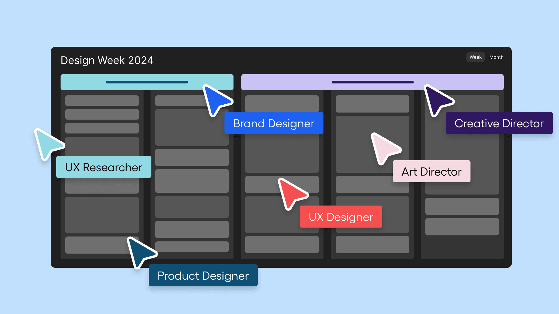
Finding the vision of design week
We started the process with an offsite design week, bringing together our product and brand design teams. We know our customers and understand the challenges of setting up data. So, we began by imagining an end-to-end experience where today’s friction points simply didn’t exist—where everything was seamlessly integrated. This became the foundation for elevating Amplitude’s UI and product hierarchy from a graphic and brand perspective.
The excitement was contagious. Everyone bought into this future vision, from engineers to product leaders to executives. The only question left was, “Where do we start?”
Turning concepts into action
It’s one thing to get people excited about a vision. It’s another to bring that vision to life. To avoid the risk of “boiling the ocean,” we broke the project into core components, ensuring each team had a clear roadmap while staying aligned with our broader goals. Here’s how we broke it down:
- Core navigation pattern upgrade: Our top priority was to create an intuitive navigation system, helping new users understand what Amplitude does and how to use it effectively. We focused on simplifying the entry experience and creating seamless onboarding pathways.
- Out-of-the-box analysis from a single snippet: We wanted to give users immediate insights without requiring a deep setup. By creating pre-built reports that deliver value from day one, we made it easier for teams to get actionable insights with minimal effort.
- Improved hooks and automations: We introduced automated workflows and engagement triggers to ensure users could extract value from Amplitude, even if their usage patterns slowed. These automations helped users stay engaged without additional effort.
A redesign at warp speed
Initially, we planned for a longer redesign cycle, digging deep into information architecture and refactoring the product from the ground up. But fate had other plans—our CEO and CPO challenged us: “How can we ship the first version by August?” It was May.
With pragmatism as our guide, we ruthlessly prioritized what would provide meaningful upgrades. We began with navigation, rapidly developing a proof of concept behind a feature flag and testing it internally with a working group.
The goals, informed by foundational research from our Head of Research, Jules, were clear:
- Improve first impressions: Make Amplitude feel premium from the first session and provide immediate value.
- Organize the product more intuitively: Ensure users can easily find what they’re looking for while clarifying what Amplitude offers.
Collaboration is key
Redesigning a product is tricky. Not only are you changing something others have built, but you’re also changing something people are already accustomed to using. The key is early and open collaboration. We engaged with teams across the company from the start, involving them in decision-making and ensuring alignment. Doing a first pass on changes gave everyone a solid starting point, encouraging deeper collaboration and iteration.
Running big design reviews with 25 people can feel intimidating. But with the right framing and preparation, they became highly productive alignment sessions. However, most of the real work happened in smaller, one-on-one jams. This approach ensured that everyone was already on the same page when we met as a larger group, making the process smoother and more fun.
What we prioritized and why
Our source of truth was the design prototype. We built iteratively, testing internally in quick cycles. Through user testing, we discovered that the highest-scoring variant wasn’t the one we’d initially started building. Thanks to our flexible, all-hands-on-deck approach, we pivoted quickly and adjusted the work on the fly.
Managing change: Bringing users along
Let’s be honest—nobody wants a redesign. People get used to the old product, and any disruption can be met with resistance. The key is communication. For existing users, the goal is to do no harm. For new users, the goal is improvement.
We communicated the changes clearly, offering users the ability to opt-out and return to the previous experience. This approach ensured no one felt forced into something new during critical workflows.
The key metric for existing users was stability—maintaining their ability to work effectively. For new users, we measured activation improvement using qualitative feedback and early indicators to gauge success.
Knowing when to ship
The scariest part of a redesign is knowing when it’s ready to ship. It’s about balancing personal judgment, user feedback, and data. We asked ourselves, “Is this meaningfully better for both new and existing users?” When the answer was yes, it was time.
Early feedback confirmed our direction:
“It took me 20 seconds to realize how much better this is.”
“I LOVE the new navigation.”
“It’s so much easier to find what I need.”
Our opt-out rate was just 1.5%, and usage of key features like Experimentation and Session Replay doubled.
And that’s how we did it
A few key takeaways:
- Start early, even before you have full buy-in.
- Tell a compelling story about where you’re headed.
- Foster collaboration and alignment across teams.
- Ship iteratively and gather feedback along the way.
- Listen to qualitative signals to build confidence.
- Measure the impact with both early and long-term indicators.
This is how you turn a vision into reality—and we’re just getting started.
Ready to see simplicity in action? Explore the new Amplitude experience today and discover how it can transform your team’s analytics workflow with effortless navigation and instant insights. Get started for free now.

Will Newton
Principal Product Designer, Amplitude
Will Newton is a designer at Amplitude and lover of coffee and code. He snacks on data for breakfast.
More from Will


