Release Notes: Q1 2021
Root-cause analysis, proactive data governance, new ways to collaborate, and a self-serve personalization engine - these were Amplitude’s big product bets in 2021 so far - and it’s only May.

Wow – what a start to 2021. Our product and engineering teams have been busy creating incredible new capabilities across all of Amplitude, and shipped more product bets shipped in Q1 than any quarter in company history. These innovations span across the core pillars of the Digital Optimization System – our core, industry-leading product analytics, built-in collaboration suite, foundational data platform and integrations, and of course, the launch of a new standalone personalization solution with Amplitude Recommend.
We also are excited to share a new home for release notes. Visit Product Updates in the Amplitude Community for a centralized view of all Amplitude releases as they are shipped.
New in Product Analytics
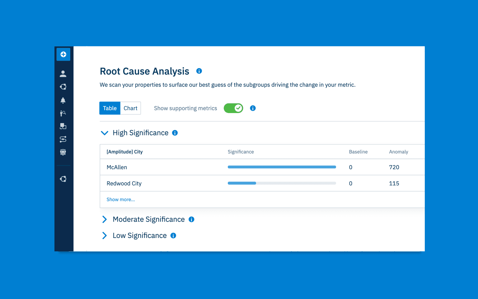
Investigate Anomalies with Root Cause Analysis
Our vision for Amplitude is a proactive one, where meaningful insights are delivered to our Customers, with little to no data digging required. At a minimum, customers should be notified when a spike or dip occurs in their KPIs, but it’s more important to understand why. In the past, identifying why changes occured required random guess work, manual group by-filters, or “eyeballing” charts – all of which could take hours. With Root Cause Analysis (RCA), a new view within Anomaly and Forecast, you can identify the cause of your data anomalies in seconds, at the click of a button. To quote one of our Customers, Hubspot, “RCA literally saved us hours, if not days worth of debugging work and we love it.”
When you run RCA on a detected anomaly, Amplitude analyzes the properties of the anomalous event, and ranks their impact on the change by significance. RCA even factors in external context like region-specific holidays and recent releases in your product.
To give an example, say your active user metrics plummeted, due to a service outage on the west coast. RCA would identify users in Seattle, Portland, and San Francisco as the leading contributors to the change, right away. This level of causal analysis used to be possible for only the most analytically savvy users in Amplitude. Now anyone on the team can do it, which means less time spent digging through data, and more time optimizing your product experience.
See here for full documentation on Root Cause Analysis. RCA is currently in beta for customers on Enterprise plan and who have purchased the Insights add-on.
Measure Time Spent and Event-Based Engagement in User Sessions
The User Sessions chart helps you view customer engagement through a session-based lens. In Q1, Amplitude brought new capabilities to User Sessions that enable you to easily measure time spent in your product, and to measure engagement with specific features within sessions.
Media, gaming, or streaming companies measure their success based on the time customers spend engaging with their products, and their total customer engagements. By working with customers like NBC, we’ve identified which time spent metrics provide the most valuable insights to engagement focused product teams, and addressed them with four new features:
- Total time spent: Graphs the total sum of all session lengths within the interval.
- Average time spent per user: Graphs the average amount of time spent in sessions per interval (total time spent / total active users).
- Total session counts: Graphs the total number of sessions across all users.
- Customizable session duration bins: Allow you to customize duration bins in session length distribution to better fit your product, or to create cohorts of users with a specified session length for further analysis or targeting.
In addition, you can now measure feature engagement per session through the Events performed within sessions toggle, and three new charts views:
- Average events per session: Graphs the average event counts across all sessions from all users within the chart interval.
- Total events across sessions: Graphs the total number of events across all users within the interval.
- Total session counts: Graphs the total number of sessions across all users.
Add Clarity to Analysis with Custom X-Axis Chart Labels
You now have the ability to add your own X-Axis chart labels to bar charts! Simply double click on the event name to customize the text, or delete your custom text to revert to the default name. These can be applied to the following chart types: Event Segmentation (Uniques, Totals, Avg, % Active & Formulas), and Funnels (Conversion).
Post Monitor Alerts to Slack
The Amplitude Slack app helps teams keep a pulse on the insights created in their Amplitude org. For instance, you can forward Amplitude comments and mentions to Slack, or subscribe to a team space to stay in the loop with new analyses your team creates. Now, we’ve expanded our slack offering to include Webhooks for Custom Monitors. Once a webhook is configured, you’ll receive slack alerts when any of your monitored KPIs changes beyond your designated threshold.
New in Collaboration
Designate a Source of Truth with Official Dashboards
For many Amplitude users, it can be challenging to identify the charts and dashboards that serve as a “source of truth”—in other words, which content can be trusted to be accurate, up to date, and relevant to the entire organization. We’ve made this content easier to find and reference with Official Dashboards. This new feature increases data trust for existing users, and helps new users ramp more quickly.
To label a dashboard as official, simply click the blue checkmark icon next to a saved dashboard’s title.
Monitor Change with Series Selection on Dashboard Metrics
You can now view metrics for charts with multiple series on dashboards, and toggle which series to visualize. We’ve also added descriptive labels and matching series colors to make it easier to understand the metrics you’re viewing. This is available for event segmentation, sessions and revenue charts on saved dashboards, and can be set up by clicking the options icon on a chart saved to a dashboard, and clicking “Show Metrics.”
Monitor Digital Business Performance with New Executive Reporting
Last month, we launched Executive Reporting, a series of powerful upgrades to our Dashboards that help leaders monitor digital business performance. You can now set and track progress to a target metric, add critical context as notes throughout the Dashboard, and more flexibly customize the layout of any report. These additions make it easy for leaders to:
- Report on product health
- Track against targets
- Monitor performance changes over time
- Drill into critical insights wherever they need them
See our launch blog here for more on why we built Executive Reporting, and the powerful use cases it unlocks!
Add Context with Dashboard Chart Notes
Ever wanted to add contextual notes to an individual chart on a dashboard? This is now possible with Dashboard Chart Notes. When hovering over a chart, you will see a new “Add Note” button. Once a note is added, it can be edited/deleted by the dashboard owner(s), and viewed by non-owners. We currently only support a single line displayed below each chart, but upon clicking the note a modal will appear allowing a full view of the chart note (with no limit on length).
New in Data Management
Instrument Amplitude for WatchOS
Amplitude-iOS SDK has added support for Apple’s watchOS platform, enabling customers to instrument their Apple Watch apps. With this feature, our iOS SDK is fully cross-platform and our customers can now integrate Amplitude with all Apple products.
For full documentation on our iOS SDK, see our developer’s center here.
Instrument Amplitude with React Native SDK V2
React Native SDK V2 is an entirely new SDK, built from scratch, focused that provides all of the necessary API’s to use Amplitude effectively in a React Native application. This new SDK takes a mobile first approach by leveraging React Native’s ecosystem, making it much easier to introduce Amplitude into a cross platform mobile app.
React Native SDK V2 is built as a layer on top of the existing iOS and Android SDK’s, so it will automatically update with any additions, improvements, or modifications to these SDK’s. It also leverages TypeScript to provide strong typing of the API, which makes for a better developer experience
Proactive Data Governance
Last month, Amplitude also launched several new data management capabilities that proactively surface issues in your data. Read all about proactive governance in our launch blog here, so you can spend less time digging through data, and more time driving value for your teams.
To stay up to date on Amplitude releases as they are shipped, visit Product Updates in the Amplitude Community.

Grant Wensley
Former Technical Product Marketing Manager, Amplitude
Grant is a former technical product marketing manager, writing the “how we do it” section of Amplitude’s story.
More from Grant


