Multi-Metric Analysis with Data Tables in Amplitude
Introducing a brand new way to visualize data in Amplitude.

For product and data teams, decision-making often requires data visualization across multiple dimensions. This can include product conversion metrics, revenue data, and campaign attribution across channels—broken down by segments and other filters. At Amplitude, we’ve found that while product, growth, and analyst teams all utilize data visualization, their individual responsibilities require analysis flexibility—they need more than the standard event or funnel charts we’ve all come to know.
We’ve been working with customers to bring these types of flexible analyses into a single view and at Amplify we announced this brand new analysis called Data Tables. Starting today, Data Tables will be available to all customers including those in our free plan (give it a try!). With Data Tables, we’re unlocking multi-dimensional analyses right inside Amplitude so teams can quickly compare and visualize how products are driving key business outcomes. This level of tabular analysis for product analytics is unprecedented, since most vendors primarily focus on event charts, funnels, and user flows.
How do Data Tables work?
Data Tables act as a flexible analysis tool, allowing users to quickly analyze any combination of user behavior, user attribute, or metric. Here are a just few examples we’ve seen from our customers:
- Want to compare trial signups with revenue? Done.
- Want to break down those signups by device type and location? Easy.
- How about looking at users that engage with a bug next to users that later deactivate? No problem.
Customers now have a new, first-class analysis tool at their disposal to discover new insights about their products. Now let’s walk through a few examples of how Data Tables can be put to use in some of your most important workflows.
How are product KPIs performing across segments?
With Data Tables, you can add events and metrics relevant to your product KPIs and quickly drill into segments that matter to you like country, product type, or plan type. You can even compare KPIs across cohorts of users that are relevant to your product. Built-in visual cues help you quickly parse through the data unlocking insights that matter to you. We recently also introduced Metrics which lets you pre-define metrics you wish to save and standardize within Amplitude across charts, cohorts, and tables.
How do channels contribute to product conversion?
Let’s say you want to understand how your channel inputs impact key product conversion and monetization metrics. With Data Tables, you can now quickly build a conversion report that shows you how your channels are driving your monetization KPIs. Using our new Channel Classifier you can easily model your acquisition channels directly in Amplitude and use Data Tables to view the impact of these channels on your downstream adoption metrics. With built-in attribution, you can also distribute credit to your channels based on first touch, last touch, or a custom “30/40/30” attribution model to evaluate the true impact of your channels on key conversion and monetization metrics.
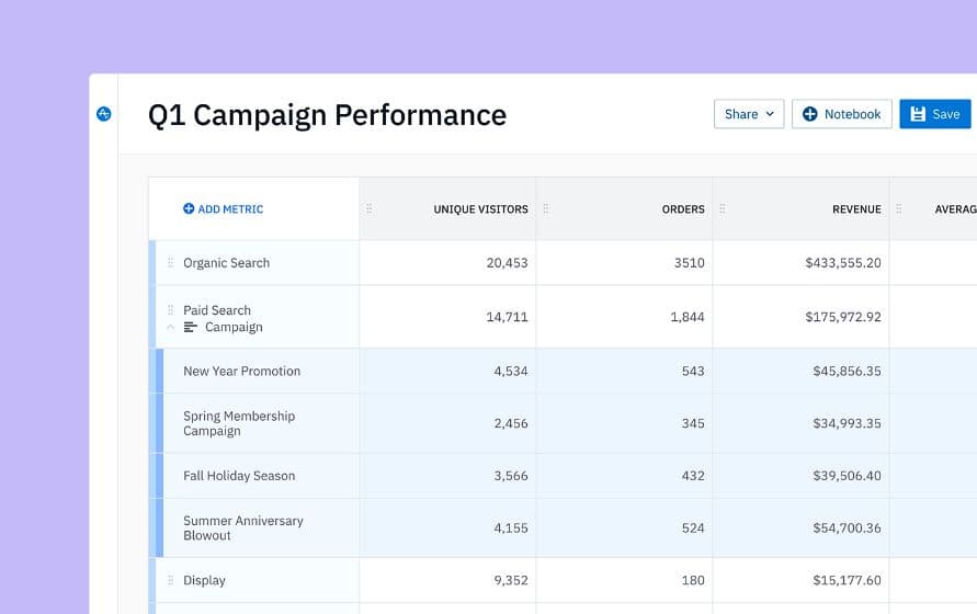
What is the cost of acquiring new customers?
What if you want to understand the performance of digital campaigns in acquiring customers, as well as Return on Ad Spend (ROAS) associated with your advertising costs? Adam Greco shared some of the challenges that marketing teams face when trying to effectively tie acquisition spend to product conversion metrics. At Amplify we announced a brand new set of data integrations for campaign data and with Data Tables, you can easily compare advertising spend to your product KPIs in a single view without having to combine data in spreadsheets to analyze the performance of your acquisition investments.
Unlocking insights faster with Data Tables
Data Tables is just the beginning of our vision to unlock more value for digital products using Amplitude. As product-led companies collaborate around a shared understanding of the digital customer journey, product and marketing teams are coming together using data to build a more comprehensive view of their user base to power long-term growth. Data Tables, along with our new announcements such as Metrics and Campaign Reporting capabilities, make it easier for teams to consolidate their analytics solutions while modernizing the metrics they can track across the end-to-end customer journey.
Stephanie Halamek, a product data scientist at WeWork notes:
“In the world of product analytics, visualizations get all the love, and Amplitude packages a powerful set of visualization capabilities that can unlock an understanding of user behavior and usage of our products. But the foundations of data analysis and reporting are important. While data tables are not ‘sexy’ they drive a ton of insight and value for our teams in how we operate. Data Tables from Amplitude have made it easy to summarize and compare product metrics across segments in a single snapshot. No matter how sophisticated your analytics practice, tabular data analysis will always play a part in distilling and communicating insights about your product.”
Data Tables are available within Amplitude Analytics to all customers starting today. Be sure to check out our documentation for more information. Additional features such as Metrics, Channel Classifiers, Attribution and our new Campaign Integrations are currently in closed beta. If you’re interested in learning more, check out our Data Tables Overview on Amplitude Academy!


Nikhil Gangaraju
Director, Product Marketing, Amplitude
Nikhil is a product marketer at Amplitude focusing on Amplitude Analytics and works with teams to advance our mission to help companies build better products.
More from Nikhil


