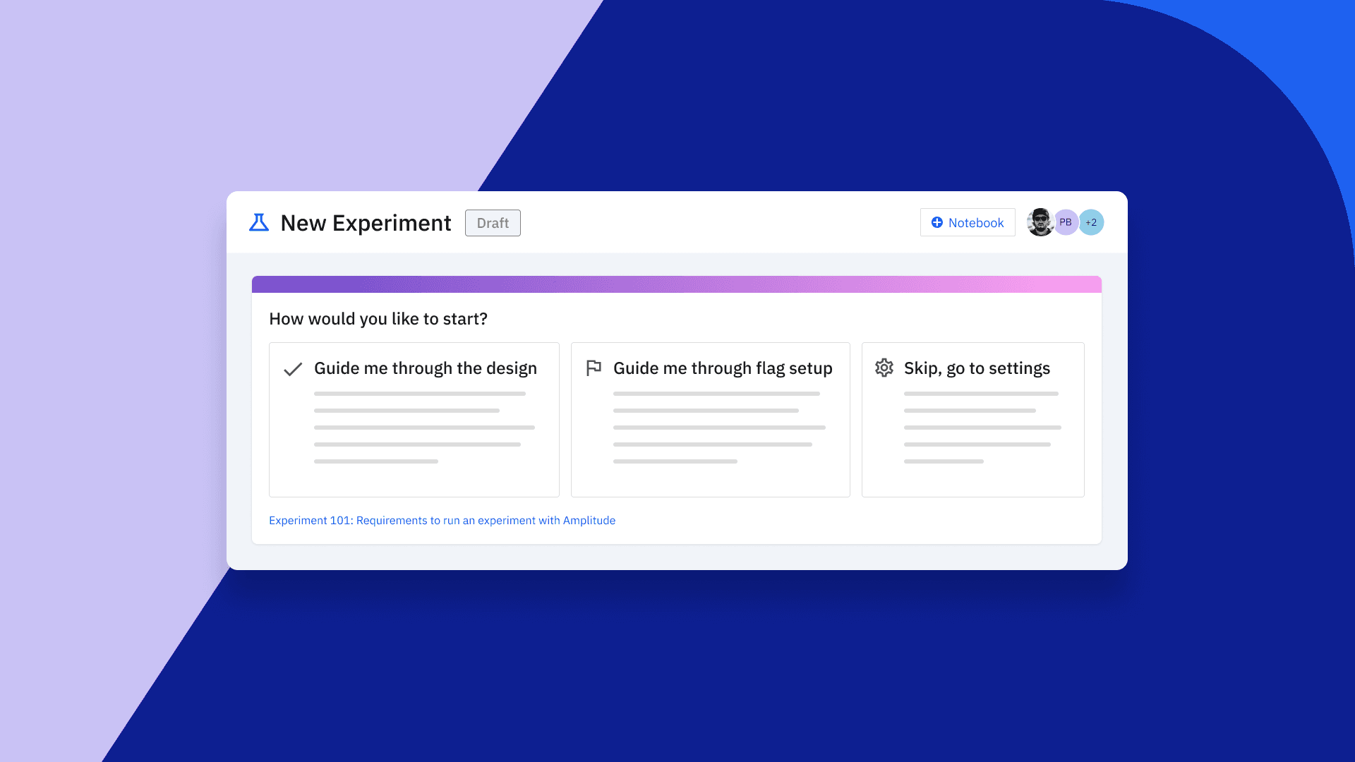
Reimagining Experiment: Guiding Users with a Radically Simple User Experience
Learn why Amplitude Experiment delivers a guided experience to every user—no matter where they are in their testing journey.
We launched Amplitude Experiment back in 2021 to help customers connect insights to experiences as a core component of Amplitude’s Digital Analytics Platform. Since our launch, we’ve continued to introduce more powerful features like sequential testing, CUPED, and enterprise-grade feature management to enable teams to learn as they ship.
Through dozens of customer interviews, we realized that we served some users better than others. Our initial user experience (UX) suited power users at organizations who already had experience running product experimentation programs.
But teams aspiring to run more experiments didn’t feel well equipped to do so. We knew we had an opportunity to better serve these teams and help them scale experimentation. The challenge: How do we embrace radical simplicity yet bring the same power and impact to every team regardless of their experience running experiments?
Understanding our users
Our first step was to understand these teams and what friction they experienced when using Experiment. A few common themes emerged from our interviews that helped us identify how we could improve the user experience so teams could scale adoption more effectively:
- The tabbed UX didn’t align well with cross-team workflows.
- Open-access editing meant that experiments could be modified unexpectedly.
- Users new to the practice of experimentation didn’t know how to start validating their ideas.
Before this update, our tabular UX worked well for experienced teams, but most of our customers needed more guidance to run successful experiments.
Taking cues from our customers like Spirit Airlines, Evocalize, and Coursera, we challenged ourselves to reimagine what it would take to become the most comprehensible experimentation experience and bring more value to a wider range of customers more quickly.
Our customers needed more guidance to scale experimentation.
Our approach to the redesign
We took a multifaceted approach to accomplish our goal by focusing on enhanced usability and prioritizing user education to lower the barrier to entry. We found new ways to guide more teams to set up, analyze, and roll out new experiences successfully.
In the first release of the redesign, we made the following improvements:
- We streamlined the essential information users need through the experiment workflow. We now serve relevant information tailored to the experiment’s lifecycle directly to customers.
We streamlined relevant information throughout the workflow to make it easier to understand.
- We moved to a dashboard-like layout for a comprehensive picture of an experiment and provided opportunities for guidance.
We also identified more opportunities for guidance throughout the design process.
- We focused on ways to empower users with educational resources about critical features and steps to upskill teams and demystify the process.
- We reduced the number of tabs from four to two to alleviate cognitive overload and enhance user comprehension.
A guided experience to meet teams where they are
We introduced an opt-in experience tailored for novice users that offers a step-by-step workflow for experiment design. We also added duration estimates to provide insight into the anticipated test duration, empowering users to make informed choices about whether to run a test and how long it lasts.
This critical insight into experiment duration helps teams accelerate the value they generate from experimentation, elevates their understanding of what is worth testing, and boosts their confidence. Now, teams have the insights necessary to maximize the impact on their end-user experience.
Our new guided experience provides clear direction for each step while you design your experiment. Our duration estimates help teams quickly understand if they should update their testing parameters to get meaningful results faster.
Additionally, because this is an opt-in guided experience, power users can still get started quickly with an experience that works best for them. And they still benefit from the usability and workflow improvements we made to our new user experience.
We also improved other areas of the experiment workflow. Another pain point we identified was during the QA phase of an experiment. Less experienced users may overlook the testing phase as they design and build their test variants. Now, we have incorporated this critical step into the experiment workflow. During the testing phase, you can easily make it viewable by customers’ internal QA teams only without impacting your customer’s experience.
Easily deliver your new experience to QA teams without impacting your customer’s experience.
Looking ahead
In the next few months, we’ll release further improvements to unify Experiment recommendations and data quality notifications. By focusing on simplifying the language and evaluating conditions as a whole, we’ll make it easier for teams to act quickly when it’s time to make a decision and determine the next steps for testing.
This will also make it easier for teams to surface impactful insights and connect those insights to actions to build world-class experiences.
While this evolution of our initial design marks a significant milestone, our journey toward user-centricity and radical simplicity is far from over. With each iteration, we inch closer to our goal of crafting an experience that resonates with users across diverse backgrounds and proficiency levels.
We remain committed to iterative improvement, guided by customer feedback and evolving customer needs. We look forward to delivering even more value to every user—no matter where they are in their digital analytics journey—in 2024 and beyond!
Want to learn more? Explore our Amplitude Experiment demo today.

Jacqueline Ho
Former Principal Product Designer, Amplitude
Jacqueline Ho is a former product designer with the Experiment Team at Amplitude. With 10 years in product design, Jacqueline has helped solve user problems and contributed towards the development of digital experiences across a wide range of industries like fin-tech, travel, and ecommerce. In her free time, she enjoys traveling, using her hands to make things, and down time with her dog.
More from Jacqueline


