Driving Growth with Amplitude Part 2: Measuring Campaign Impact
Learn how our team uses Amplitude to understand and improve campaign performance and share insights.

This is part two of a three-part series on how the Amplitude Growth Marketing team uses the Amplitude platform to increase adoption, retention, and monetization. Part one covered data integrations and derived properties. Part two covers how to measure campaign performance and share insights at scale, and part three covers proven methods to prevent data silos.
“Drink our own champagne.” “Eat our own dog food.”
You’ve likely heard these expressions before when an organization is referring to how they use their own product. Regardless of what you call it, it’s good business practice.
At Amplitude, we are in the unique and fortunate position to be able to use our own product every day to unlock the power of our own work. In doing so, we not only get the insights we need to take action and drive growth but also get the invaluable perspective of walking in our customer’s shoes to create an even better product for all of us.
In this three-part series, we’re exploring how we use Amplitude to support our go-to-market teams and, in this blog specifically, how we measure campaign impact.
- Measuring campaign performance helps the Amplitude team understand if growth marketing tactics are working and where they can improve.
- Defining a holdout group and measuring against it is a great way to benchmark campaign performance.
- You can ingest campaign interaction data into Amplitude to analyze and understand campaign success.
- Out-of-the-box dashboard templates available within Amplitude unlock usage insights at scale.
Measuring campaign performance
When it comes to measuring campaign performance, we have one primary question: Do our messages help drive our goal of increasing product adoption? And while email engagement metrics like clicks and opens are helpful, they don't provide a complete answer.
That’s why our team builds campaign interaction tags directly into Intercom series and pushes these tags to Amplitude. The growth marketing team uses Intercom as their lifecycle marketing tool to serve up timely in-app messages and email campaigns.
Pushing these tags to Amplitude enables us to analyze email engagement correlated to product interactions and answer the question: Did program X drive adoption metric Y in the product?
Create tags in Intercom with clear naming conventions for post-launch analysis
Manually configuring tags in Intercom and other marketing tools can be tedious, especially if you’re launching a multi-message, omnichannel series. We mitigate this by 1) only measuring the most meaningful campaign interactions and 2) leveraging a tag naming convention that captures campaign information in a structure that allows us to easily aggregate information.
Below is an example of how we try to capture the sample information within tag names.
- Structure: channel action - program name message title - node id
- Tag value examples:
- post delivered - new user activation event segmentation - 4552828
- post opened - new user activation event segmentation - 4552828
- post clicked - new user activation event segmentation - 4552828
This granular tag naming convention enables flexibility to analyze program impact by:
- The granular message and interaction impact on driving users to complete the success metric(s).
- All messages from the entire program.
- All channel-specific messages.
- All deliveries, opens, clicks.
Below is another example of how we configure tag names for surveys executed via Survicate and Intercom.
- Structure: action - program name - question response - survey
- Tag value example: survey responded - data setup - need more info - sid:5020f9774b
The manual configuration of delivered, opened, and clicked message tags in an Intercom series can be set via tag blocks, shown in the image below:
This tag data then gets ingested in the following format in Amplitude:
Event is ingested in Amplitude from Intercom when a program recipient engages with a message and triggers a manual tag block configured in a series build. Then, filter on the event property to identify the tag name saved in the tag block in the Intercom series.
It’s a prerequisite to configure the Intercom source connector in Amplitude Data to ingest this Intercom data back into Amplitude and review Intercom’s webhook topics. These are all the possible track events that can be ingested from Intercom to Amplitude. This can cause downstream noise, especially the various custom attribute event properties that get sent into Amplitude.
Pro tip: Consider setting up a block filter to prevent ingesting noisy vendor events and properties and then delete all the unwanted events/props that get ingested. This will help you maintain a clean taxonomy.
Setting a holdout group drives more impactful campaign results
Across each of our nurture programs, we always define a success metric to monitor post-launch to gauge the program's impact.
We follow the best practice of measuring campaign success against a holdout group. A holdout group is a portion of our cohort that we don’t experiment on to act as a global control group. For example, 10% of our target cohort does not receive the campaign message.
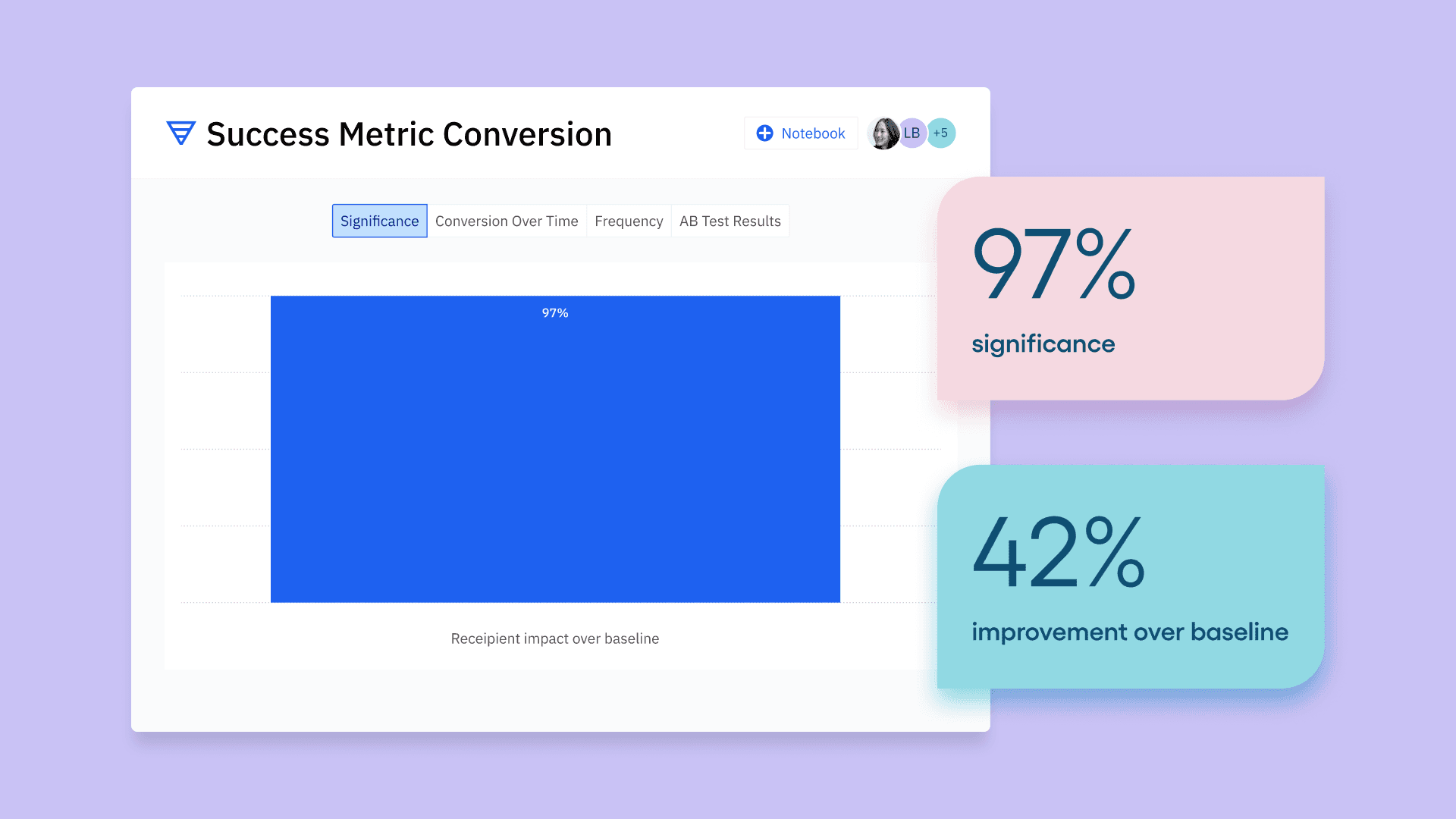
This enables us to analyze the statistical significance in an Amplitude funnel analysis chart among recipients compared to non-recipients who converted to the success metric. Below is an example of how we set up an A/B test in an Intercom series for a single message.
Step 1: Set up an A/B split test in an Intercom series and tag each group.
After we launch our program, we build a funnel analysis chart in Amplitude to analyze the following question: Among all users who started the program, did the recipients outperform the holdout group in completing the success metric(s)?
Step 2: Analyze the A/B test significance in Amplitude. For example, did the target group outperform the baseline holdout group to convert to the defined program success metric?
To do so, we first define our funnel events, for example:
- Event 1 = started program, or action X
- Event 2 = success metric.
In the example Intercom series above, all eligible users start the series, and then they’re split into the recipient vs holdout groups. This enables us to begin a funnel conversion chart with the “series started” tag that we’ve defined in Intercom.
Note: All Intercom tag data gets ingested into Amplitude via the following format:
- Event Name—[Intercom] user.tag.created
- Event Property—tag.name
After you define your funnel events, you can set up 2 user segments.
- Segment 1: Recipients of the program who received the “program delivered” tag defined above.
- Segment 2: The holdout group, who received the “A/B test - holdout group” tag defined above.
Then we adjust the funnel analysis “measured as” section to display significance, and set the baseline segment to the holdout group. This enables us to see if our recipient group is outperforming or underperforming against our holdout group in the funnel conversion.
The outcome of this comparison determines if we should continue investing in the program or we should pause it to evaluate more impactful programs that might drive more users to complete the desired action.
Recommendation: Define your campaign goal and success metric prior to launching your program. Ensure you have the right data instrumented in Amplitude to measure your campaign’s attribution to drive users to complete the intended outcome.
Dashboards, templates, and notebooks drive insights at scale
After launching a new Intercom campaign, we put together a program dashboard to highlight some of the following metrics:
- Message delivery counts and unsubscribe rates
- Deliver, open, and click conversions broken down by message title
- Recipient vs. holdout group success metric conversion and statistical significance
- Engagement by plan, location, and device
- Subsequent user action in our product after engaging with the program
- Qualitative vs. quantitative comparison of what users say in feedback surveys vs. what they do in the product
Dashboards
Our dashboards highlight critical metrics to monitor for our programs and products. This view provides us with more high-level executive metrics that we can reference on our weekly metrics readout call.
We use dashboard templates to drive insights at scale for all our analytics users, both novice and advanced. So, whether your company has a mature taxonomy or is just getting started, we recommend using templates. They’re the building blocks to accelerate the adoption of Amplitude instrumentation across all departments and drive stronger data-driven decisions.
The go-to-market team at Amplitude has created dedicated dashboard templates for each function, enabling each of us to understand how our customers and prospects are adopting Amplitude.
Since all the charts contain a common filter, such as Org ID, a CSM can easily update all embedded charts with a single action by setting the new Org ID value within the dashboard parameters. This unlocks data insights across all personas at the company, including executives!
Notebooks
Notebooks tell a story and guide users on how to interpret data. Our team uses notebooks for multiple “how to” guides to drive more data confidence among viewers by showcasing valuable insights derived from the underlying data. Some use cases include:
- Drive awareness of product or campaign experiment progress.
- Educate users on using our internal taxonomy for key analyses.
- Summarize how to interpret user engagement in a key product or feature.
Follow our lead on Amplitude
Measuring campaign performance, analyzing the derived data, and taking action can be challenging—but it doesn’t have to be. We share how our team uses Amplitude not to put ourselves on a pedestal but instead to demonstrate how our team tackles these same challenges.
We’re also lucky that our organizational needs overlap with those of our customers, enabling us to walk in your shoes and create a more powerful product!
Stay tuned for part three of this blog series, where we’ll review helpful methods to prevent data silos. Or, if you missed it, check out part one about unlocking the power of integrations.
For more resources to power your growth with Amplitude, join the Amplitude Community. And for specific questions on this topic, start a thread and direct it to @jennru.

Jennifer Rudin
Senior Data Strategist, Amplitude
Jennifer is Amplitude’s Sr. Data Strategist, focused on integrating Amplitude into her everyday work. Her intentions are to break down data silos, increase data literacy, and build confidence in our internal data infrastructure.
More from Jennifer


