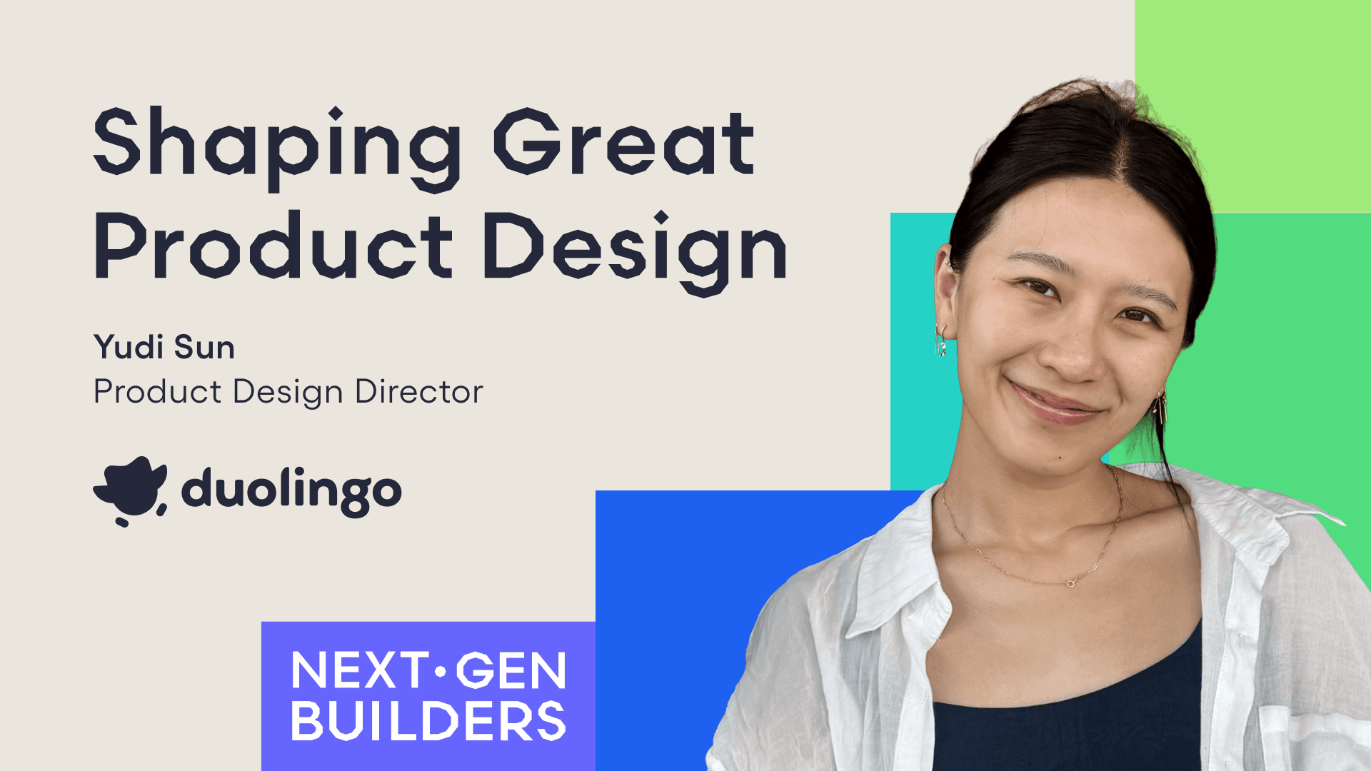
Meet the Next Gen Builder: Yudi Sun, Director of Product Design at Duolingo
How to scale creativity, clarity, and shared ownership across fast-moving product teams
What keeps users coming back to a learning app days, months, or even years in a row? It’s designing with intent, crafting something that feels effortless, and staying true to the brand.
In this episode of Next Gen Builders, host Francois Ajenstat sits down with Yudi Sun, Director of Product Design at Duolingo, to explore how one of the world’s most popular education apps scales creativity, clarity, and consistency across its many teams.
Listen to the episode on Apple Podcasts, Spotify, or YouTube.
60% brain share: A lesson in collective ownership
For Yudi, the most successful product teams don’t just collaborate—they co-own. That means that product, design, and engineering don’t operate in silos, but instead share roughly 60% of context, information, and priorities.
This concept of “60% brain share” helps teams move faster, reduce handoffs, and eliminate unnecessary meetings—because each function understands enough of the others’ world to act with confidence.
“60% brain share means we’re able to cut away a lot of the early work of getting alignment because we have so much shared context that we’ve already created it.”
—Yudi Sun, Director of Product Design, Duolingo
How do you build that brain share? Curiosity, repetition, and rituals. Yudi recommends designers act like PM interns: Ask lots of questions, dig into terms they aren’t familiar with, and state their intention to build a brain share.
What does “good” product design look like?
Craft and taste are central to design philosophy, but neither exists in a vacuum. For Yudi, great design at Duolingo looks very different from great design at Cash App. Why? Because context changes the definition of “good.”
For Duolingo, that means:
- Balancing playfulness and clarity to keep learners engaged without overwhelming them.
- Evolving the brand’s expression while staying rooted in a clear, consistent visual language.
“Good craft is within the context of the world we build in.”
—Yudi Sun, Director of Product Design, Duolingo
Existing between Apple and Candy Crush
Yudi maps out Duolingo’s design philosophy between two ends of the brand spectrum:
- Minimalist utility: Think Apple and Airbnb—clean lines, whitespace, quiet confidence.
- Maximalist delight: Think Candy Crush and Clash of Clans—bold illustrations, loud UI, lots of confetti.
Duolingo lives right in the middle. Its interface is simple and familiar, but its character is rich. UI elements are animated. Characters cheer you on. The app feels like a storybook and a tool at the same time.
This doesn’t happen by accident. It’s the result of intentional design choices made across hundreds of product interactions.
“Which direction do we want to veer for this subset of products? Do we want to make it more game-like or more minimalist and simple? We actively make those decisions on a daily basis.”
—Yudi Sun, Director of Product Design, Duolingo
Designing for achievement
How can other apps take a page from Duolingo’s playbook? Design for achievement.
Focus on helping users feel accomplished by reducing friction, clearly signaling progress, and celebrating completion.
In consumer apps, that might look like confetti, coins, or sound effects. In enterprise tools, it’s clarity, speed, and control. The reward isn’t a badge—it’s knowing you got something done, and exactly what it was.
Achievement builds momentum. The easier it is to finish a task—and the better it feels when you do—the more likely users are to come back.
Product review, Duolingo style
One of the biggest surprises for Yudi when she joined Duolingo was the radically transparent, hyper-efficient product review process.
Every Tuesday and Thursday, team members can sign up for 10-minute slots to present new ideas directly to the CEO and product leadership. Anyone can watch. Feedback is fast, focused, and clear.
This process fits right into Duolingo’s culture. It creates an open door to upper management while driving alignment and transparency with the wider organization.
“Oh sh*t” moments opening opportunities
Yudi shares a story from her time at Cash App—a team with no product manager or roadmap that needed someone to step in and lead.
So she did. As the de facto product manager, Yudi learned the codebase, met with stakeholders, prioritized ideas, and shipped a plan when no one else could.
“In that moment, I realized that if I tried to do this and failed, it’s okay—because nobody else was going to do it anyway. Those are the best and most beautiful learning moments where you go out of your way to try something new.”
—Yudi Sun, Director of Product Design, Duolingo
That moment shaped her view on brain share—and her belief that anyone can learn to do the job next to them, as long as they dare to try.
Tune in to Yudi’s story
Design at Duolingo isn’t just about illustration, animation, or brand. It’s about alignment, repetition, and shared ownership. It’s about crafting with clarity and decision making that scales—without slowing teams down.
Whether you’re building for fun, function, or somewhere in between, the biggest takeaway from Yudi’s playbook is this: Build trust. Share context. And get curious. Check out the full episode for more of Yudi’s product design insights.
Want to make sure you don’t miss an episode of Next Gen Builders? Subscribe today.

Brynn Haynam
Sr. Director, Brand Marketing, Amplitude
Brynn Haynam is a brand builder who's always had a passion for the intersection of art and data, and for building world-class creative teams. Before Amplitude, Brynn built and led a brand team at Medallia and helped grow the business from startup to a publicly traded company.
More from BrynnRecommended Reading

Introducing The Amplitude Quickstart Series
May 8, 2026
9 min read

Rebuilding Session Replay’s Delivery Layer to Be Lighter on Your Page
May 7, 2026
9 min read

The Eval Signal That Predicts 3x Agent Retention
May 7, 2026
6 min read

Agents Write Code. Fixing It Is Still On You.
May 6, 2026
6 min read

