Product Tooltips: What They Are and How to Create Them
Discover how to design, trigger, and measure product tooltips that guide users, reduce friction, and drive meaningful in-app engagement.

Tooltips are small, helpful messages that appear inside a digital product (like an app or a website) to guide users, highlight features, or offer quick tips based on where they are or what actions they’re taking. When used effectively, they reduce friction, improve onboarding, and increase feature adoption—all without interrupting the user experience.
This guide breaks down why tooltips work, how to create effective ones, and how to use product analytics to measure and optimize their impact.
- Tooltips are discreet, in-product messages that appear near a specific feature or element to guide users or provide quick context—without interrupting their workflow.
- Tooltips can be passive (like hover-based help icons), triggered by user behavior (like interacting with a feature), or persistent nudges highlighting new or important functionality.
- Effective tooltips are clearly written, well-placed, triggered contextually, and continuously tested to ensure they support user goals and product engagement.
What are product tooltips?
A tooltip relays important information to your users via in-app messages or descriptions that are shown when the user interacts with a feature or element within your product. Their primary job is to help a user discover or learn something they might not have been able to work out themselves. It's common for a product to use multiple tooltips throughout the app, especially for user onboarding, contextual help, and feature discovery.
Typically, tooltips are small or nearly invisible, often triggered by a user hovering over an icon or clicking a “Learn More” button. When designed well, product tooltips help educate a user on how to use your product, like triggering a tooltip for a feature or element to match what users are trying to do at a specific moment.
Why are product tooltips effective?
Tooltips guide users through the product experience in ways that drive engagement, adoption, and long-term value. Here's how:
- Improve usability and reduce friction: A product tooltip offers just-in-time guidance that users can easily access without searching or guesswork.
- Boost onboarding efficiency: Tooltips show users how to navigate core features without needing a full tutorial, shortening time-to-value by helping users understand your product's value faster.
- Drive feature adoption: You can set up tooltips for new or underused features to be delivered at the right moment (when they need it).
- Support retention: Tooltips support retention by continuously surfacing relevant features, reinforcing the product’s value as users’ needs evolve.
Used strategically, tooltips can impactfully guide users toward successful outcomes at every stage of their journey.
Types of product tooltips
Product managers use three common tooltip designs.
1. The hover tooltip
Users can hover over an icon to view a text tooltip. Hover-based tooltips have the added benefit of staying discreet in their dormant state, only expanding when the user wants to tap into them. However, make sure hover-based tooltips are not blocking any common mouse pathways. Otherwise, users will often accidentally trigger tooltip modals.
Hover tooltips can be dismissible by clicking outside the tooltip, pressing an X icon, or a clearly marked dismiss CTA. Even near-perfectly designed products will experience users accidentally opening tooltips; at no point should closing that tooltip introduce additional friction.
2. The ever-present tooltip
For often confusing or critical features with larger form factors, an ever-present tip––a tooltip that is always available for users to access, like a banner—may be the ideal option. These are common during user onboarding. Banner tooltips are large enough that users will not ignore them; however, they will occupy screen space, which may prove to be a design challenge.
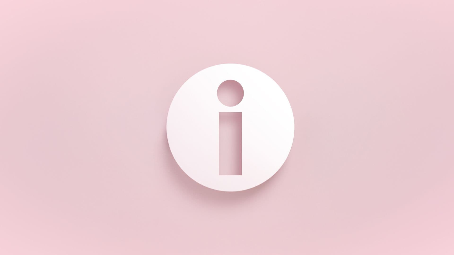
Banner tooltips often have a colored border on the left, top, or all around to alert users that they are informational. You can use an icon––like the commonly used italicized ‘i’ icon—to flag that a banner is an informational tooltip.
3. The nudge
A happy medium between hover tooltips and ever-present variations are nudges. A nudge is a dismissible notification-like modal that typically slides out from the left or right of a user’s screen. You can trigger a nudge automatically when certain conditions are met, for example:
- The user is on a page or step for longer than that action typically takes
- The user is taking a commonly confusing path
- The user has actively requested help from a setting
- The user is doing something different than they’ve done before
A nudge is a more dynamic way to present help, often without interrupting the user’s flow unless the need for help is suspected.
How to create engaging product tooltips
Tooltip design is important. Well-placed, visible, but not overbearing tooltips can dramatically improve product adoption and answer questions before the user has them. From a business perspective, that means less churn and more renewals. Here’s how to create product tooltips that feel natural to users.
Identify user friction points
Use a product analytics tool, like Amplitude, and usage data to find where users struggle with feature adoption or feature usage.
Identify where folks are dropping off or triggering rage clicks—these are the scenarios where you should create tooltips to guide users through the trickier parts of the user journey. For example, if users land on the integrations page but don’t connect anything, a tooltip that says, “Connecting tools helps you sync data in real time” and then shows them how to do it can nudge them toward action.
Design for visual clarity
Use consistent styling, readable font sizes, and contrast that aligns with your brand. If your app has a dark mode, test how your tooltip renders there.
Visual clarity directly impacts whether users notice your tooltips and trust the guidance. If a tooltip blends into the background, covers important user interface (UI) elements, or feels off-brand, users are more likely to ignore or dismiss it.
Create a simple visual checklist for your team to review every tooltip: Does it contrast well with the background? Is it readable on both light and dark themes? Is it clearly associated with the element it refers to? If the answer to any of these questions is “no,” you can address them to improve visual clarity. Running through these basics can catch issues before they become feature adoption blockers.
Keep the language clear and practical
Clear language helps users quickly understand and follow a tooltip, increasing their likelihood of taking the intended action. Tooltips are there to explain a feature, not sell it to the user. Ensure your tooltips are easy to follow and capture a feature concisely and clearly. Avoid using jargon, writing long paragraphs, or applying difficult vocabulary.
Instead, use direct, action-oriented language that focuses on the action the user should take:
- Strong: Click this button to hide users to be restored or deleted later.
- Not actionable: Hide users to be restored or deleted later.
The most effective tooltips should be easy to parse in under a second.
Place tooltips where users need them
Tooltips are only useful if users notice them, so anchoring or deploying them near the element they refer to is key. For example, if you’re using question mark icons to represent tooltips, place one in close proximity to each element that needs a tip. If a tooltip appears too far from the element it references or in an unexpected spot, users may miss it entirely.
Watch a few user sessions or screen recordings to see where people hesitate or hover. If users are hunting for help, that’s a strong indicator the tooltip placement needs improvement.
Use behavior-based or contextual clues
Use contextually triggered tooltips in response to user behavior. If you deliver a pop-up tooltip without context, you risk it being ignored or dismissed. However, if it appears because of what the user is doing (or not doing), it feels timely and helpful. For example, if a user hovers over a grayed-out, unclickable “Export” button, a tooltip could appear that says, “You’ll need to add data before exporting a report.”
Use analytics to identify hesitation moments, like long hover times, rage clicks, or abandoned flows. These pain points are strong candidates for tooltips that clarify what to do next or why something isn’t working.
Track tooltip engagement to improve over time
Test and iterate your tooltips based on what users respond to. Tracking engagement and outcomes helps you understand whether a tooltip is actually helping users take action.
Use analytics to monitor tooltip clicks, dismissals, and downstream behavior. For example, if you launch a tooltip that introduces a new dashboard feature, track how many users who see it go on to use that feature.
Use A/B testing on different tooltip variations to see what drives the most engagement. Change the copy, placement, or trigger timing between versions. Even small changes, like shortening the message or delaying when it appears, can make a measurable difference in adoption.
Learn from user behavior to improve product tooltips
Improving the effectiveness of your tooltips is an ongoing process. The more you can learn from user behavior, the more you can improve future versions of your product tooltips.
If you need better ways to gather insights and improve your product experience, check out Amplitude’s Guides & Surveys. It’s a simple way to turn in-product guidance into measurable impact.

Carmen DeCouto
Group Product Marketing Manager, Amplitude
Carmen DeCouto is a Product Marketing Manager at Amplitude, passionate about helping digital businesses connect data to growth. Before joining product marketing, she led a growth team focused on monetization lifecycle and startup programs—bridging the gap between user activation, engagement, and revenue.
More from Carmen


